You might remember the radial Sankey diagrams “invented” by Visio guy (here). This 3-D version below left me speechless… I hope the guys at junkcharts dedicate a critical evaluation to it….
(view the original diagram here)
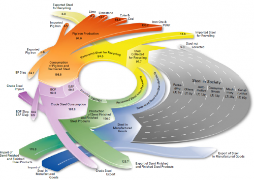
This is from EUROFER (The European Confederation of of Iron and Steel Industries) and shows steel flows in fifteen European countries (EUR-15) in million metric tons. Values are for 2004. The grey area is supposed to represent steel accumulated in capital goods (machinery, buildings, …) over a certain life time.
Whooo woah, that’s a merry go round, I feel dizzy already!
