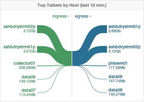
Nice to see that more and more applications now use Sankey diagrams rather than pie charts to visualize distributions. In this case it is a widget available in the dashboard of Boundary, a real-time application performance measurment (APM) suite.
Inbound traffic is on the left side in green, outbound traffic to the right in blue. Only the top five connected hosts by traffic are shown. Inbound and outbound traffic is about the same size, so they have the same height in the stacked part in the middle.
Similar to the cargo traffic Sankey diagram I did here, but in this case the traffic is not traffic of physical goods…

1 Comment
Comments are closed.