Author: matthew

U.S. Freshwater Withdrawals in 2000

I had bookmarked a number of Sankey diagrams a while ago when visiting the website of Lawrence Livermore National Laboratory. These diagrams on energy, CO2 and freshwater are a great source of information. You can, for example, find the typical energy Sankey diagrams (like the one in my previous post) for the U.S. all the way back to 1950, 1960 and 1970 and then from 1973 to today.

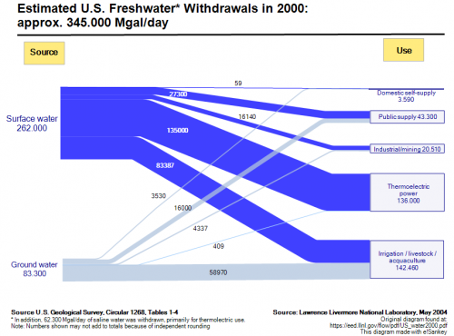
Summer is coming closer, and we can again expect water shortage in some states. So the Sankey diagram I have selected for presentation today (original PDF), is for freshwater withdrawals in the year 2000.

The overall extraction was 345.000 Mgal/day (roughly 1.3 bio litres per day) with approximately 75 % from surface water and 25 % from ground water. Another 62.300 Mgal/day of saline water is withdrawn for thermoelectric use.

The largest portion of the water is for irrigation, livestock and aquaculture, closely followed by the water used in thermoelectric power generation. Domestic self-supply is a comparatively marginal 3,590 Mgal/day (1,04 %), which makes my Mom’s call to “close the tap” sound somewhat ridiculous.
A Sankey for Energy Generation in the U.S.

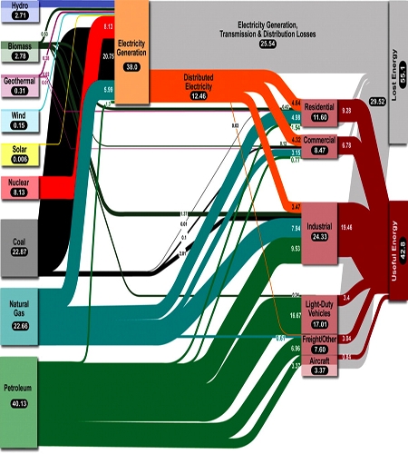
Joshua Rosenau over at scienceblogs took up on the energy topic in his ‘Thoughts from Kansas‘ and presents a Sankey diagram for the U.S. energy distribution (The Problem of Energy Generation) from an article in Science (Whitesides and Crabtree: Don’t Forget Long-Term Fundamental Research in Energy, Science 9 February 2007:Vol. 315. no. 5813, 796-798). It shows that more than 55% of the energy produced is lost, mainly in transmission and distribution on the grid (approx 25%) and another 30% in transport-related combustion of petrol [Note to self: do a Sankey diagram comparison for 1911 race car and modern light vehicle].

“…over half of the energy produced for our domestic market goes to waste. Fully two thirds of the energy produced by electrical generation and distribution goes to waste.”

This Sankey diagram shows the energy carriers on the left side, the sectors where energy is consumed (noteworthy: traffic has a larger share than industry) as midpoint groups, and a breakdown to useful and lost energy on the right.