Author: phineas

sankey-diagrams.com now on WP 2.5

I have updated from WordPress 2.3.3 to the long-awaited version 2.5. While the visitors of the blog might not even notice any difference, the management of the blog via the admin dashboard looks much more comfortable and cleaner to me. I have already played with the improved tags (tags are also visible in the footer of each post again), but still have to experiment with the new built-in galleries. Kudos to the guys at WP, you’ve done a good job. And thanks King Louie for helping me with the update!

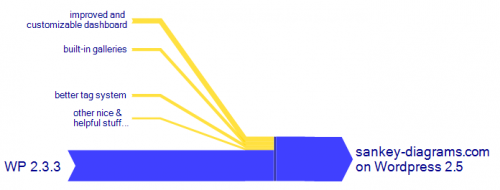
Just for fun – here’s my Sankey-diagram-like schematic display of the upgrade to WP 2.5. The magnitude of the arrows this time do NOT represent anything (neither lines of code nor the amount of satisfaction with each feature….)

Cogeneration Sankey

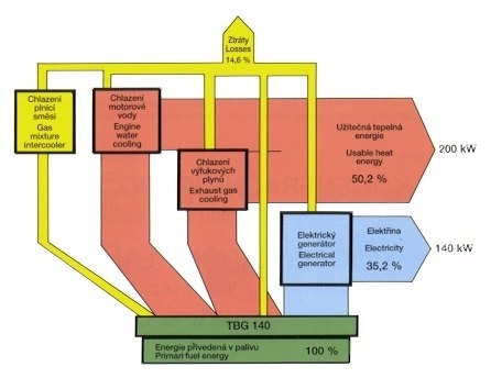
Just a quick casual Friday post. Found this Sankey diagram from a Czech website in my bookmarks.

It shows that in a cogeneration unit with recovery of heat energy from engine water cooling and exhaust gas cooling, an overall efficiency of 85,4% can be achieved, and losses can be reduced to 14,6%.

Don’t ask me what the accompanying text means, I just understand that ‘Kogenerace’ is ‘cogeneration’. Note Nov 2011: I noticed that after an update the original page with the image is not available any more on motorgaz.cz

Utility / Nonutility Sankey for Electricity

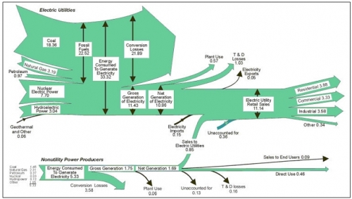
DOEs Energy Information Administration (EIA) produces a lot of energy statistics, and they often use Sankey diagrams to illustrate energy flows.

One of their Sankey diagrams that dates back to 1999 has an interesting two-part structure. It actually is made up from two Sankey diagrams, which are connected by one flow. Values are in quadrillion BTUs.

The top part of the diagram shows electricity produced from various sources, losses along the production line, and the consumption of the electricity in the “Residential”, “Commercial” and “Industrial” sectors. This is structured very similarly to other Sankey diagrams EIA publishes annually (example).

The bottom part shows another Sankey diagram for electricity produced by ‘Nonutility Power Producers’. So what exactly are these NPPs?

A corporation, person, agency, authority, or other legal entity or instrumentality that owns electric generating capacity and is not an electric utility. Nonutility power producers include qualifying cogenerators, qualifying small power producers, and other nonutility generators (including independent power producers) without a designated franchised service area, and which do not file forms listed in the Code of Federal Regulations, Title 18, Part 141. (Source)

Half of the electricity produced by Nonutility Power Producers in 1999 was fed into the grid, while the other half was consumed on-site. I imagine these are typically larger industrial facilities, that have their own power generation. The fact that nuclear energy appears in this section does irritates me a little bit, but as this page explains, the reason is probably a nuclear reactor in a national research laboratory, that is accounted for here.
Making it look nicer…

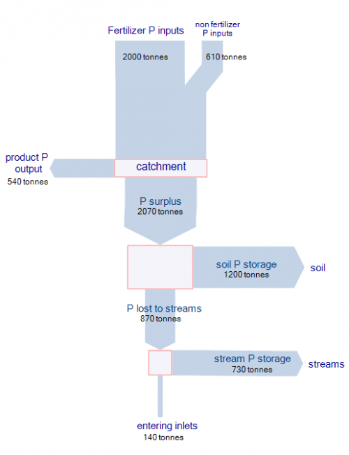
Reading on one of my favorite blogs actually made me take a harder stance on the Sankey diagram I presented in my last post. Following Kaiser’s attitude of making it better rather than only criticizing, I redesigned the Sankey diagram of phosphorus flows in the Peel-Harvey catchment area.

In the first version I didn’t differentiate the various sources of phosphorus, but only used one color for the overall flow quantity. Introducing nodes dramatically improves the comprehensibility and the mass balance check for the flows branching off sideways. There is some redundancy in the labeling of the flows, but I left it to stick as close to the original Sankey diagram as possible.

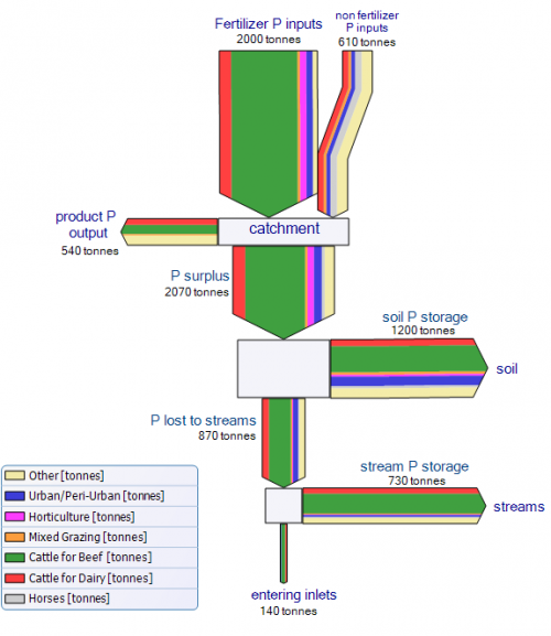
The second Sankey diagram is even closer to the original one. I tried to match the colors as much, and also introduced a legend. Please note that, since I didn’t have access to the raw data, I just approximated the flow values. Because of the multi flow arrows, I decided to leave a border line at each arrow, and to put heads to the first two input flows (‘fertiliser P input’ and ‘non fertiliser P input’) to better be able to distinguish them.

Sankey for Phosphorus Flows and their Origins

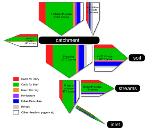
A paper on ‘Guiding BMP adoption to improve Water Quality in various Estuarine Ecosystems in Western Australia’ by Nardia Keipert from the University of Western Australia’s Department of Agriculture and Food shown on the ARWA Ecohydrology website features a Sankey diagram on phosphorus flow in a catchment area.

The stacked Sankey arrows show “the relative contribution from each land use sector”. The origins of the nutrients are cattle for dairy, cattle for beef, mixed grazing, horses, and others. From statistical data on nutrient use efficiency, which ranged from 10 to 50 %, the researchers estimated the accumulation of phosphorus in the soil and streams, and the final delivery into the ocean.

The Sankey diagram does look kind of … errh, how should I say, …. “different”. But this is mainly due to the fact that flows that accumulate in a storage branch off to the side. The arrow magnitudes are actually to scale. To check this, add the horizontal flow to the storage and the vertical flow.

The full report is here, the Sankey diagram is shown on page 8.

Update: see my followup post to this

3D Sankey Diagram from WBCSD

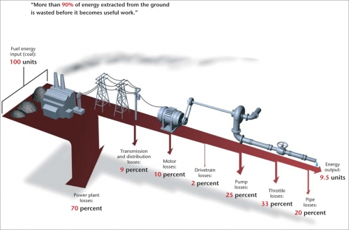
The World Business Council on Sustainable Development (WBCSD) in an article on “Making Tomorrow’s Building’s More Energy Efficient” features a great three-dimensional Sankey Diagram, to illustrate that “more than 90% of the energy extracted from the ground is wasted before it becomes useful work”. The article calls for green buildings where energy is produced onsite, and losses are minimized.

The Sankey arrows representing the losses bend down sharply, they remind me of the Iguazu Falls. Neat 3D images of the equipment are placed on the diagram to visualize the process steps where energy is lost. The whole thing hovers over the ground throwing a faint shade. The graphic designer who did this really merits an applause.

If ever I launch a ‘Best Sankey Diagram Award”, this one will have good chances to win it. Any sponsors out there? Any volunteers for the award jury?

Another Greenhouse Effect Sankey Diagram

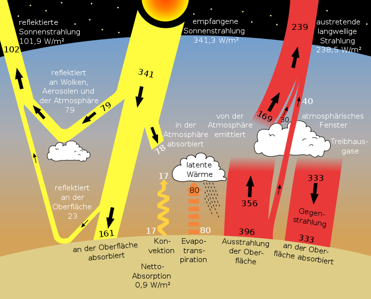
On Wiki Commons I discovered a different Sankey diagram image for the greenhouse effect than the one I presented in a previous post. The diagram is titled ‘sun climate system’, which seems appropriate.

The values are in Watt per square meters. Labels are in German, but if you want to know what they mean, just go to the original Earth Observer (Nov/Dec 2006 Vol. 18 Issue 6) PDF file by NASA and check out page 38.

Energy Losses in Small Fish Trawler Operations

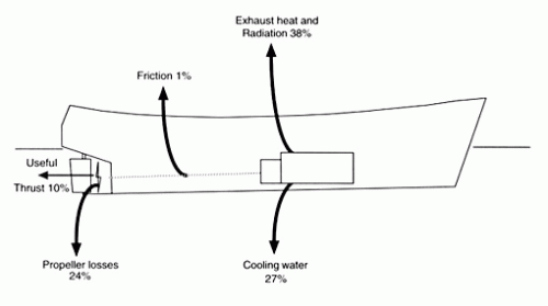
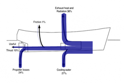
In a report on “Fuel and financial savings for operators of small fishing vessels” by J.D.K. Wilson from Maputo, Mozambique (available on the FAO website), the author explains that in a small slow-speed vessel, only approximately 35% of the energy created from the burning of fuel can actually be utilized to run the propeller, thus can be “spent on useful work such as pulling the net”.

I have “translated” the given values into a Sankey diagram, using the original image as a background layer. This works quite fine, apart from the very thin (1%) flow of friction losses.

On a side note: this is the first time I am presenting a right-to-left oriented Sankey diagram on this blog.

The author concludes, that energy can be saved on the engine and transmission, however the mode of operation (e.g. to reduce the effect of wave resistance), and hull maintenance also play a role. Read more interesting details.