Category: Fakes

Something went wrong here…

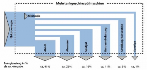
As some of you might know, I also like to post a diagram from time to time that has, … mmmh, say …. has the potential of being improved. This one, found on the website of a German consulting firm, is such an example.

.

I am glad they don’t call this a Sankey diagram anywhere. Everything that could go wrong did go wrong here. The horizontal arrow segments all have the same width, probably due to the fact that the diagram was prepared by combining rectangles. The added outflows that leave vertically at the bottom are much wider than the horizontal first segment. And the outflows are not to scale when being compared among each other (check the 5% arrow commpared to the neighnouring 11% arrow that should have roughly the douuble width. OMG!

Mes chers amis: ‘How not to Sankey’

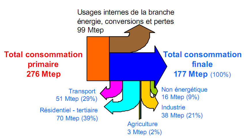
A presentation from 2005 on the French energy flows included the Sankey diagram below (I prefer not to name the author or the link to the original source, in order not to embarass anybody).


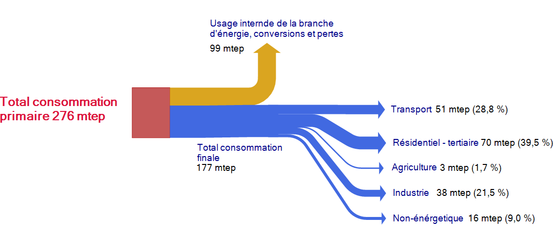
This Sankey diagram is pretty much messed up, and definitely a candidate for the “Worst Sankey Diagram Contest” that has already been called for. It took me a few seconds to understand that the flows dangling vertically below the blue arrow are actually a breakdown of the 177 mtep consommation finale. Vraiment … j’ai vu mieux que ça!

This is more or less how I would do it. Less colors, a breakdown of the blue flow into the five consumption sectors.

Lying with Sankey diagrams (4)

Below is a great example of how to misguide the viewer’s interpretation of data in a Sankey diagram. Found this one on presentation slides somewhere on the web.

The two arrows branching off to the top in a 90° angle do not maintain their magnitudes, which supposedly represent the quantities, and are drawn at a deliberate width. On top of that, the bases of the arrowheads are about two times as wide as the actual arrow width, thus overemphasizing the flow. Look at the 40% thermal losses which look much larger than the 50% useful work to the right side…

I did play around a little bit with this tiny example, and came up with a number of alternative versions.


Not sure which one is the “best” one, and each has its pros and cons. #1 (hover the mouse pointer over the image to see the number of each alternative version) is very close to the original version. The arrow head size in #3 is more modest. #4 has no explicit spike arrow heads at all. #6 has grey divider lines on most of the horizontal section. I kind of like #7 with color differentiation best, but then again, it is energy that is displayed in all flows.

What do you think? Let me know your favourite or suggestions for improvements in your comment

Swiss Wood Flows

I received another diagram from Gabor Doka, who already pointed out the Swiss biomass flows Sankey diagrams to me. Gabor seems to have a close eye on publications in the environmental field in Switzerland, and he apparently is an avid follower of this blog. I appreciate.

He writes:

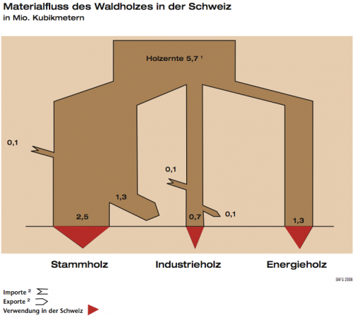
Now a very similar topic (just wood flows in Switzerland) but probably a by-the-book example of how not to do Sankey diagrams. This is from the FOEN magazine “Umwelt” issue 4/2008 (full PDF 8 MB here)

Shown are wood flows in Switzerland in million cubic metre. Again only in German though.

Errors that I saw include:
a) flows are slimming, when pointing in a non-vertical direction (“angle-dependent violation of mass conservation”). See e.g. “Stammholz Export” and “Energieholz” which both should be 1.3, but the latter is larger.
b) Addition of imports does not lead to wider flows. The author could not be bothered to deal with small flows, although 0.1 represents a 14 % increase over 0.7, i.e. perceptible.
c) The arrows representing “0.1” are over 2 times too wide, i.e. they visually represent 0.23. Also the arrow representing 0.7 is somewhat larger.

He continues:

What I do like is visual aid of identifying inland consumption (red arrows). Also inputs and outputs add up, which is always a nice thing 😉 However, this seems like a stitched together diagram drawn manually (and probably re-drawn for publication). This is supported by the angled design and observation that in the original paper publication, the main input representing 5.7 Mio m2 is exactly 5.7 cm wide…

Not much more to add from my side. Thanks, Gabor, for this contribution.

Lying with Sankey diagrams (3)

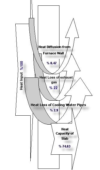
Found this Sankey-like diagram accompanying an abstract submitted for the 2001 International Conference on Thermal Engineering and Thermogrammetry. Posting it here on the blog before this site eventually vanishes. This Sankey diagram is a good example of how not to draw Sankey diagrams, I think. Or, as a Japanese friend would put it politely: “Maybe… [turn head at 30° degree angle, make slight air-sucking noise by inhaling through open mouth] … maybe not so good”.

Here’s the diagram:

The idea was to display heat losses at a slab furnace in a Turkish steel plant. Heat losses were identified in exhaust gases (22 %), at the cooling pipes (2.90 %), and at the furnace walls (0.47 %).

The fact that the widths of the arrows displaying the heat losses were chosen arbitrarily give a completely wrong idea of the proportions. The powerpointish curved arrows don’t really contribute to a better understanding.

All in all, not a very good one. Adding this to my “Lying with Sankey diagrams” mini series (see part 1, part 2), which has been neglected recently.

Sun Energy Reloaded (or: Make it Look Nicer)

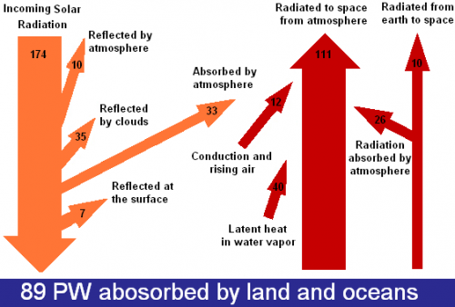
This diagram of sun radiation being absorbed and reflected when hitting earth (from Solar Energy Facts website) is a rather weak remake of the original Nasa diagram.

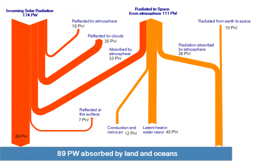
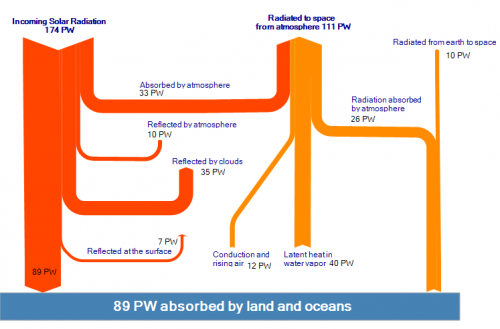
I find the floating powerpointish arrows kind of disturbing, and with the arrow magnitudes not to scale, would even call it misleading. Took the time to prepare two new versions of it (actually I am beta testing the new version 2.0 of e!Sankey at the moment – so this was a nice little test case).

The first version sticks more to the original idea of the diagram shown above, but the arrow magnitudes are corrected and to scale.

The second version is closer to the original ‘Breakdown of the incoming Solar Energy’ diagram by User A1 that can be found on Wikicommons. The latter one has the flow for energy being absorbed by atmosphere (33 PW) branching off as the first arrow horizontally.

Lying with Sankey diagrams (2)

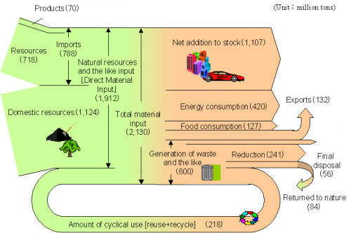
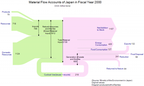
The below Sankey diagram of the ‘Material Flows of Japan in the FY 2000’ has been published by the Japanese Ministry of Environment (環境大臣) and has been reproduced in a number of publications and presentations (sample PPT). Similar charts, representing the inputs into the Japanese economy and the outputs are available for subsequent years.

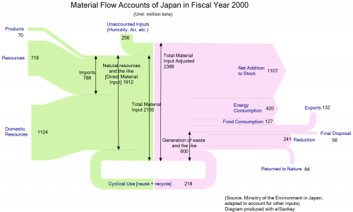
When I copied the values of the Sankey diagram and re-designed it (see pic 1 below), it quickly became obvious that the inputs (2130 Mio. tons) don’t match the Outputs (2386 Mio. tons). After some research I finally detected the reason for the mismatch in a footnote to the diagram in a press release by the ministry. It said that, “due to intake of moisture, etc., total output shall be larger than total material input.” This footnote might have been dropped unintentionally when using the diagram in other publications. I wouldn’t really call this “lying” (as the title of the post implies), but maybe negligence. I wonder if anyboy doubted the numbers when looking at the diagram?

In the second diagram below I adjusted this difference of 256 Mio. tons on the input side.


Another rather surprising thing in this Sankey diagram is the fact that the domestic food consumption within Japan (127 Mio. tons/year in 2000) was almost as high as the total quantity of material being exported (132 Mio. tons). Taking into account, for example, the number of cars being exported from Japan, and their weight, this sounds a little unlikely. However, I think that many of the produced goods might be hidden in the “Net Addition to Stock”.

And for the readers who study Japanese … Sankey diagram : サンキーダイアグラム

Lying with Sankey diagrams (1)

I have decided to present in a loose sequence some diagrams I have found on the web that are obviously wrong. Or -let’s put it in other words- don’t reflect the numbers appropriately. Well, we all know that this happens quite often, and if you plan to do that purposely this book might be of use for you…

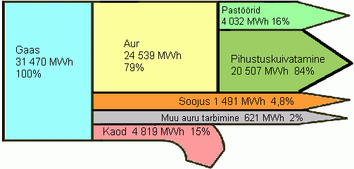
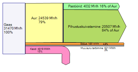
So, here is the first sample from an Estonian energy portal page:

I kind of like this Sankey diagram, because it is simple, colorful, and even though I don’t speak Eesti, I more or less get the meaning of it.

However, have a look at the gray flow labeled “Muu auru tarbimine” which supposedly represents 2% of the overall energy. Shouldn’t it be much thinner, compared to the other flows? I think this ‘not-to-scale’ representation is owed to the fact that in a diagram set up with a conventional drawing tool (is it Power Point they used?) would be very hard to draw and the label couldn’t be placed inside. So they decided to make it “small” but at the same time “lying” with this diagram.

It is also quite funky how the purple arrow for “Kaod” has an arrow line pretty much to scale, but the arrow head is much fatter!
Ah well, and the percentage values don’t add up to 100% and the percentage values for the green flows (“Pasöörid” and “Pihustuskuivatamine” – I love that word!) are percentiles of the yellow “Aur” flow in contrast to the other percent indications.

Here is the same Sankey diagram but with the values to scale, automatically created with a Sankey diagram software. I have adjusted the percentiles in accordance with the absolute values given.

Do you have an interesting Sankey diagram to share? Send it to phineas@sankey-diagrams.com