Category: Samples

Sources and Beneficiaries of R&D Funding

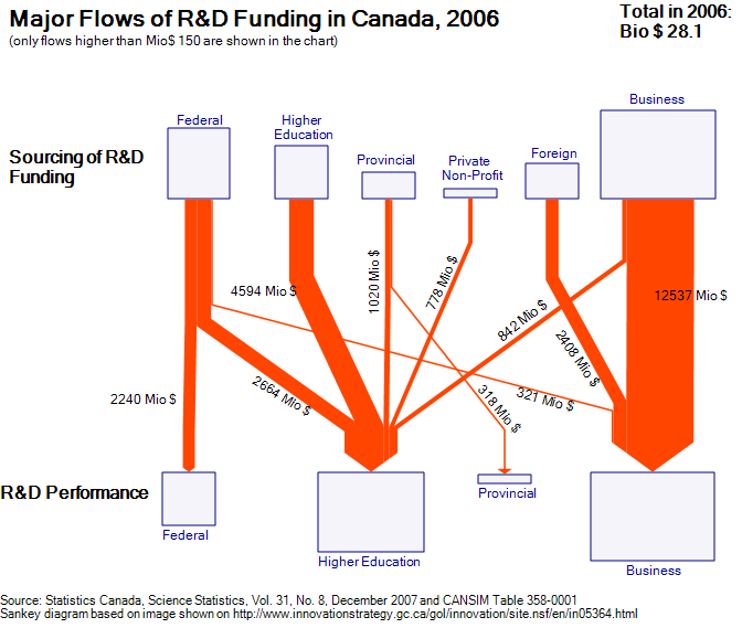
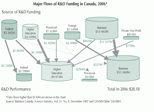
In early November I was pointed to an image on the Innovation Strategy Canada website [the website itself is not accessible any more] by a reader of this blog. Peter asked whether I know of any Sankey diagrams for financial flows, like they are shown in the one below.

The diagram visualizes the sources of R&D funding, and the institutions receiveing this funds. Data is from Statistics Canada for 2006 and shown in Mio (supposedly) Canadian Dollars.

While there are only four different arrow widths to show the financial flows, the interesting thing is that the sums of funds from each source and received by each beneficiary are shown as cylinders (database symbols, tanks, …).

I quickly did several versions of the diagram, but was not too happy with the results. The flow quantities are OK, but as it turns out, it is difficult to see the volume of the cylinder, supposedly to scale with the sums. This information is redundant anyway, since the width of the joined arrows at their base or at their head is exactly the sum that is supposedly to be shown by the cylinder volume.

Here is one version of my Sankey diagram for R&D funding in Canada for 2006 based on the original image. I decided to make the boxes in different sizes (the problem remains the same: can one immediately grasp the area of each box).

Your comments are welcomed. Is there a better way to display the sums?
Visualizing Social Conditions

Came across densitydesign’s images on flickr and was really fascinated by the visualizations presented there.

Density Design is a research framework and an experimental laboratory, born as a laboratory course in the final year of the Master Degree Course in Communication Design at the Politecnico di Milano.

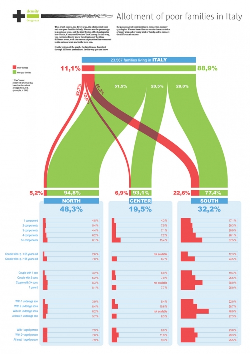
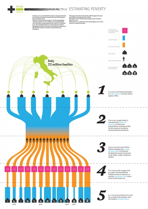
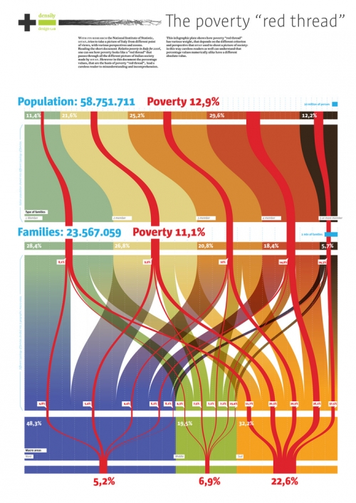
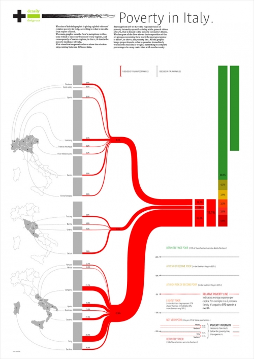
One of their recent projects was on social conditions and poverty in Italy. Some of the visualizations that were created in the course of this project resemble Sankey diagrams, and this is why I thought I should share them with you.


The designers had several dimensions of information they wanted to put into the visualization of statistical data on poverty in Italy. The four shown above chose bands of proportional widths to display the numbers rather than pie charts. In contrast to Sankey diagrams these are not flows, because they are not directed. The works by Luca Rossi (2nd above) and Elena Capolongo (4th above, my personal favourite) try to link the quantities to regions using a map of Italy.

A nice followup project would be to display the migration movements from Southern Italy to the North and abroad due to the social conditions, as previously reported about here.

Density Design has kindly granted permission to show these visualizations here. Read the summary (Project progress report 01. Economic statistic & Communication Design) and learn about their other projects on the Density Design blog. I am adding them to the blogroll too.

Virginia Natural Gas Flow Sankey

The Virginia Center for Coal and Energy Research at Virgina Tech has a website on Virgina Energy Patterns and Trends (VETP).

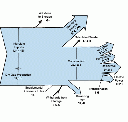
This summary page on natural gas features a Sankey diagram for natural gas flows in Virginia in 2005.


Flows are in million cubic feet. Note that the division line between dry gas production (88.610 million cubic feet) and interstate imports (1.114.460 million cubic feet) overemphasizes VA’s own production. Also the magnitude of the “consumption” flow and “interstate exports” are not to scale, probably owed to the desire of the designer to be able to split up the consumption arrow into separate arrows. The transportation arrow is exaggerated, and would only be a thin line if to scale.

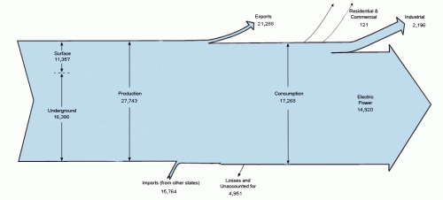
On the VETP summary page for coal, there is another interesting Sankey, also for 2005.

The second one also has some pecularities: The Sankey arrows for imports (15.764 thousand short tons) and exports (21.288 thousand short tons) of coal are not to scale, neither are the losses/unaccounted coal flows 4.951 thousand short tons.

Reminder to self: If I find the time I’ll do these two diagrams properly and to scale.

Showing Migration Flows as Sankey

Most of the Sankey diagrams I come across on the net focus on energy issues, followed by the topics greenhouse gases and material flows of different kinds. Display of cost Sankey diagrams (value streams) is less common, so are people/passenger flows. An interesting approach is presented with Sankey diagrams that show migration flows between countries, or in and out of a region.

The best one I have seen was in this summary report on ‘Europe’s Demographic Future’ published by Berlin Institute for Population and Development. On page 11 you can see the migration flows within Europe (with omissions). The widest Sankey arrows are for migration movements from Bulgaria and Romania, mainly to Spain. There seems to be a lower cut off threshold at approx. 10.000, which leads to smaller flows not being scaled linearly any more. A lot of interesting details in this one… [would have loved to reproduce it, but permission wasn’t granted].

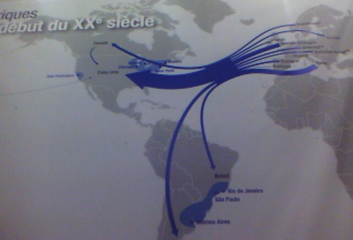
Here are other samples for Sankey diagrams visualizing migration flows (no quantities given, exact time range unknown).

Emigration flows to North and South America in the first half of the 20th century

Refugee flows in Middle East, Africa and Asia in 2006 (clustered quantities)

Both diagrams found on My Paris Your Paris blog

I think Sankey diagrams in this context merit more attention. Will be looking for more of these…

More National Energy Flow Diagrams

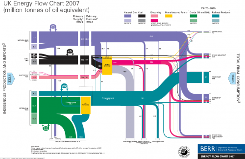
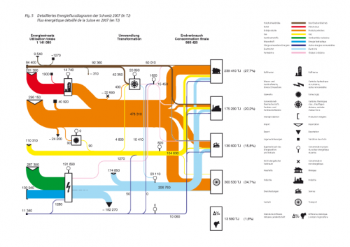
A followup to my last post: This thread on ‘The Oil Drum: Europe’ features similar national energy flow diagrams for UK (2007), The Netherlands (2006) and Switzerland (2007).

For the UK these Sankey diagrams are published by BERR (Department for Business, Enterprise and Regulation). Historic charts back to 1974 can be found on their website.


UK Energy Flows 2007, by BERR, via The Oil Drum: Europe

A commentor to Chris Vernon’s original post added the Swiss version of this Sankey energy flow diagram originally published by Swiss Bundesamt für Energie (BFE):

These Sankey diagrams have some nice details, which a worth a mentioning: The UK diagram shows stock increases and decreases with circles. The size of the circle has no significance, but the magnitude of the in and out flows seem to be to scale, thus allowing to see if the stock has increased or decreased in that year. Losses at transformation steps are shown with “hanging arrows” (the flows branching off to the bottom line of the diagram). The Swiss version also shows exports this way, but visualizes losses with a pin with a big round head.

Even though your run the risk of being overwhelmed by a gloomy feeling when your read through the comments to Chris Vernon’ post, I would like to draw your attention to a comment by “realist” on Sept 5. He writes: “Deceptive graph! Why show losses for electric power generation and not transportation? The heat losses from the internal combustion engine in most transport is 70-80%”. This is true, but I have always understood that losses explicitly shown in these energy flow Sankey diagrams are the losses occuring in the energy generation, conversion and grid, while losses in the energy consumption (such as use for transport) are not shown. This let alone that they are worthwile to discuss.

Sankey for Energy Flows in Spain

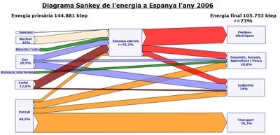
One type of Sankey diagram layout seems to get popular recently. A representation of national energy flows of a country with the energy carriers on the left side (source), and the consumption sectors on the right side (sink). The Sankey flows in between show how energy from these sources are consumed and in which sector. Wasted energy is shown, and the overall energy (in)efficient use of primary energy is made clear with such a Sankey diagram.

I just discovered the energy flow diagram for Spain for 2006 on Joan Vila’s blog.

Unfortunately I don’t speak Catalán (well, I learned that “blog” is “bloc” in Catalán!), and the image quality isn’t very good. You can see nuclear, natural gas, coal (“carbó”) and crude oil (“petroll”), as well as hydro an wind (the two green lines) on the left side. The top box on the right side that takes the big red Sankey arrow for losses from electricity generation (“pérdues”). The others are the use sectors transport, industry, and domestic / services / agriculture. Vila calculates an efficiency of 38,2% for the electric power generation.

Joan advocates Sankey diagrams for visualizing and being able to better understand the issue. He says, that you won’t understand many things about what’s going on, if you don’t study this [kind of] diagram (“No entendrem moltes coses sobre el que passa si no estudiem aquest diagrama.”).

Check out simiular diagrams for Japan, Scotland, Ireland, Canada, United States.

“Sankeyware”

Just back from a short late summer holiday, enjoying a few “Sankey-free” days at the coast. To get going again I am presenting a Sankey diagram you might have seen already. It is Gabor Doka’s sample diagram for his ‘Sankey Helper’ application.

Sankey diagram created with Sankey Helper 2.1 (by G.Doka)

The tool comes as a Microsoft Excel workbook, with a number of macros and a toolbar that allows to create shapes and assignments from the data sheet to these shapes. Of course, graphical layout capacities of this helper tool is limited, however, simple diagrams can be drawn easily once you understand how to handle it.

Sankey Helper 2.1 is freeware – err, sorry! – “Sankeyware”. You must sent the author a Sankey diagram you created, but otherwise there is no cost. Nice idea! Download Sankey Helper from Gabor Doka’s website.

COD loads in Wastewater Treatment Plant

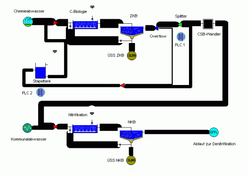
This Sankey diagram shows COD (chemical oxygen demand) in a waste water treatment plant that handles both municipal waste water as well as effluents from a chemical plant.

It was generated using the software package STOAT, which allows for dynamic simulation of wastewater treatment plants. Image with kind permission of Berlin-based EnviaTec GmbH.

The Sankey diagram does not show any flow quantities explicitly, and the values seem to be clustered into five or six fixed arrow magnitudes. The flows have a flat arrow base, and a rounded arrow head, which is uncommon, but still let’s you determine the flow direction. Process clipart icons overlay the nodes, where flows branch off or merge.

I have added the STOAT model to the list of software tools with Sankey drawing capabilities.