Category: Samples

Sankey Diagram Use in Energy Auditing

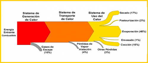
A presentation titled ‘La eficiencia energética: una opción estratégica para la empresa y para el país’ (‘Energy Efficiency – a strategic option for companies and for the country’) by Pedro Maldonado of the Energy Research Program (Programa de Estudos e Investigación de Energía) at Universidad de Chile features a Sankey diagram as an important tool in energy auditing.

The diagram shows exemplary losses (pérdidas) in heat generation, heat transmission and the use of heat. Use of heat is broken down into drying, pasteurization, evaporation, etc. The main message of the author: “The energy we purchase is not what we ultimately use as energy for our productive processes”.

Water Balance (or: Metabolic Profile Sankey)

This article on “Conceptualizing the built environment as a social-ecological system” by Sebastian Moffatt (CONSENSUS Institute) and Niklaus Kohler (University of Karlsruhe) published in Building Research & Information, Volume 36, Issue 3 May 2008 , pages 248-268 has an exciting Sankey diagram in the section ‘Current perspectives, promising methods, missing pieces’ (scroll down about half way).

The authors explain Sankey diagrams as an instrument of Material Flow Analysis (MFA)

“Sankey (directional flow) diagrams are often used to summarize the MFA visually as an entire connected and balanced system. In a Sankey diagram the material flows begin with inputs from nature, then flow into intermediary processes (any infrastructure used for processing, converting, storing, or regulating), and then into the various end use(s). After use, flows may be reconverted by infrastructure systems for reuse or recycling. Ultimately, all flows are directed to a category of output (waste products emitted into air, into water bodies or into landfills; long-term storage; export). The balanced accounting thus tracks every flow from source to sink.”
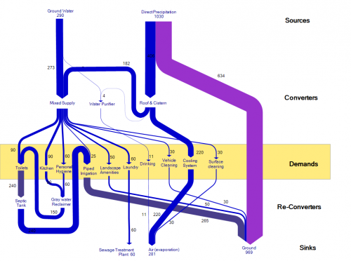
The original Sankey diagram shown in this article is for an resource efficient house, planned or built in New Delhi (India). It sports the water flows through five groups of processes (sources, converters, demands, re-converters, and sinks). The authors call it a “five-partition metabolic profile”, and suggest that it can be done not only for a single house, but “for the built environment at any scale, from parcel to urban region”.

The unit for the quantities given is not indicated, but I presume the water flows are in litres.

When reproducing the Sankey diagram (see above) I tried to make it a little more clearer by changing the order of the (invisible) nodes, thus avoiding crossing flows.
World Greenhouse Gases as Sankey

A great Sankey diagram is available in the Charts&Maps section on the website of the World Resources Institute (WRI), “an environmental think tank that goes beyond research”.

It shows the sectors from which greenhouse gases (GHGs) are released (such as energy generation, land use change, agriculture) and the end use areas or activities, through which CO2, methane and others gases are relased.

Data is for 2000, the diagram was published in 2005. A very well done Sankey diagram indeed, and highly educational.

Unfortunately a request for showing this Sankey diagram here on the blog was not granted by WRI, and an attempt to purchase the publication right (OK, it was not an attempt, it was a price inquiry only) was in vain.

I have to respect WRI’s copyright policies, so you have to click here to view the World GHG Sankey diagram, or download the large version PDF.

They also did a Sankey diagram on U.S. Greenhouse Gas Emissions, available on their website and as a PDF. Enjoy!

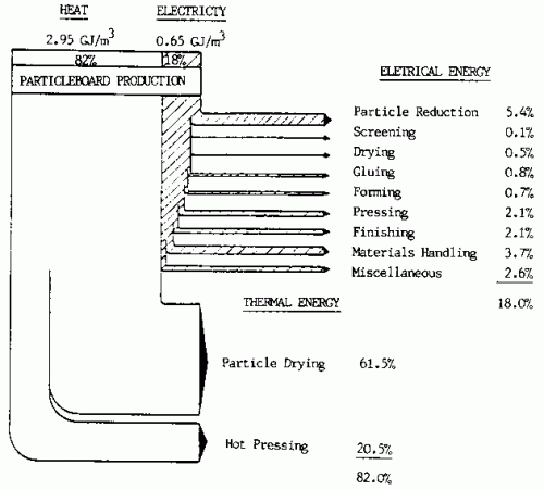
Energy Use in Particleboard Production

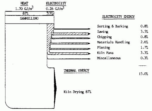
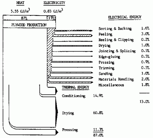
A reminiscence to the days when Sankey diagrams were drawn in black&white by hand and labeled with a typewriter. The three Sankey diagrams below from a 1990 article on “Energy conservation in the mechanical forest industries” by FAO (Food and Agriculture Organization of the United Nations, FAO Forestry Paper No. 93, Rome 1990) illustrates energy use in sawn timber, plywood and particleboard production.

Sawmilling:

Plywood:

Particleboard:

The article explains that

“Although the diagrams are of an approximate nature they do serve to identify the relationship that each major energy consuming centre has with each other and also readily identifies the prime energy users to which particular attention should be paid in any conservation effort.

In all three product manufacturing processes heating is by far the largest user of energy, representing some 82-87 percent of the total energy requirement in the manufacture of sawntimber, plywood and particleboard, with drying accounting for approximately 87 percent, 61 percent and 62 percent respectively.”

Use of Sankey diagrams with kind permission of FAO

Traffic Load Visualization using Sankey

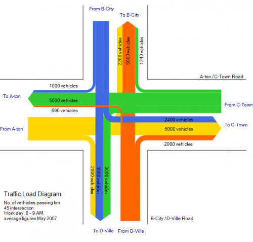
Just discovered this neat Sankey diagram provided in the e!Sankey 2.0 trial version as a sample file. It shows the number of vehicles passing a (virtual?) intersection within a given time frame.

Not sure if traffic planners could make use of such a visualization, but it is yet another nice idea of how Sankey diagrams (originally used only to visualize energy efficiency) are being used for other purposes.

Canadian Energy Flows

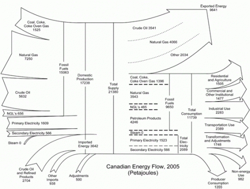
Statistics Canada in its “Report on Energy Supply-demand in Canada” for 2005 shows two Sankey diagram in the annex (HTML version of the two Sankey diagrams). They show the energy flows for Canada 2005 and 2004 in Petajoules per year.

I have featured similarly structured diagram for other countries here before: Japan, Scotland, Ireland, and the United States.

Out of 21380 PJ of total energy produced in Canada and imported, some 9641 PJ (45%) are exported, while 11739 PJ (55%) are national consumption. If you have the impression that the proportions are not 45:55, you are right, they are more like 39:61! From a graphical perspective this Sankey has more peculiarities worth a mention: the magnitude of the Sankey arrow changes and just before the arrow head they become narrower. The flows labeled “Steam” and “Adjustments” seem to have been added at a later stage as they don’t merge into the other arrow. Steam is represented on the production side as well as in the breakdown of energy carriers with a small, but not unsignificant width, however the quanity is given as zero.

Sun Energy Reloaded (or: Make it Look Nicer)

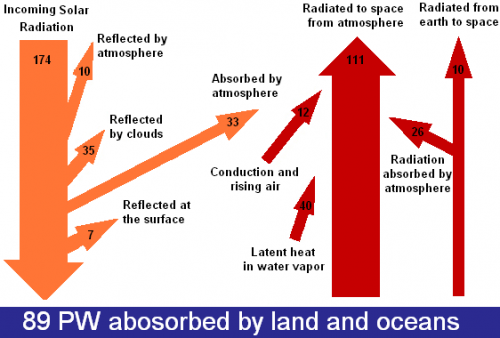
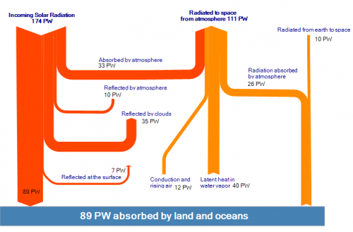
This diagram of sun radiation being absorbed and reflected when hitting earth (from Solar Energy Facts website) is a rather weak remake of the original Nasa diagram.

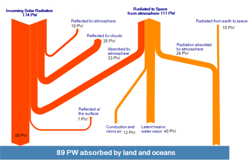
I find the floating powerpointish arrows kind of disturbing, and with the arrow magnitudes not to scale, would even call it misleading. Took the time to prepare two new versions of it (actually I am beta testing the new version 2.0 of e!Sankey at the moment – so this was a nice little test case).

The first version sticks more to the original idea of the diagram shown above, but the arrow magnitudes are corrected and to scale.

The second version is closer to the original ‘Breakdown of the incoming Solar Energy’ diagram by User A1 that can be found on Wikicommons. The latter one has the flow for energy being absorbed by atmosphere (33 PW) branching off as the first arrow horizontally.