Category: Samples

History of Parties and Armies

A company named HistoryShots offers some fine diagrams, that show the development of political parties in the U.S. and two historical graphs of the civil war (1861 to 1865) that remind of Sankey diagrams. Prints of these maps can be purchased from their site.

The ‘History of the Confederate Army’ and ‘The History of the Union Army’ how armies were formed, regrouped or significantly lost men in battles. The width of the ‘arrow’ with an implicit direction along the time line (shown at the bottom of the chart) represents the number of men. Additionally, the diagram is split into three main geographical areas (Western Theater, Eastern Theater and Trans Missisipi Theater).

History of the Union Army (by HistoryShots)

These diagrams are inspired by the famous Minard chart, which shows the loss of men on Napoleon’s march to Moscow and during the retreat.

The other two graphs are in the ‘Political’ section of the HistoryShots webpage, and show the development of political parties in the U.S. from 1730 to 1892 and from 1892 to 2005 respectively. On these graphs the widths of the “bands” don’t represent votes or seats. The popularity of each party is shown as the amplitude on the unlabeled x-axis.

History of Political Parties (by HistoryShots)

Democrats and Republicans are like sinus and cosinus waves over time, a picture that continues on the 1892 to 2005 map. Or one might also be reminded of the intertwined DNA double helix structure…

Note: I presented a similar diagram for the development of political parties in Slovakia 1990 to 2008 here on the blog before.
Energy Flow in Norway Municipality

ENOVA is a public enterprise owned by the Royal Norwegian Ministry of Petroleum and Energy. It advises the ministry in questions relating to energy efficiency and new renewable energy.

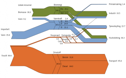
One of their services is the practical development of energy and climate plans (Kommunal energi- og klimaplanlegging) for Norwegian municipalities. On their website they present a sample Sankey diagram to visualize energy flows.

The Sankey diagram shows the energy flows in the Stor-Elvdal municipality in GWh (probably per year, a year is not given). This is very interesting, as the municipality can cover almost all of its energy for industry and private households from renewable energy sources, such as biomass and wind. Energy from fossil sources is consumed through almost entirely transportation. Stor-Elvdal produces 47.5 GWh within the municipality, and imports another 35,8 GWh from wind from outside the municipality.

A small typo can be found in label on the the orange flow (saying 85,8 where it should read 95,8), but this doesn’t spoil the overall quality of this diagram painted with SDraw, I guess.

Download the publication (in Norwegian) as PDF file

Odum’s Energy and Matter Flows in Ecosystems

A visitor to this blog pointed me to the work and life of system ecologist Howard T. Odum.

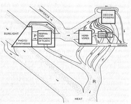
Odum “in his early work used a diagramming methodology very similar to the Sankey diagrams used in chemical process engineering. In this model energy and matter flows through an ecosystem”.

In Odum’s ‘Silver Spring Study’, he

…mapped in detail all the flow routes to and from the stream. He measured the energy input of sun and rain, and of all organic matter – even those of the bread the tourists threw to ducks and fish – and then measured that gradually left the spring. In this way he was able to establish the stream’s energy budget. (Wikipedia)

This diagram shows the energy flows in the ecosystem. The main contributors are sunlight and other biomass imports. Energy “leaves” the system as exports (extraction of animals and biomass) and mainly as decomposed matter. There are no absolute figures in this diagram, but the proportions seem to be represented by the arrow magnitudes.

The diagram has a nice “natural touch” to it, and at first sight one might think that you are looking at the arms of a river delta…

Visio Pre-Wired Sankey Diagram Shape

Visio Guy has been “messing around with … Sankey Diagram Shapes for Visio again — because [he] just couldn’t resist”. πŸ˜‰

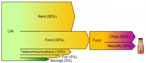
The result is a pre-wired Sankey diagram shape, in which five flows exit from a process box. The flows scale automatically according to the user input.

VG’s example is fun, showing cost of living and what money is being spent on. I just hope his food spendings don’t spread 60/40 on chips and coffee… πŸ˜€

Read the full blog post. There is a download link for this Visio shape at the end.

Estimated Budget Chart

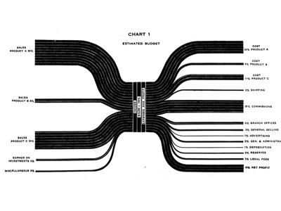
A similar Sankey-style diagram to the one I presented in my last post can be found on the visualcomplexity.com website.

It shows the estimated budgeted costs and earnings and was published by IBM back in 1940 (original source: H. Arkin, Graphs: How to make and use them (Harper & Brothers Publishers, New York, ed. Revised, 1940).

I am not sure if this fully qualifies as a Sankey diagram, since the flows are not directional. The earnings from sales of different products are broken down into arrows of different magnitude from/to the left. Costs for producing the products and overhead costs are on the right side. This chart thus constitutes a graphical representation of an accounting system, with values given in percent rather than as absolute figures.

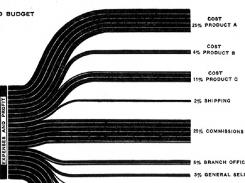
These distribution diagrams are also known as ‘Spaghetti diagrams’. See this detail:

Manuel Lima’s visualcomplexity website has more interesting diagrams, and one can spend hours browsing the projects. I will be presenting a few more of them that qualify as Sankey diagrams here on the blog in the future.

Energy Sankey of a Fuel Cell

Cummins Power Generation and Versa Power Systems are teaming in the development of a Solid Oxide Fuel Cell (SOFC). The three-phase SECA project, funded by the DOE/NETL (US DOE SECA DE-FC26-01NT41244) has completed its first phase. A prototype (named Mission 1) has been developed that produced 3.2 kW of electrical power over 1500 hours test operation time, with an availability of 99%. The ultimate goal is to built a SOFC power system that provides 10 kW.

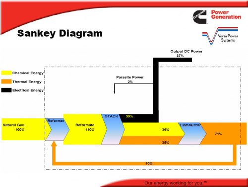
The Sankey diagram below is reproduced (courtesy of the author) from a presentation that summarizes the findings of the first phase of the project.

The Sankey diagram distinguishes chemical energy, thermal energy and electrical energy (as output) and shows the processes reformer, stack and combustor. Some of the heat from combustion can be recovered and used in the reformer. The orange arrow leaving the system at the right should actually be thinner, as 10% branches off. Unfortunately the arrow magnitudes in the diagram are not to scale, as can be seen between stack and reformer, where the magnitude of the chemical energy flow (yellow) is larger than the one of electrical energy (black), even though it is 36 % compared to 39%. The black arrow is also thicker at its tail than at its head.

Still, this is an attention-grabbing Sankey diagram, and an interesting research, which made me read more about fuel cells and solid oxide fuel cells (SOFC) in particular on Wikipedia.

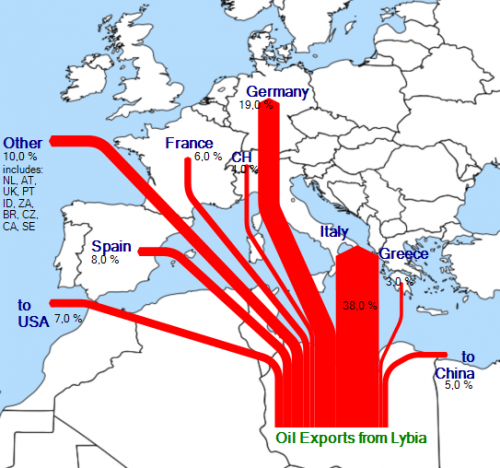
Oil Exports visualized as Sankey Diagram

After my posts on visualizing Rotterdam port’s imports/exports and on Internet traffic maps, I have started to experiment with showing the export quantities and destinations for a certain trade good.

I wanted to do a Saudia-Arabia or Irak oil export Sankey map, but couldn’t find good data. I finally came across this summary on Lybian oil exports, and converted the data from the pie chart Lybian Oil Exports, by Destination, 2006 to a Sankey style export flow diagram.

It was new to me that “Libya has the largest proven oil reserves in Africa” with 41.5 billion barrels, and estimated net exports of 1.525 million barrels per day in 2006.

The underlying map is a crop from a World map found on Wikicommons. I think it could be a little more transparent though…

Floating 3D Sankey diagram

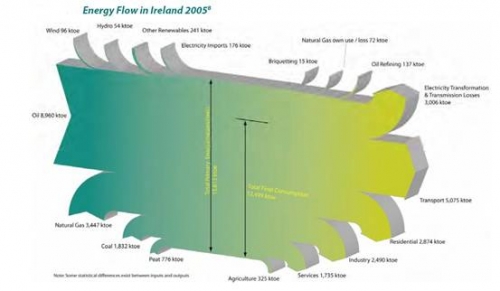
Another runner-up in my private “Fancy Sankey Diagram” contest definitely is this Sankey diagram shown on a webpage of the Longford Environmental Alliance (LEA) from Ireland.

It visualizes the “Energy Balance for 2005 as a flow diagram showing our inputs from the left hand side and our outputs or usages on the right hand side.” It is a 3-D image, and kind of floats above the ground, although it doesn’t have a fancy shadow effect as this one does.

I have shown similar diagrams for California, Japan, Sri Lanka, Scotland and the U.S. before. In these national energy balances the various energy sources are shown as entries from the left, while consuming sectors (or the “sinks”) are displayed as output arrows. This Irish Sankey diagram distinguishes ‘Agriculture’ as a separate sector.

Well done Γ‰ire, home of late Mr. Sankey…