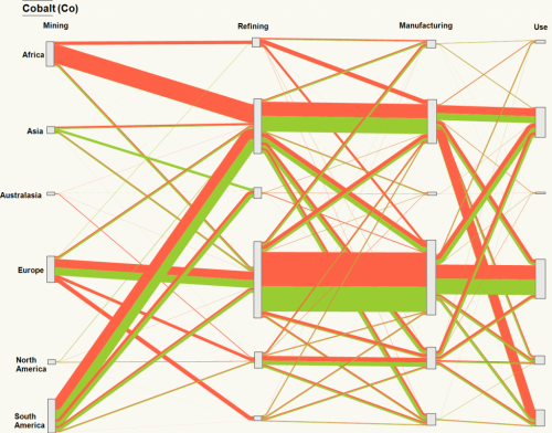
Happy New Year to all followers! Kicking off with a distribution diagram (aka ‘alluvial diagram’) for cobalt (chemical element ‘Co’) by the Geospatial Engineering Research Group at the University of Newcastle, taken from the article ‘Sankey diagram of cobalt life-cycle’ on their blog.
This shows the mining, refining, manufacturing and use stages for cobalt broken down by continent.
Not sure what the orange and green arrows stand for, or what the unit is. Also, there seems to be a mismatch between the input and the output quantitites at some nodes (check, for example, cobalt flows received from mining countries for refining in Europe compared to the deliveries to the manufacturing stage).
This could be due to mismatches in data from the different sources, or caused by changes in cobalt stocks (i.e. Europe mining and importing less but reducing stocks from previous year, thus being able to ship more to manufacturing in the same period). Maybe one of the authors wishes to comment?
