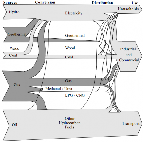
From the deepest and darkest parts of my bookmark list, here is a Sankey diagram for energy flows in New Zealand in 1997. I found it in a PDF document on this website of the Ministry of Economic Development (maori: Manatû Ôhanga).
The text under the diagram reads: “This energy flow diagram summarises New Zealand’s energy use. Primary energy sources are at the left. The flow of these through conversion processes to consumers is pictured, with final end-use classified by consumer type. The width of the bands is approximately to scale.”
Well, almost everything that can go wrong in information visualization goes wrong in this diagram… No quantities or units are given. Flows that are “approximately to scale” narrow down along the way. [The only explanation I have for this, is that this a novel way to account for transmission losses.] Streams meet, but don’t seem to merge. No idea what the spaghetti flows are good for…
In defense of the authors of this diagram I can say that in 1997 there probably weren’t any Sankey diagram software tools around.
I have a nicer one for NZ, which I will present in of my next blog posts. Better energy flow Sankey diagrams from other countries can be seen here, here or here.

1 Comment
Comments are closed.