Sankey Diagrams

A Sankey diagram says more than 1000 pie charts

Menu
Samples

DrawSankey

phineasMarch 18, 2010August 17, 2012

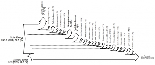
After the colorful Sankey diagrams in the last two posts, here is a black/white one to soothe your eyes…

drawsankey_mkii

It has a left-to-right orientation, with inputs from the left, and losses branching out to the top. Made with Matlab add-on m.DrawSankey from EPFL Lausannne.
Tagsmatlabsoftware
Previous StoryEnergy Efficiency Analysis in Finland
Next StorySankey Diagram Overlay to Show Changes

phineas

Pages

  • About
  • Privacy Policy
  • Sankey Definitions
  • Sankey Diagram Software
  • Who is this Sankey guy?

Categories

  • Fakes
  • General
  • History
  • Methodology
  • Publications
  • Samples

Tag Cloud

AustriabiomassbuildingCanadacarChinacircularcogenerationcostefficiencyenergyenergy balanceenergy efficiencyenergy lossEuropeexergyfinancefoodFranceGermanyGHGheathouseLatin AmericamapmetalMFAmoneyNetherlandsprocess technologyremakesoftwareSpainSwitzerlandtradetransportU.S.UKurbanverticalvideowastewaterwoodworld

Blogroll

  • ChartPorn
  • Density Design
  • EagerEyes
  • Flowing Data
  • Infosthetics Blog
  • InfoVis:Wiki
  • Junkcharts
  • MFA Diagrams
  • Visual Complexity
  • Visual Literacy
Sankey Diagrams, Proudly powered by WordPress. Privacy Policy