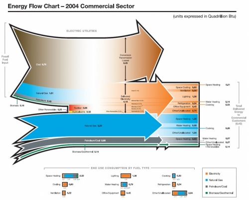
An energy flow chart for energy use in the residential building sector is shown on the Autodesk Sustainability Workshop page ‘Measuring Building Energy Use’. There is also a similar Sankey diagram for energy sources consumption in the commercial building sector.
Both are taken from a Pacific Northwest National Laboratory (PNNL) report from 2006 prepared for Department of Energy (DOE) titled ‘Energy End-Use Flow Maps for the Buildings Sector by D.B. Belzer (PNNL-16263).
Residential building sector energy flow chart:
Commercial building sector energy flow chart:
Both Sankey diagrams are built up the same way. The top part of each diagram shows electricity generation, the bottom part the energy flows for heating. Significant conversion and transmission losses can be identified by the arrow branching out at the top. Flows from the left represent the energy sources: coal (brown), natural gas (blue), biomass/solar (green). To the right the flows are broken down to the individual consumption, such as heating, cooling, lighting, other electric appliances, etc.
All units are in quadrillion BTUs for the U.S in 2004.
