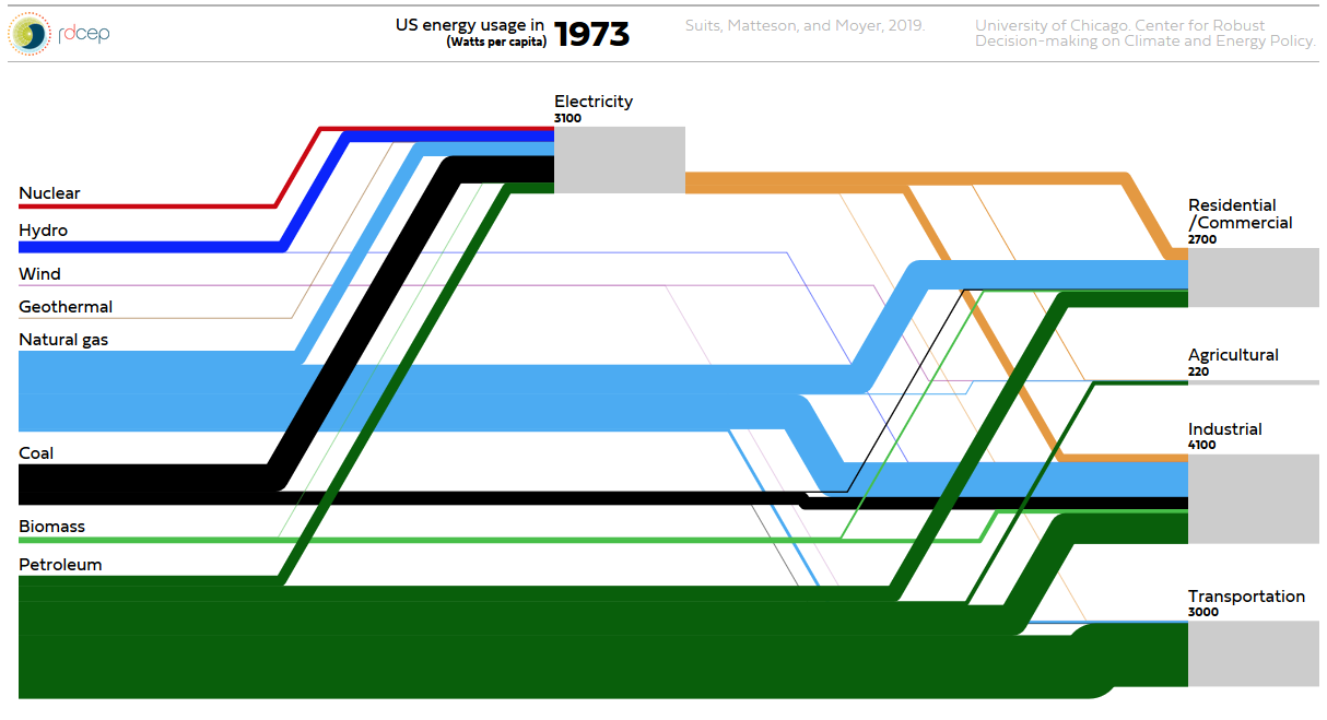
Watch this beautiful animated Sankey diagram for per capita energy usage in the United States from 1800 to today… Created by Suits, Matteson, and Moyer. University of Chicago, Center for Robust Decision-making on Climate and Energy Policy. Click here to go to plasm.ist website and watch animation. Update: new website here
