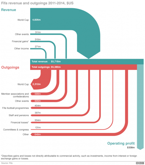
This diagram is by Salim Qurashi and Gerry Fletcher for the May 29, 2015 BBC News article ‘How Fifa makes and spends its money’ by Paul Sargeant.
BBC News via Coffee Spoons blog
The data is based on FIFA financial statements for 2011 through 2014. Flows in US$. The diagram depicts how “the Zurich-based multi-million-[dollar] organisation make its money and what does it spend it on?”.
This is only “sort of a Sankey diagram” as Brendan Barry “the man behind Coffee Spoons” notes. The light blue arrow for “operating profits” represents the balance difference between turquoise incoming and red outgoing flows. The infographic authors chose to set the arrows apart, which make it difficult to verify if arrow widths are to scale.
For the expert eye, some observations:
(1) Why has the sort order for incoming and outgoing flows been reversed? Imagine the red outgoing flow for “World Cup” (2,312m) being located at the right side thus becoming the longest arrow with a stronger emphasis…
(2) Not all flows are to scale: Compare the width of the light blue arrow for “operating profits” (338m) with another flow in the 300m-range such as “Financial Losses” (331m). An unintended flaw?
