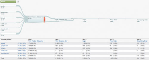
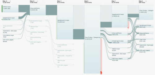
I was advised by a reader that Google Analytics now visualizes web visits with Sankey-style diagrams. On the Google Analytics blog this new instrument was presented.
“Our design team chose not to build individual “path analysis,” which can quickly become complicated. Instead, they took inspiration from a wide range of sources to reimagine approaches for visualizing visitor flow. Our goal is to help marketers and analysts better optimize their visitor experience by presenting the ways that visitors flow through their sites in an intuitive and useful way.”
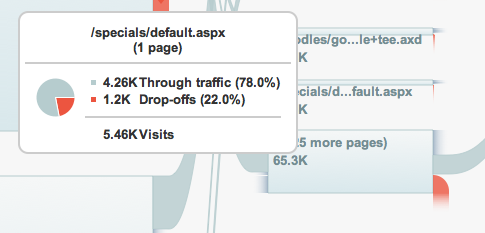
The flows look neat, but they are still struggling with the diagonal routing of the arrows where the width of the flow is not maintained. Check the flow that leaves the node in the bottom left corner of the picture below.
(Source: Google Analytics Blog)
All in all a great new tool and this will surely help spread the idea of Sankey diagrams for visualizing flow quantities.


1 Comment
Comments are closed.