Haven’t posted much in this mini-series recently … not that there would be a lack of Sankey diagrams that have technical defects or simply misrepresent flow quantities with deliberate arrow widths.
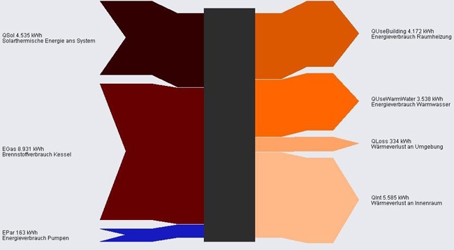
In this Sankey diagram from a website by AEPC the blue arrow is grossly exaggerated and not to scale with the other flows.
Flows are in KWh. Energy inputs (solar, fuel for boiler and pumps) on the left. Uses and losses to the right.
