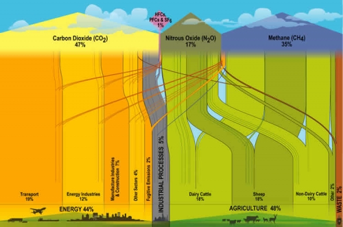
New Zealand’s Ministry for the Environment has the below Sankey Diagram on Greenhouse Gases (GHG) Emissions on their website.
It is interesting to compare this to the U.S. or to the world average. Similar GHG emissions diagrams have been published by the World Resources Institute WRI.
In NZ the main sources of emissions contributing to climate change are from agriculture (48%), while in the U.S. only 6.5% and on a world average this is only 13.2%. (Note: WRI data is for 2003, and there might be methodological differences in the background statistical data. But the proportions should be more or less correct).
Energy consumption accounts for more than 86% of the GHG Emissions in the U.S., and 44% in NZ. Quite a different panorama, and different challenges in New Zealand.
