My Sankey diagram tour around the Baltic Sea continues. After stops in Estonia and Poland, today it is Sweden.
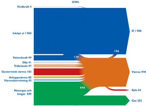
The diagram below is from the website of the energy provider of the Swedish city Lund.
This diagram is in GWh. It shows the different energy sources used in Lund on the left side, like wind energy (“Vindkraft”, 4 GWh) or geothermal energy (“Geotermisk värme”, 183 GWh). The largest portion (1960 GWh) is electrical energy purchased. The arrows on the right hand side show as what type the energy is being consumed: electricity, heat, cold and gas.
I like this diagram for its ‘blockish style” and the very strict horizontal orientation. The fact that certain flow quantities are branching off to join other arrows is indeed rather difficult to depict. You can see – especially on a b/w printout of the PDF file (on their old website) – that they were struggling with this, but they smoothed it nicely with color gradient effects.
If you take out your pocket calculator (and that’s what I always do!), you will come up with a difference of 244 GWh (“inputs” on the left 3361 GWh, “outputs” on the right 3117 GWh). Might this be attributed to transformation losses?
