LatAm BEN – Paraguay

So, after Argentina and Uruguay, here is the Balance Energético Nacional (BEN) for Paraguay.

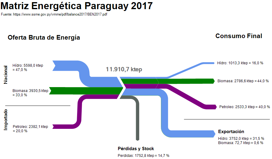
I couldn’t find any Sankey diagram for the national energy flows on any government website. However, a document on the Balance Energético Nacional (BEN) is published annually by the Viceministério de Minas y Energía. It contains this schematic drawing:

I turned this into a Sankey diagram using the ktep values and the percentage shares indicated.


The structure of this BEN is a little different from the ones previously seen, since it doesn’t indicate the sectors of final consumption. Obviously, most imported crude derivates are used for transport. Regarding biomass, the report indicates that wood is used in households for cooking and sugar cane to produce ethanol to be mixed into fuels for the transport sector. Electricity is produced entirely from hydropower and Paraguay exports over half of the electricity generated to its neighbours Argentina and Brasil.
Misc Sankey Diagrams Uncommented 20

Uuh-uh, already Friday afternoon… Here is another quick, almost uncommented Sankey diagram, just to not leave you without one for the weekend.

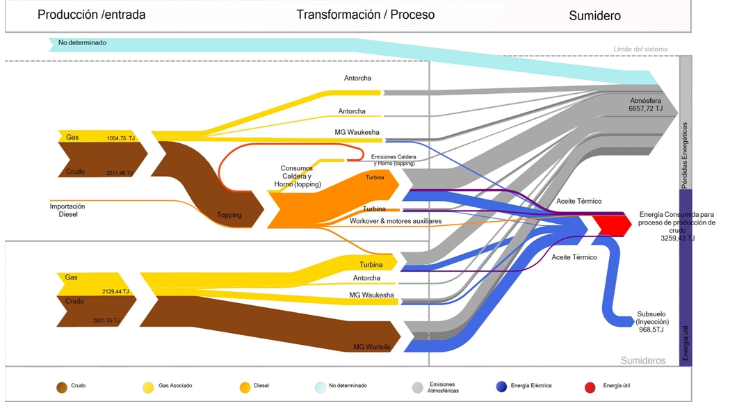
Argentinian environmental consultancy and engineering firm Neoambiental uses this Sankey diagram on its website (go to section 4) to market their professional experience in energy efficiency studies.


Flows are in TJ. Feedstock is crude (brown arrows) and associated gas (yellow). Grey flows are losses or unused energy, while red represents the actual used energy.

Sankey Diagrams from Cement Production

I would love to share with you two Sankey diagrams from cement production, but better do respect “Crown Copyright”. These two are featured in Gao, Tianming: Analysis of material flow and consumption in cement production process. Journal of Cleaner Production. DOI 10.1016/j.jclepro.2015.08.054 as figures 7 and 9 on pages 560 and 561. One is for the raw roller mill system, the other from the clinker process. Both Sankey diagrams are for mass flows in the process.

To see the diagrams please go to article on Researchgate.

In lieu of the copyrighted material, please enjoy this schematic of a rotary cement kiln.

LatAm BEN – Uruguay

Working my way up the southern cone, next in the mini-series on national energy balances for countries in Latin America is the one for Argentina‘s neighbor: Uruguay.

The Ministerio de Industria, Energía y Minería (MIEM) is publishing the Balance Energetico Nacional (BEN) for Uruguay and there is a dedicated website with all the underlying data.


The flow diagram (diagrama de flujo) for the 2015 energy balance was produced by engineering and energy consultancy SEG Ingenieria from Montevideo and appeared in their technical file on energy indicators (Nov 2016, in Spanish only).

Flows are in ktoe (Spanish: ktep, kilo tonelada equivalente de petróleo). The country-wide final consumption in 2015 was 4399 ktoe.

The round icons visualize sources, energy conversion and consuming sectors. They look nice and playful, however, they might also dissimulate the flow quantities: For example, if you look at ‘Transporte’ and ‘Industria’ in the right-hand side, they do have the same diameter, but transport has a 28% share of the final consumption while industry has 42%.

Chemicals from Lignocellulosic Biomass

One of the research topics in the research group of Prof. Christos T. Maravelias at University of Wisconsin – Madison is ‘Renewable Chemicals from Lignocellulosic Biomass’. One line of research is into producing chemicals such as 1,4-butanediol (1,4-BDO), 1,5-pentanediol (1,5-PDO) and 1,6-hexanediol (1,6-HDO) from wood chips.

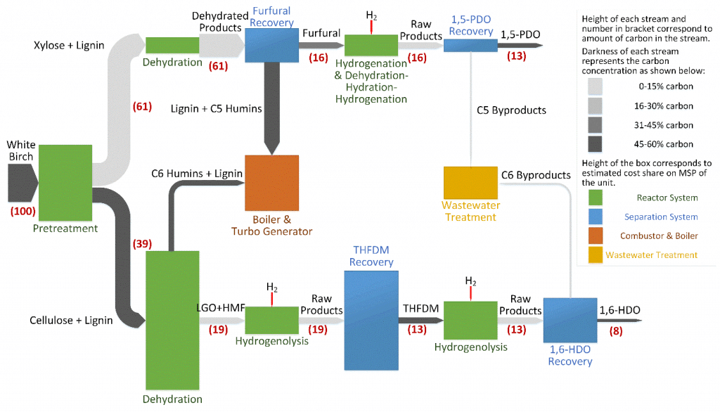
This process Sankey diagram is from the research description page of the Maravelias group.


The red numbers relate to the carbon content in the process (starting with 100% carbon molecules in the feedstock, white birch wood). The coloring of the Sankey arrows is used to signal carbon concentration. And the height of the process nodes shows the cost share of a unit in the process (no absolute cost, just relatively to each other). Interesting! Read more here.

Also see: TriVersa process

LatAm BEN – Argentina

Recently I have been reading about energy policies in Latin American countries. Quito-based OLADE, the inter-governmental Organización Latinoamericana de Energía plays a key role in coordination and cooperation between countries in regard to energy.

OLADE has also established the SIER (Sistema de Información Energética Regional), and one of their products is SieLAC (Sistema de Información Energética de Latinoamérica Latina y el Caribe) where energy data for 27 countries can be accessed.

For all countries the national energy balance (Balance Energético Nacional, BEN) can be produced as Sankey diagrams for the years 2005 through to 2010. Further, these energy flows can also be shown for regions, such as the Caribbean, the Andean countries or the “Southern Cone”.

Here is the one for Argentina in 2010.

To try for yourself, just go to the sieLAC page and click on ‘Balance Energético Resumido’. Then select country, year and the unit.
Unfortunately, data for more recent years is not available at this time.

This work of OLADE has inspired me to start a loose mini-series of posts titled ‘LatAm BEN’ where I will be showing Sankey diagrams representing national energy balances from the region. Don’t worry, they will not all be from SieLAC, and will show how differently BENs can look like.

What’s in a Book? Sankey Diagrams!

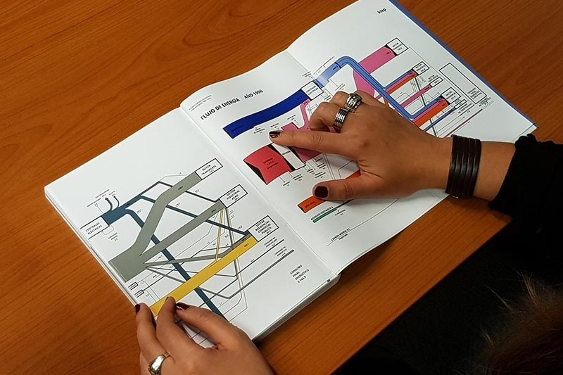
I would love to get a copy of the book shown in the picture below… but then it is probably just a symbolic photo of someone studying the energy balance of a country (the caption reads “Energy Flows Year 1996”).


This find has inspired me to a new mini-series of posts on national energy balances shown as Sankey diagrams with a focus on Latin America.

Here is the list with links to all post so far:
Argentina: 2010
Bolivia: 2014
Brazil: 2014
Chile: 2015
Colombia: 2012
Costa Rica: 2010, 2015
Ecuador: 2017
Guatemala: 2011
Honduras: 2017
Mexico: 2011 and 2016 (coming up)
Panama: 2018
Paraguay: 2017
Peru: 2009, 2017
Uruguay: 2015

Update 04/2020: I am still looking for energy balances for a number of Central American countries (Nicaragua, El Salvador) and for Venezuela on the southern cone. If you can point me to some sources, please leave a comment below.

Finland Wood Flows, Two Versions

The below Sankey diagrams both show wood biomass flows for Finland for the year 2013.

The first one was published in the report VTT Technology 237 ‘Sustainability of forest energy in Northern Europe’ by researchers from VTT Technical Research Centre of Finland and Natural Resources Institute Finland (Luke).


Authors of this figure are Eija Alakangas and Janne Keränen. The diagram is oriented top-to-bottom and shows how the 104.4 Mm³ of round wood that grew in Finnish woods in 2013 were used. Basically there are two (three) main pathways, with a lot of arrows branching out to depict certain uses. 38.3 Mm³ of round wood was used in pulp industry, 26.2 Mm³ in the mechanical wood industry. Another 9.5 Mm³ of wood is used directly for energy generation.

The second Sankey diagram seems to be a remake of the above. It was published in a VTT Research Report on ‘Cascading use of wood in Finland – with comparison to selected EU countries’ by Laura Sokka, Kati Koponen, Janne T. Keränen.


Here the overall orientation is left-left-to right. The color scheme seems similar. There are some minor differences in the energy use part (orange and dark red arrows).

The first diagram has some images and comes across a little more playful than the second one. Although they depict the same data, I perceive them quite differently.
Is it due to the scaling or the vertical vs. horizontal orientation? Let me know your impression in the comments please.