Sustainability of Olive Growing in Andalusia

The Niche Canada blog ran an interesting piece by Juan Infante-Amate from Unversity Pablo de Olavide in Spain titled ‘The largest tree crop concentration in Europe: The making of olive landscapes in Southern Spain’. It is a summary of research done on the changes in olive cultivation in Andalusia from traditional olive growing in the 18th century to today’s industrialized production.

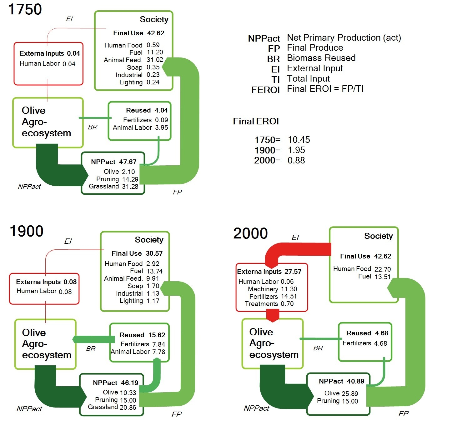
The post features these three schematic Sankey diagrams. Data is for one specific site:


(licensed under a Creative Commons Attribution-NonCommercial 4.0 International License)

The above are three snapshots of the energy flows of one production site in Andalusia in 1750, around 1900 and today. By relating the final product quantity (FP) to the total input of energy or work (TI) the researchers are trying to measure sustainability with the indicator FEROI. An indeed, “[e]verything suggests that over the course of the history of Mediterranean landscapes these current conditions have been the least sustainable.”

Interesting approach and use of Sankey diagrams to compare a sustainability indicator. References to the full research papers can be found at the end of Infante-Amate’s Niche Canada post.
Denmark Energy Flows

Denmark’s Energy Flows for the year 2016 were published by Danish Energy Agency (‘Energistyrelsen’).

For detail, I recommend to study the high-quality image of the Sankey diagam in this PDF.

Flows are in petajoule (PJ). Smaller flows are shown with a minimum width, so they are not to scale with the others, but remain visible. Even zero flows are shown, either because there is actually a quantity (less than 1 PJ) that is just rounded, or, because in other years there might be a flow quantity available for them. Arrows arrive at the nodes separately, their flow labels shown inside the node. This feature enhances legibility quite a bit.

Also see this 2012 post on a Denmark 2050 Nuclear Free Energy Scenario.

Living Sankey Diagrams

A reader of the blog, Olov, has produced the following video. He calls this a “Living Sankey Diagram”. The background can be found on the Sweco Blog (in Swedish). Basically he suggests to take energy declarations for buildings (‘Energideklarationen’) one step further and have visual energy monitoring for building using realtime data.

Energy consumption of a house is shown over a period of a year with up to 3 or 4 datasets per day. We can see heat (red) and electricity (orange). Not sure about the temperature indication at the top left, possibly meant to be the difference to a default temperature (Olov, if possible, please explain by commenting below).

Main consumers in the building are hot water generation (‘Tappvarmvatten’), room heating (‘Radiatorer’), ventilation and cooling. Some PV cells (‘Solceller’) at times add to the purchased energy (‘Köpt Energi’). The pink flow shows heat recovery (‘Värmeåtervinning’). The building is classified in energy class B.

Here, a data series has been used to produce the Sankey diagrams and then the frames were converted to a video. This makes for a nice effect and allows watching your energy flows in retrospect. For example, the PV cells feed energy mostly during the months, while in the same period heat demand and recovery is very limited.

This was apparently produced using e!Sankey. To really do an energy monitoring and produce the Sankey diagram every couple of minutes, there is a software development kit (SDK) the allows linking to a data source (energy measurement data) and pushing the “living Sankey diagram” to a website. Another example can be found here.

Energy Efficiency of Ships, Deltamarin

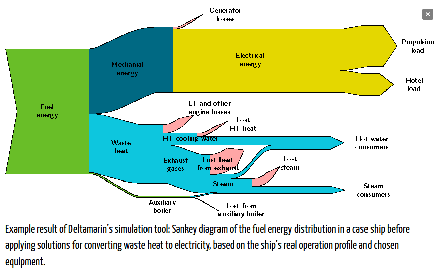
Deltamarin Ltd, a Finnish maritime engineering and consulting firm has developed a simulation and analysis tool, that allows to study the energy efficiency of ships. The model takes into account not only the vessel speed and fuel consumption, but also the secondary on-board electricity consumers and waste heat recovery. Results are shown in a Sankey diagram like the one below.


The Sankey diagram in this pic doesn’t show any numbers or unit of flow, so we can only conclude from the arrow magnitudes that about 50% of the energy is lost as heat at the engine (some of which is recovered for heating of water).
I am not sure about the propulsion being electric though.

The design of the diagram is rather crude and diagonal lines are visibly pixelated. But nevertheless it seems like a good way to get the energy efficiency model result data across other than in a table.

Watch this video where a Deltamarin engineer explains the simulation model and also the Sankey diagram.

Botswana Energy Flows

Botswana, a country with just over 2 million population, borders South Africa to the North. Would you be able to tell its capital?

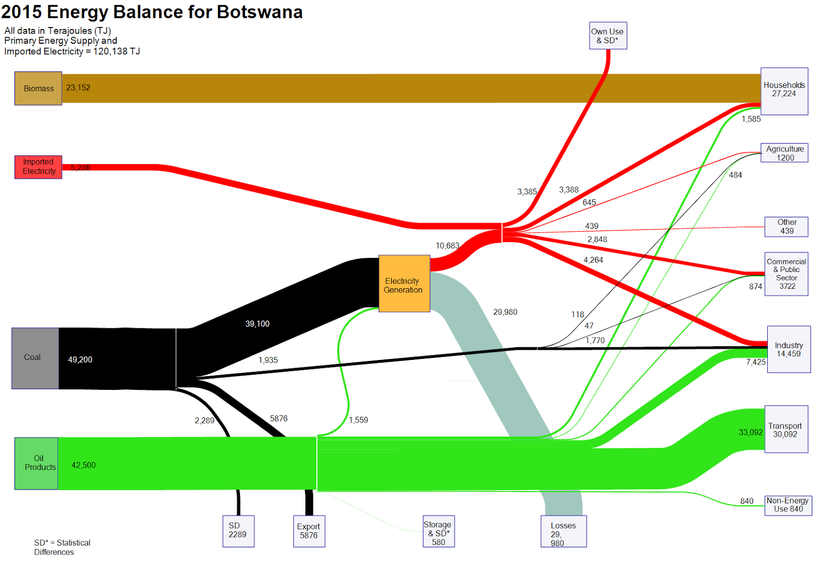
Nevertheless, a Sankey diagram with the energy balance of Botswana can be found on the web. Mike Mooiman, a professor at Franklin Pierce University, New Hampshire and a former visiting scholar at University of Botswana featured it on his ‘Energy in Botswana’ blog. These are the energy flows for the African country for 2015 (based on IEA data).


Flows are in terajoule (TJ) and overall energy demand was 120,138 TJ. Biomass (wood) is the predominant fuel in private households (e.g. for cooking). Locally mined coal accounts for 40% of the primary energy and is used for electricity generation with an efficiency factor of below 30%. Imported oil products account for over 40% of the energy consumed (mainly for transportation).

The 2012 energy balance for Botswana is also available on Mike’s blog.

Energy Flows in Wood Gasification Plant

Most Sankey diagrams I find on the web are from Germany, Switzerland or Austria. Anybody in the know, if this due to the visualization type being part of the engineering curriculae in these countries?

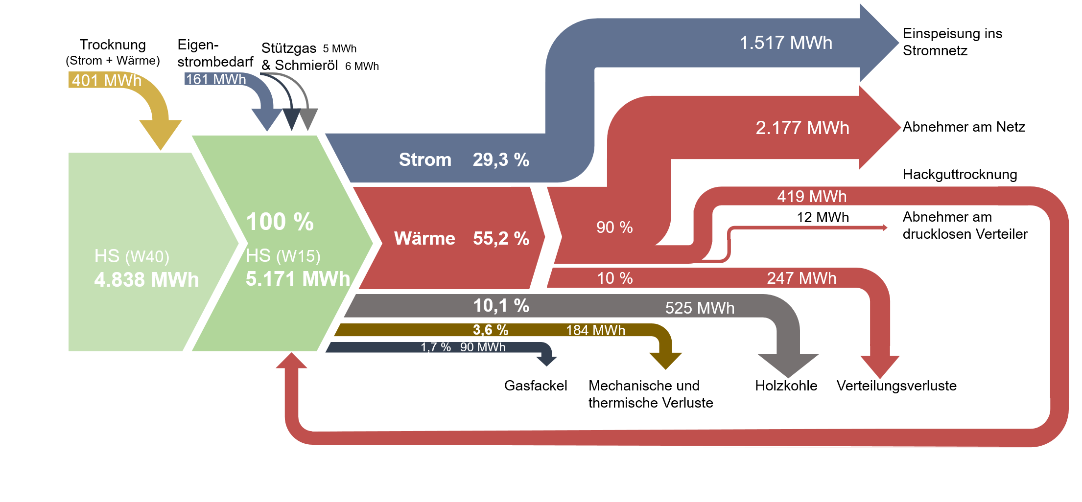
Here is one I found on ‘The Wood Power Plant’ blog by Austrian firm Syntec. It is originally taken from a student master thesis on ‘Life Cycle Analysis of Electricity and Heat Generation of a Wood Gasification Plant including District Heating Network’ (German title: ‘Lebenszyklusanalyse der Strom- und Wärmeerzeugung einer Holzvergasungsanlage inklusive Nahwärmenetz’, thanks Google Translate – you are my friend!) by Elena Käppler of University of Applied Sciences Vorarlberg.

While being graphically quite appealing there are some issue with this Sankey diagram. Flows don’t seem to add up correctly: for example the main stream 4.838 MWh and the 401 MWh coming in at the top would be larger than 5.171 MWh.
Also, some flows are not true to scale. Check out the red arrow representing 247 MWh (going down to ‘Verteilungsverluste’) and compare it to the red one going back in a loop, which represents 419 MWh (‘Hackguttrocknung’).