Nordic Transport Energy in 2050

The report ‘Nordic Energy Technology Perspectives 2016’ published by IEA looks at energy scenarios for Northern Europe / Scandinavia and pathways to carbon-neutrality. Several Sankey diagrams are included in this extensive study.

These are the energy flows in the nordic countries caused by transport. The first Sankey diagram is for the current situation (data from 2015), the second for a 2050 carbon-neutral scenario (CNS).


© OECD/IEA 2016 Nordic Energy Technology Perspectives 2016, IEA Publishing. Licence: www.iea.org/t&c

In the 2050 scenario we see a massive shift from diesel and gasoline powered transport to biofuels and electricity. This ambitious target could be achieved with “fuel efficiency improvements on existing technologies but also rapid penetration of alternative drivetrain technologies such as hybrids and electric vehicles” (p. 66).

Check out the full report here.
Swiss Sankey Sweetness

Unpretentious and humble, quietly producing beautifully crafted Sankey diagrams … this is one reason why I admire the Swiss (and also for their Swiss Schoki, cheese and engineering skills).

This is the energy flow chart for the Swiss canton ‘Basel-Stadt’ for 2014 published by the Statistics Agency of the canton (Statistisches Amt des Kantons Basel-Stadt).

Flows are in Gwh. Nine different energy sources on the left, but only three sectors of energy use: transport, residential and non-residential. Observe how the colors of the icons match the corresponding colors of the arrows. Flow quantities below approximately 150 GWh are not true to scale and are drawn with a minimum width to keep them visible. The footnote alerts the reader to this graphical pecularity.

This Sankey diagram does set a standard for other similar energy flow charts, in my opinion.

Download the report from here (in German), the diagram is on page 11.

Vintage Wind Park Sankey Diagram

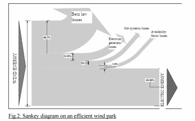
A vintage black and white Sankey diagram for an efficient wind park is shown in this post on the Hypergeometric blog aka ‘667 per cm’ blog.

Out of the several Sankey diagrams shown, this one was new to me. So I dug a little deeper into the original source.

Published originally in: Koroneos, Christopher & Katopodi, E. (2011). Maximization of wind energy penetration with the use of H2 production — An exergy approach. Renewable and Sustainable Energy Reviews. 15. 648-656. 10.1016/j.rser.2010.06.022.

The authors from Aristotle University of Thessaloniki, Greece argue that Sankey diagrams can also be used to visualize exergy flows, and that they can be used to compare “exergy losses of an efficient and an unefficient wind park”.

The one above has “an excellent exploitation of wind energy for an organised park that operates efficiently and effectively”. They further discuss what factors contribute to losses based on an exergy analysis, and show several exergy Sankey diagrams.

Read full article here.

Energy Flows in The Netherlands 2016

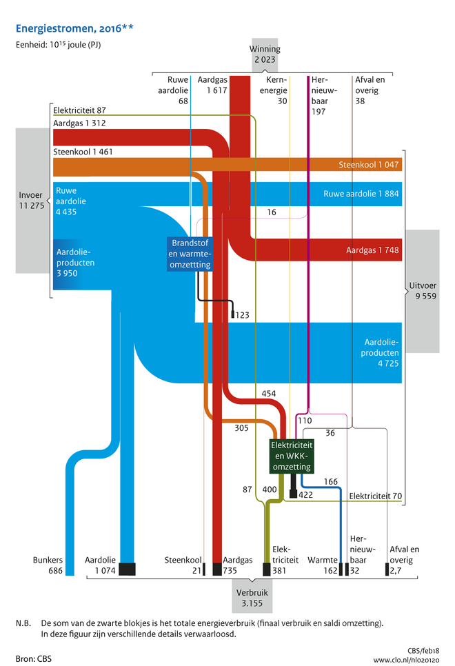
The below Sankey diagram depicting energy flows in the Netherlands in 2016 is very interesting. Actually it features two dimensions: energy production and consumption (from top to bottom) and energy imports and exports (from left to right). This is quite different from other national energy balances I have presented on this blog before (such as e.g. for Switzerland 2015, Chile 2015, Lithuania 2013, or Sweden 2014)

It can be found in the ‘Compendium voor de Leefomgeving’ (Environmental Data Compendium) a website run by the Dutch Government (Rijksoverheid) and is titled ‘Aanbod en verbruik van energiedragers in Nederland, 2016’ (Supply and consumption of energy carriers in The Netherlands, 2016).

Data for this Sankey diagram is from Centraal Bureau voor de Statistiek (CBS). Flows are in petajoule (PJ). Locally produced energy (‘Winning’) in 2015 was at 2.023 PJ, with a consumption (‘Verbruik’) of 3.155 PJ.
So, the Netherlands still had to import some 1.000 PJ to cover demand. However, it imported 11.275 PJ (‘Invoer’) and exported 9.559 PJ (‘Uitvoer’). In the first pace, the Netherlands seem to be an energy transit country. This is owed to the fact that Rotterdam is the largest oil port in Europe, and is a prime location for handling oil products (‘Aardolieproducten’).

Big Oil Climate Lobbying, InfluenceMap

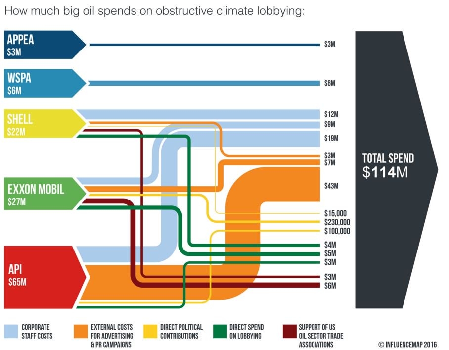
The UK-based non-profit Community Interest Company (CIC) called ‘InfluenceMap’ has produced the below Sankey diagram on obstructive climate lobbying of oil firms and interest groups. These are the spendings in US$ for an unspecified year (possibly 2015).


Source: InfluenceMap, Media Downloads
(via Hypergeometric blog)

Streams are color coded to specify the type of spending (e.g. staff cost, direct lobbying, party donations). Note that the yellow flows (in the range up to 230.000 US$) are not to scale with the others that are on a million US$ range. Some of the elements that represent the sources and the black sum arrow are also overemphasized, showing a height that is larger than the sum of the individual arrow magnitudes. So this is not fully adherent to the principles of a Sankey diagram … but to be fair: they never claimed that it is a Sankey diagram.

This is maybe the first Sankey diagram ever to be featured in the US Senate. Senator [D-RI] Sheldon Whitehouse (yes, that really is his name … you just have to love his “Whitehouse Statement on …” catchphrase) used it in a US Senate testimony in April 2016.

Watch the video how the Whitehouse does quite well explaining the streams of money and to underpin his message with the Sankey diagram. Jump in at 0:25 secs to see Sankey make its Senate appearance…

Global Food System Sankey

Food losses and food waste has been addressed in a number of scientific research papers in recent years. Peter Alexander et.al. write about ‘Losses, inefficiencies and waste in the global food system’ (In: Agricultural Systems, Volume 153, May 2017, Pages 190-200, doi.org/10.1016/j.agsy.2017.01.014)

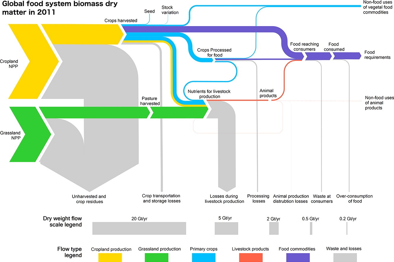
The article contains two beautiful Sankey diagrams. The first depicts the global food system in 2011. Flows are shown as dry mass. Flows are not individually labelled with the underling quantity, but rather a scale at the bottom shows 5 representative flow quantities and their corresponding width.


(under terms of Creative Commons Attribution 4.0 License (CC BY 4.0))

Crop (yellow) and grassland (green) net primary production (NPP) are shown as sources for the global food system. Losses are branching out as grey arrows. These “inefficiencies” of the system are described in detail in the article. The authors observe that “44% of harvested crops dry matter are lost prior to human consumption” and that “the highest loss rate can be found in livestock production”.

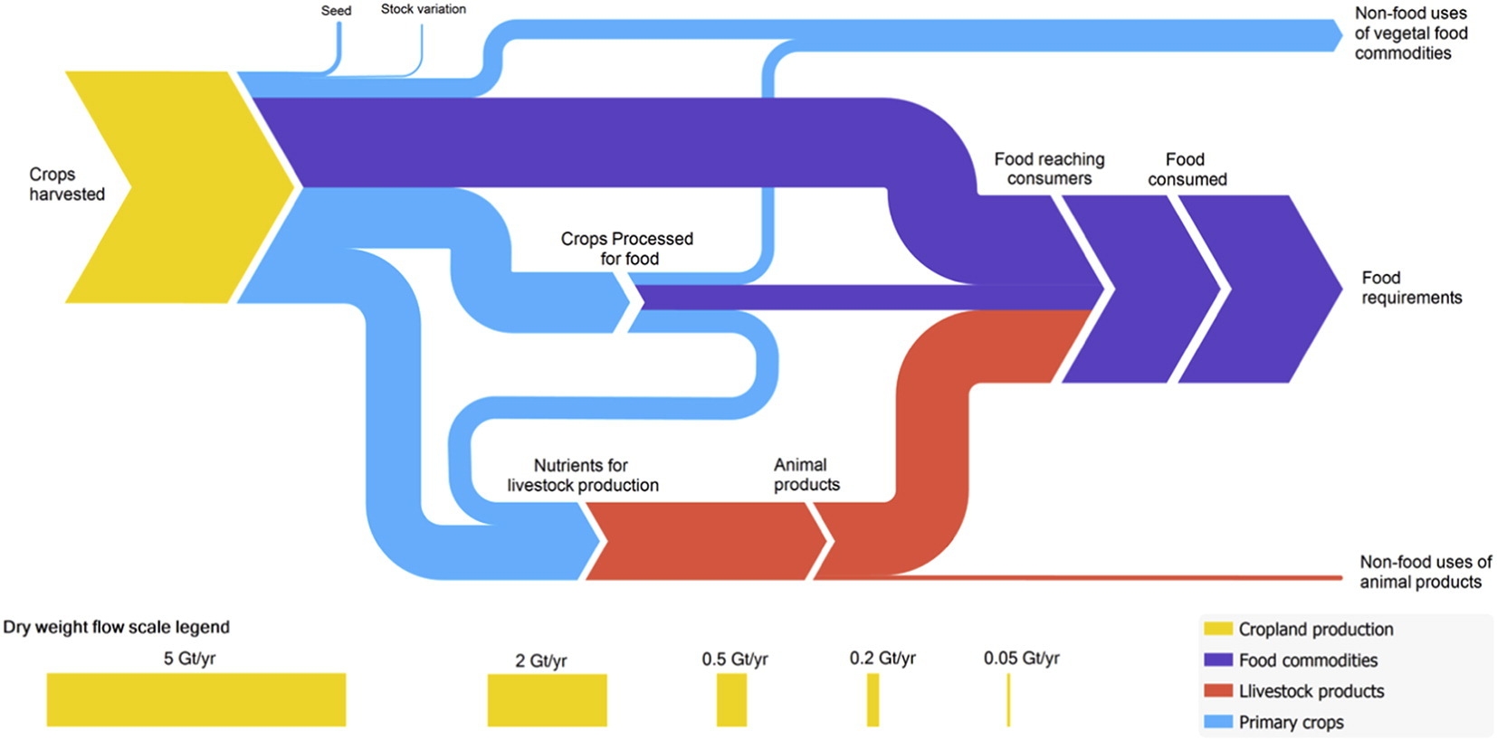
The second Sankey diagram shows a section of the above figure, just the dry matter flows from crop harvest and processing, without any losses. This is interesting because it allows us seeing the share of processed and non-processed food being consumed by humans worldwide, and the the share of crop-based food intake (dark blue) compared to animal-based food intake (red). You could call this the veggie / non-veggie split. Based on dry matter that is.


(under terms of Creative Commons Attribution 4.0 License (CC BY 4.0))

If you want to see the corresponding global food system wet mass, protein and energy Sankey diagrams check out this interesting article. A recommended read for all of us eaters.

Misc Sankey Diagrams Uncommented 18

Back from a summer break … sorry for neglecting the blog for a couple of weeks. The FIFA Worldcup 2018 prediction from my last post has already become outdated … 😉

Here is a black and white hand drawn Sankey diagram from a doctoral thesis (Giovanni Angrisani:’Experimental and Simulative Analysis of a Micro Trigeneration System based on an Air Handling Unit with Desiccant Wheel’. Doctoral Thesis University of Naples, year unknown).


Instead of color-coded Sankey arrows the different types of energy are shown with different patterns of the arrow head. We can see some typical flaws: width of the arrow changes when going from horizontal to vertical (see ‘Losses 3.24 kW’ arrow branching out to the top), flows not to scale (compare ‘Losses 3.24 kW’ arrow to ‘Losses 6.25 kW’ arrow), overemphasis of some arrows through massive arrow heads.

A retro-style Sankey diagram from the times you would hand-draw such figures.

FIFA Worldcup 2018 Prediction Sankey

Every four years soccer related Sankey diagrams pop up. For the 2010 FIFA worldcup in South Africa I featured this figure. In 2014 there was the beautiful “The Road to Rio” diagram from an inflight magazine.

For the upcoming 2018 FIFA worldcup in Russia, two researchers have taken a more scientific approach. Their prediction model uses mathematical methods to determine who will most likely be handed the gold trophy on July 15 in Moscow. If you are into Monte Carlo simulations, bivariate and nested Poisson regression models, Brier score and Rank-Probability-Score (RPS) then you will enjoy the paper ‘On ELO Based Prediction Models for the FIFA Worldcup 2018’ by Lorenz A. Gilch and Sebastian Müller.

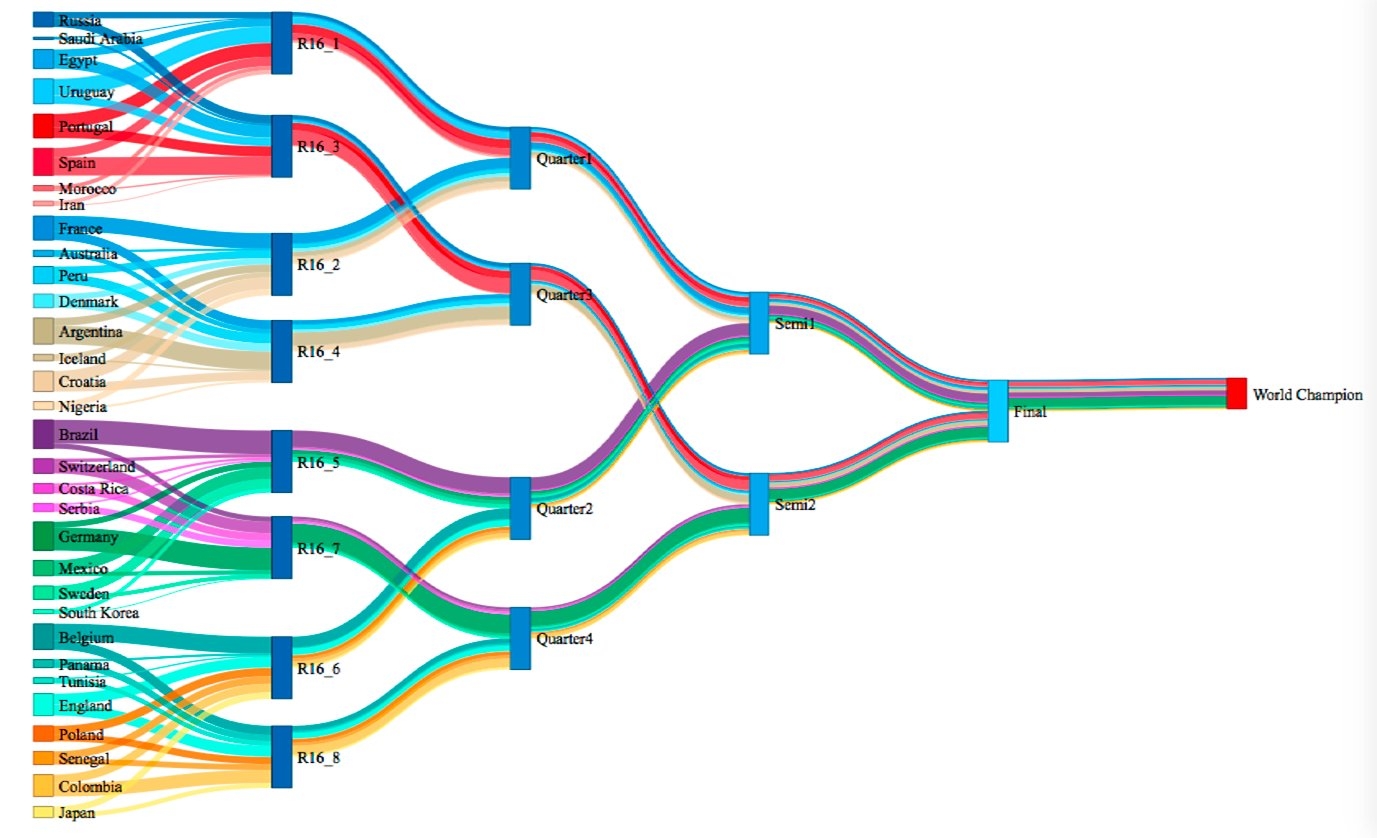
All others can just skip and go directly to page 22 of the paper to find this Sankey diagram based on 100.000 simulation runs:


via Twitter user @ggojedap

Groups and teams are color-coded, and the wider the band in the Sankey diagram, the higher the probability. So, according to this model, which takes into account performance of the teams since 2010, a nation from the green group will become the world champion. Purple runs with a probability of 18% and red with 14% (for the detailed values that form the basis for this diagram please see table 12 on page 15 of the paper).

Well, we’ll see, and in five weeks we will know the outcome. Whether you trust this more scientific approach, or whether you would rather go with a straight-forward Paul the Octopus divination … I hope you enjoy watching the matches!