Biogas in Auvergne-Rhône-Alpes region

The French region Auvergne-Rhône-Alpes in the south-east of the Hexagone borders with Switzerland and Italy. Lyon and Grenoble are located in this region, known for skiing, lush pastures … and great cheese!

Auvergne-Rhône-Alpes Énergie Environnement (AUR-EE) is a regional agency that works to bring together players in the renewable energy field and to promote RE projects.

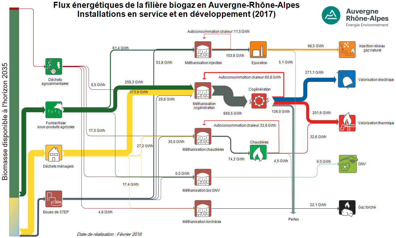
Given the agricultural character of Auvergne-Rhône-Alpes, biomass use for energy generation has been going strong in recent years. The agency has created energy flow Sankey diagrams for existing biogas installations, as well as a projection for the ones being under development.

Data is for 2017 and for the scenario where all projects currently under development would already completed. The yellow stream (‘déchets ménagers’) is household waste, providing 374 GWh of energy. Manure and other side-products from agriculture (green arrow) contributes another 260 GWh.
The stacked bar on the left hand side of the diagram indicates the potential availability of biomass by 2035, and one can see that only a small fraction of it is currently being taken advantage of.
Biogas is produced in anaerobic digesters (‘méthanisation’) and the region yields some 271 GWh electricity and 200 GWh heat per year from cogeneration plants. Already almost 100 GWh of biogas could be injected to the natural gas network, allowing for storage of the energy.

Note that smaller or even negligible flows are still shown with a minimum width in order to make them visible (these thinner arrows are not to scale with the others).
Sankey GDPR choice

Among the literally hundreds of e-mails that flooded my inbox the last couple of days, urging me to consent to receiving e-mails in the future, one particularly caught my attention, since it used a Sankey diagram pic to convey the message:

My choice made clear in a simple visualization … Did I click the button? Yes I did!

Chile Energy Balance 2015

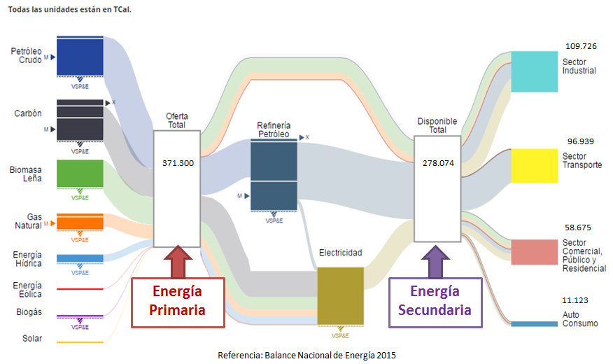
This Sankey diagram depicting the energy balance of Chile for 2015 can be found on the website Gestiona Energía MiPyMEs (MiPyMEs is the Spanish term for ‘small and medium-sized enterprises’, SMEs).

Flows are in TCal (teracalories), a unit for energy we don’t get to see very often (1 TCal = 4,205 Joules). What surprised me most in this figure was that ‘Biomasa Leña’ (biomass firewood) is the third most used primary energy source. The accompanying pie chart on the same page confirms that crude oil (25%) and coal (20%) are the most important sources, followed by biomass and oil derivates (each 19%). I guess this should read ‘biomass AND firewood’ rather than ‘biomass firewood’.

Some design shortcomings, in particular where the downward sloping stacked Sankey arrow turns to run horizontally to join the node ‘Electricidad’, and at the input side of the primary energy box, where the flows for ‘Petróleo Crudo’, ‘Carbón’ and ‘Biomasa Leña’ overlap and somehow don’t seem to hold their width all the way. My guess is that this is owed to the wish to keep the figure as compact as possible.

Addendum 11/2018: The energy balance Sankey diagram for Chile can be produced at the Energía Abierta website of The Chilean National Energy Commission.

Tracing Wood Fibre in Canadian Forestry

As part of the Canadian SPRUCE-UP research project one activity is dedicated to Genomic, Ethical, Environmental, Economic, Legal or Social (GE³LS) aspects of this applied genomics project. As part of their work the scientists have developed the Canadian Forest Service – Fiber Cascade Model (CFS-FCM) simulation model.


(see high res image here)

This Sankey diagram shows one specific scenario for a downstream flow of wood fibre from Canadian forests to products. Flows are in metric tonnes (probably for one reference year), with the exception of the ‘Bioenergy’ flow, shown in terajoules (TJ).

Minerals Exports from Latin America

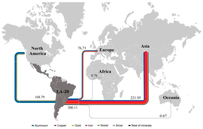
Another Sankey diagram from the article ‘Exergoecology Assessment of Mineral Exports from Latin America: Beyond a Tonnage Perspective’ by Jose-Luis Palacios I discussed in this recent post.

Non-fuel minerals exported in 2013 from Latin America to other continents. Flows are in Mtoe (for the reason why these flows are measured with a typical energy unit and to learn about the ERC approach read the article). Due to the scale, some minerals can not be seen as individual flows in the Sankey diagram and are thus grouped as ‘Rest of Minerals’ (black stream).

Handling Different Scales in one Diagram

Those of you who have already created Sankey diagrams might have come across the issue: As long as the flow data you are about to visualize is more or less in the same value range everything is fine, and there should be no problem in coming up with an nice Sankey diagram. However, sometimes we have very small flow quantities, while at the same time there are some large flows dominating the picture.

Sticking to the “golden rule” of Sankey diagrams (i.e. the width of the Sankey arrow corresponds to the flow quantity represented) and ensuring the proportionality of flows in relation to each other becomes very difficult. If you opt to show the larger flows at “normal” width, the smaller flows become difficult to perceive and are shown as hairlines (sometimes even invisible on a screen or in print). If, on the other hand, you decide to push up the scaling factor so that these smaller flow quantities can be seen in the diagram, then the large flows are really fat and spoil your diagram.

This seems to be an irresolvable issue… Nevertheless, there are some approaches to tackle this. Most of them resort to taking out the tiny flows or the very large flows of being to scale used in the Sankey diagram. You may opt to use a minimum width (e.g. 1 or 2 pixels) for arrows that carry only a small flow quantity, or you may decide to set an upper flow threshold, corresponding to a maximum width for the Sankey arrow, independent of the actual flow quantity (beyond the threshold value). In both cases I would strongly recommend to denote this decision in the diagram (e.g. in a footnote), since otherwise the person looking at the Sankey diagram will get a wrong idea of the quantities/proportions.

The Sankey diagram from the PROSUM report I recently featured in this post has another, quite unique solution. Here is a zoomed cropped section:

The metals in the end-of-life vehicle (ELV) stream of 8 million tons (in 2016) are mainly aluminium, copper and iron. This stream is on the same scale as the overall Sankey diagram (see full diagram here). However, the other metals in the stream (such as gold, silver or platinum) are contained in comparatively much smaller amounts. The authors of the Sankey diagram hence opted to emphasize them by switching to another scale (1:5.000). As a result the arrow representing the flow of approximately 660 tons of critical raw materials (CRMs) is almost a wide as the arrow that shows 6780 ktons!

The fact that the precious metal stream is highlighted and not to scale with the rest of the flows in the diagram is clearly signalled with a note, a dotted line that separates this diagram area, and even an exclamation mark symbol.

Since CRMs were the focus of the PROSUM study I think such a “trick” is justified. What are your experiences with flows on different scales? How would you handle this “dimension challenge” in a Sankey diagram? Let me know your ideas!

Material Flows in the EU economy

Up on the EUR-Lex, the European Union’s database on laws, regulations, publications and reports is a staff working paper ‘Measuring progress towards circular economy in the European Union – Key indicators for a monitoring framework’ meant as accompanying background text for a ‘Communication from the Commission to the European Parliament, the Council, the European Economic and Social Committee and the Committee of the Regions on a monitoring framework for the circular economy’.

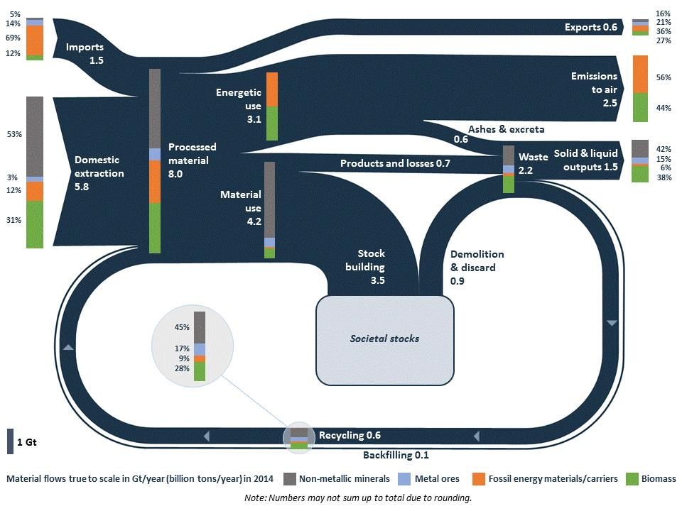
And it shows this beautiful Sankey diagram on material flows in the EU economy (2014).

Beautifully crafted, this diagram shows that “8 billion tonnes of raw materials were processed during 2014 in the EU: of this 1.5 billion (i.e. around 20%) are imported, which indicates the EU dependency on imports of materials. Out of the 8 billion tonnes of processed materials, 3.1 billion tonnes are directed to energetic use, 4.2 to material use and 0.6 are not used in the EU but exported.”

Flows are in Gt/yr (billion tons per year. The composition of the flows is presented at certain points in the diagram as bar charts on top of the dark blue bands: metal ores, non-metallic minerals, fossil energy materials/carriers and biomass. For each of those four groups individual Sankey diagrams can also be found in the working paper.

The EU never stops to surprise me! In this case in a positive way, as Sankey diagrams seem to have arrived at the top echelons of European policy making (or at least with their staff).

TriVersa biorefinery process

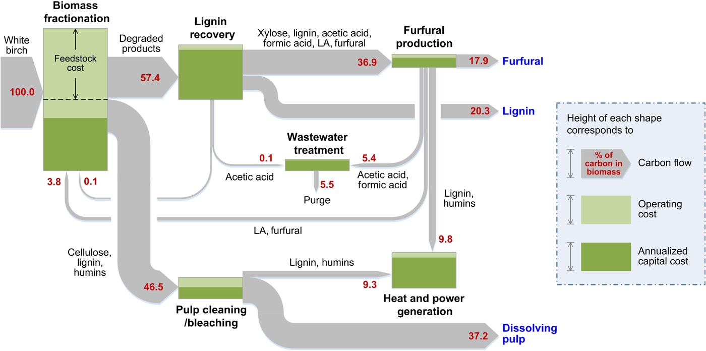
Javier Dufuor on the madrid+d Energía y Sostenibilidad blog reports about a novel lignocellulose biorefinery process developed by Prof. James A. Dumesic at the University of Wisconsin-Madison. This so-called TriVersa process can yield up to 80% of biomass from birch wood as marketable products.

The Sankey diagram for the TriVersa process shows carbon in biomass flows. Values are in percent, starting with the 100% C molecules in birch wood being used as feedstock.

An interesting detail about this Sankey diagram is that it additionally uses the process “nodes” or “boxes” to indicate operating cost and annualized capital cost. No numbers are given here, but the height of the process box indicates the overall cost (in a kind of stacked bar chart).