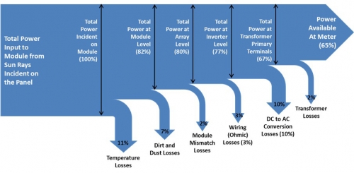
From Dr. Sanjay Vashishtha at Firstgreen Consulting blog comes this Sankey diagram on energy output of a photovoltaics (PV) system. The article on ‘Estimation of Solar PV System Output’ dates back to 2012.
Simple unicolor left-to-right diagram with losses branching out vertically to the bottom. At every step energy efficiency in percent is shown, leaving 65% of the primary solar radiation input as power at meter. Losses have a stronger emphasis due to arrow spikes.
