SaraVaca is a specialist on evaluation and data visualization. She runs the VisualBrains blog (check out the visuals CVs section!).
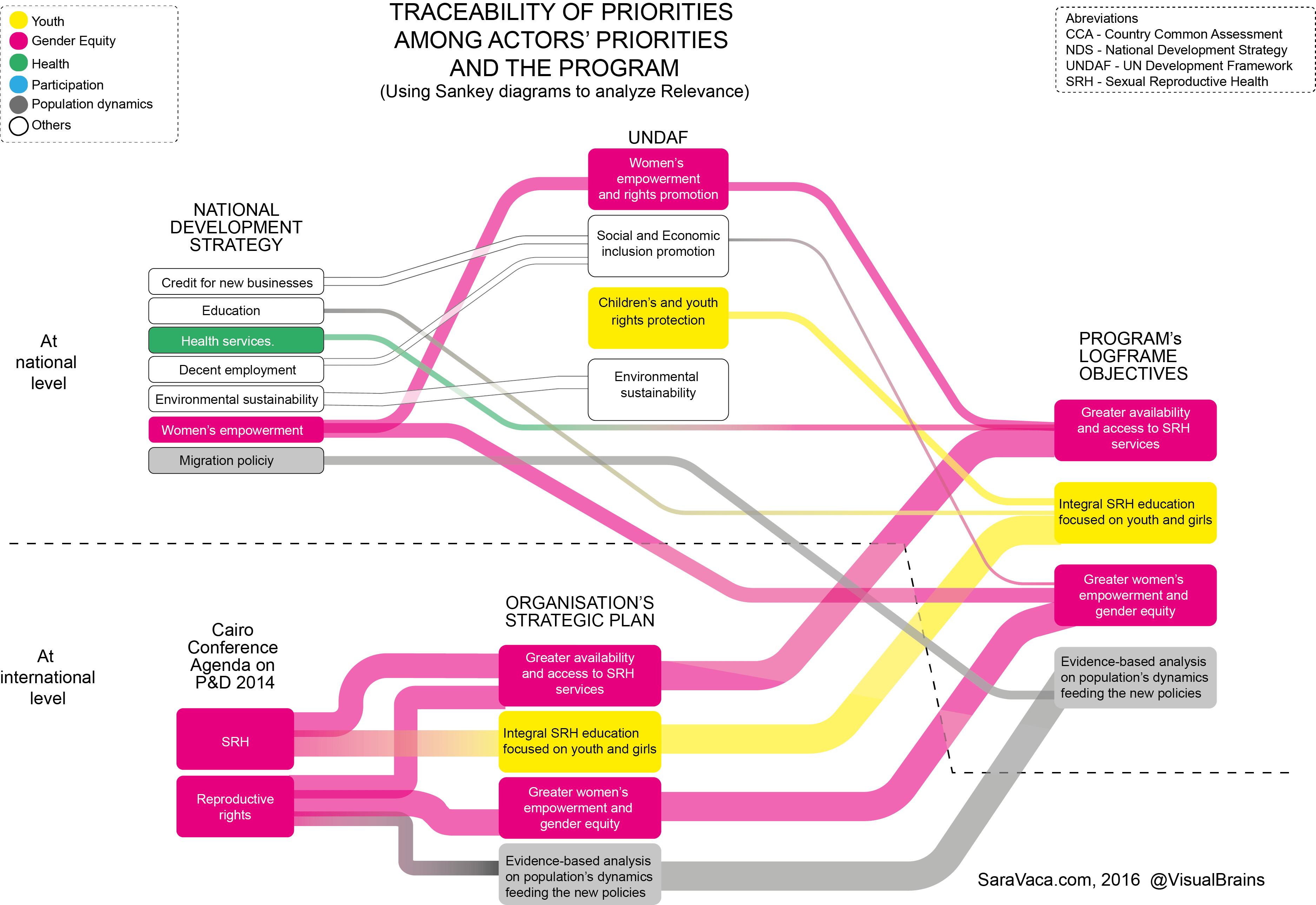
In a 2016 post she discussed using Sankey diagrams to express “Relevance” in evaluation. Having in mind a quantifiable flow perspective in Sankey diagrams, I was not sure how relevance could be translated. “Relevance in Evaluation is understood as the extent to which the aid activity is suited to the priorities and policies of the target group, recipient and donor”, she explains. So for a Sankey diagram that would mean expressing the “extent” or “suitability” in numbers. Which can of course be done either by assigning weight criteria or doing an ABC analysis.
Here is Sara’s sample:
We can see bands of four different widths. Additionally there is a color-coding for different categories for which the relevance is measured. Interesting approach. In 2017 she followed up with a post on ‘More inclusive (Sankey) diagrams to analyze Relevance’.
