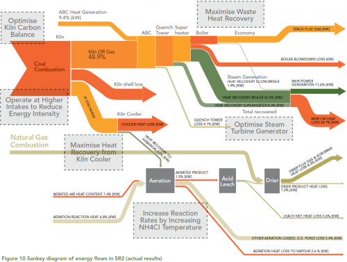
From a collection of case studies on Energy Efficiency found on the website of the Australian Department of Resources, Energy and Tourism (RET) comes the following Sankey diagram.
This is from a synthetic rutile plant of Iluka Resources Ltd. in Western Australia.
Iluka used the output from the energy and mass flows model to generate a Sankey diagram to represent the results in a visually effective and concise manner. The Sankey diagram illustrates where energy is supplied to the process, how it is transformed and where it leaves the process. … The width of the arrows is in proportion to the amount of energy associated with each part of the process. The Sankey diagram is an effective and intuitive way to communicate the energy flows at the plant. The diagram was used extensively during Iluka’s opportunity workshops. The diagram assisted the staff at the workshop to focus their attention on where the largest energy flows exist and identify where the main areas for improvement lie.
Flows are in percent of the energy input. Possible improvement measures are given in the grey boxes.
