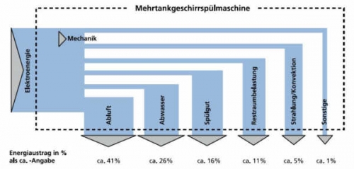
As some of you might know, I also like to post a diagram from time to time that has, … mmmh, say …. has the potential of being improved. This one, found on the website of a German consulting firm, is such an example.
.
I am glad they don’t call this a Sankey diagram anywhere. Everything that could go wrong did go wrong here. The horizontal arrow segments all have the same width, probably due to the fact that the diagram was prepared by combining rectangles. The added outflows that leave vertically at the bottom are much wider than the horizontal first segment. And the outflows are not to scale when being compared among each other (check the 5% arrow commpared to the neighnouring 11% arrow that should have roughly the douuble width. OMG!
