Tag: Austria

Emissions Sankey of an Austrian Brewery

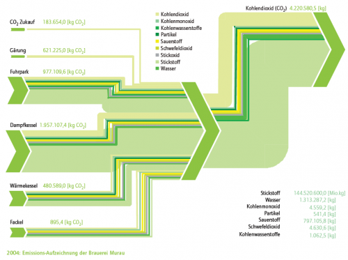
A company brochure commemorating ’10 Years of Environmental Management’ at Murau Breweryin Austria features this sparkling green Sankey diagram:

The diagram visualizes gaseous emissions (carbon monoxide, carbon dioxide, oxygen, nitrogen, …) from different equipments (e.g. steam boiler, fermentation tank, flare, …) in 2004. Carbon dioxide emissions are given in absolute values as flow label. All flows in kilograms (Note: nitrogen quantity (‘Stickstoff’) probably erronously labeled ‘Mio kg’ in the legend).

Good job … Prost!

Sankey Use in Energy Management

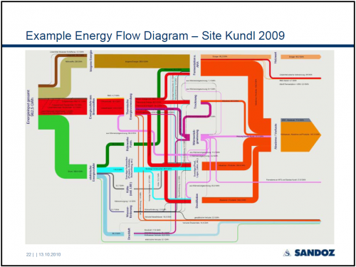
In a presentation given by Jurgen Zettl at the EM2010 conference in Vienna, the author reports about the integrated energy management and reporting at Sandoz’ Kundl site.

Page 22 of the PowerPoint has the following Sankey diagram:

The pic isn’t very clear, and it is difficult to see any detail. The overall energy consumption of the Kundl site comes in from the left (962,5 GWh in 2009). It is broken down to electric energy, energy from fossil fuels and energy from biomass (Note: I was wondering about the latter, but this is explained on page 6 that this is “feed for fermentation, solvents, … “). The streams are further broken down by use area. At the right side the flows join again to visualize useful energy and energy losses.

Good to see that large industries are using Sankey diagrams as an important element of their integrated energy management…

More Austrian Energy Sankey

Kris commented on my last post, that there is an updated version of the Sankey diagram on energy flows in Austria in 2006 to be found in the Statistical Yearbook Austria 2009 on page 360 (page 6 in this PDF).

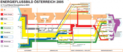
I also checked out some other Austrian sites and found one for Austrian Energy Flows 2005 (Energieflussbild Österreich 2005) on the Austrian Energy Agency website. It is a little more colorful, and has more information too.

Flows are in TJ. The diagram is divided into four sections, namely “Aufkommen” (emergence?), “Umwandlung” (transformation), “Sonst. Verwendung und Verluste” (other uses and losses), and “Endenergieeinsatz” (final energy use). The color code for the energy types is as follows: oil (pale orange), electric energy (red), coal (dark grey), gas (yellow), renewables (dark green), distance heating (light green), hydro (blue). On the right side useful energy is shown in purple, and losses are displayed as light grey arrows. (Thank you to my friend Leo for the translations…).

Yet another national energy flow Sankey diagram, and indeed a very beautiful one. Hope to see updates of it every year.
Energy Flow Austria 2002

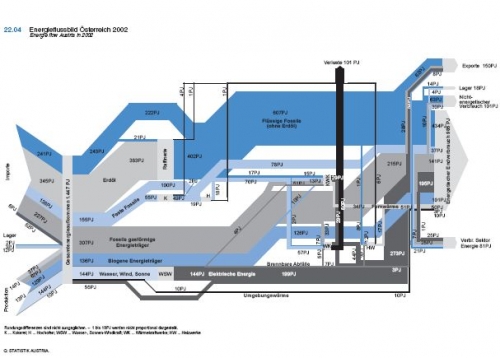
Found this Sankey diagram displaying the energy flows in Austria in 2002 on a web page with didactic material from that country.

Unfortunately this copy of the diagram isn’t very large, and I have trouble reading and translating everything. Flows are in petajoule (PJ), source given is Statistics Austria.

On the left are imports, withdrawl from stocks, and domestic production. Losses branch off in black to the top. The diagram differs fundamentally from the ones I have presented for other coutries (such as for New Zealand, the United Kingdom, or the U.S.) in two ways:
First, it doesn’t show the energy use by sectors, but instead a breakdown by energetic end use (985 PJ), non-energetic end use (101 PJ), exports (150 PJ), stock increase (18 PJ), as well as energy use within the energy sector itself (81 PJ).
Second, the colors of the flows are used to differentiate between liquid fossil (dark blue), gaseous fossil (medium grey) and solid fossils (light bluegrey) rather than specific energy carriers. Furthermore biogenic energy flows are shown in medium blue, renewables in very light blue. Converted electric energy is in dark grey.