California Energy Commission in 2005 published the final report of a project called CALEB (California Energy Balance). The CALEB database is compiled by the Lawrence Berkeley National Laboratory (Berkeley Lab) and contains “data for energy production, transformation, and consumption for the State of California for the period 1990 to present.”
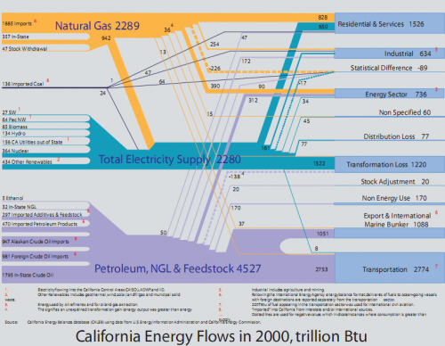
The report shows the California energy balance for the year 2000 as a Sankey diagram. (Source: Murtishaw S, Price L, de la Rue du Can S, Masanet E, Worrell E, and Sathaye J, 2005. Development of Energy Balances for the State of California. Sacramento, CA: California Energy Commission CEC-500-2005-068 (LBNL-54923))
A PDF with this diagram explains how to read it:
Reading from left to right, the figure shows all the inputs of primary (and imported secondary) energy into California’s economy in 2000. These are summed by major fuel types in the middle of the figure: petroleum and associated products, natural gas, and inputs to electricity generation. The right-hand side shows how all of the fuels are allocated to the various end uses.
The executive summary explains that the diagram shows some peculiarities for ‘Arnieland’ compared to other states. It also points out that further research is needed to collect more data and to be able to break down aggregated energy data.
This way of presenting the energy balance seems to develop as a kind of standard for representing energy flows for a state or country. Other examples can be seen here: Japan, Scotland, U.S., or Sweden.
The diagram has two special features which distinguish it from other Sankey diagrams:
Firstly, it shows negative flows as dotted Sankey arrows, indicating “instances where consumption is greater than supply” – something which on a physical level is of course impossible, but is explained with statistical differences and “unexplained transformation gain … in petroleum refineries” (NB: I would prefer to read “data inconsistency” here).
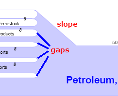
Secondly the breakdown of primary energy and imported secondary energy (input from the left) is fanned out leaving gaps between the arrow lines. The merged arrows are then “condensed” to be to scale again. This creates a 45° gradient at one side of an arrow section (or “slope” for those of you who are into winter sports). In these sections the arrow width can not be proportional to the quantities. A tribute to pay for better legibility of the diagram.


