Tag: energy

World Energy Flows 2012

Browsing through my bookmarks (plenty of Sankey diagrams there waiting to be shared with you) I wonder if I have previously presented this one.

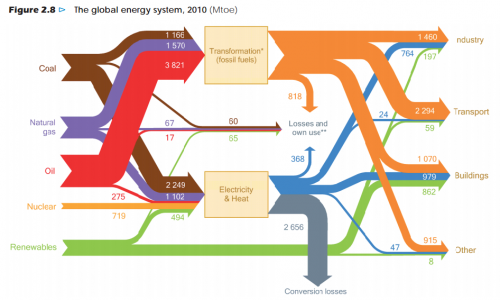
This is a Sankey diagram of the global energy flows 2010 from the ‘World Energy Outlook 2012’ by OECD/IEA. Units are in Mtoe.

via Resources Research but the original post could well be from Peak Oil (Kjell Aleklett: An analysis of World Energy Outlook 2012 as preparation for an interview with Science)

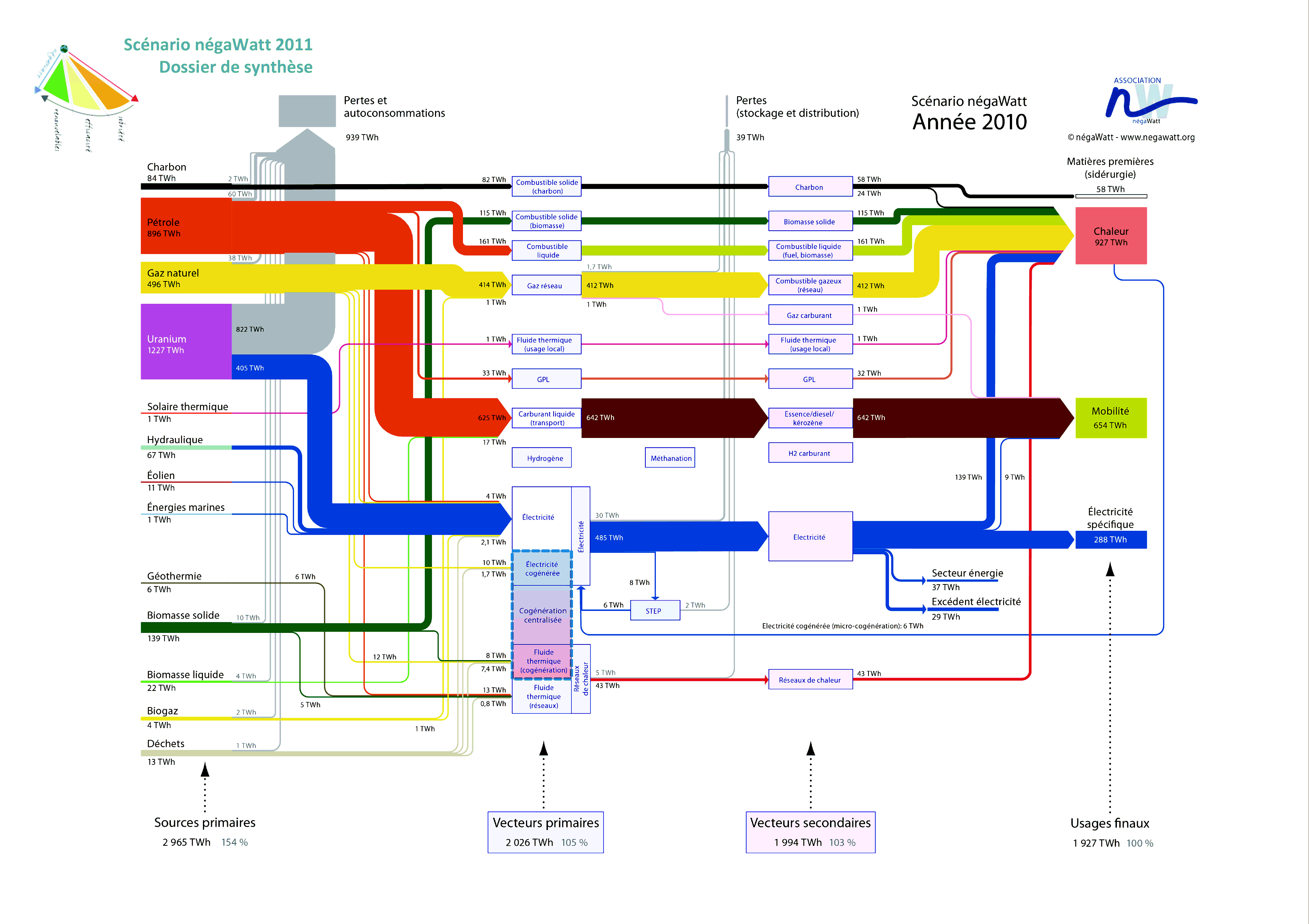
French Négawatt Energy Scenarios

French Négawatt association is advocating a changed attitude towards energy use, expressed in the three words “sobriété – efficacité – renouvelable” (translates as frugalness/modesty, effciency, renewables). On their website they show Sankey diagrams for a 2010 and a 2050 energy scenario. A simplified and a detailed version is available for both years. Below is the detailed 2010 version.


(see a high-res image with magnifying/zoom feature here)

Flows are in TWh. As common in this type of energy flow Sankey diagram they show in a left-to-right orientation the primary energy sources, energy conversion, and final use. Additionally there is a sum for each of the columns that tells us the overall energy efficiency: In 2010, to provide 1908 TWh energy to the users required 3009 TWh of primary energy (1,58:1).

These Sankey diagrams in my opinion are very-well structured, information-rich and don’t lack a certain esthétique

A day in the life of… Victor Hugo

I admire architects for their visionary ideas, for being able to transcend established limits, for pushing things beyond the common … at least when still in early phases of a project.

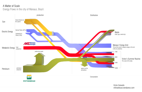
Victor Hugo Azevedo’s blog is called ‘La Ville Radieuse’ (The Radiant City) after a concept by Le Corbusier. It has all kinds of architectural stuff. By mere coincidence I discovered the following Sankey diagram he did in 2011 as class assignment on energy flows…

“This time we were asked to trace the energy flow that directly affect us. I traced the beginning of a common day during my summer in the city of Manaus Brazil. The following diagram shows how the larger infrastructure shape my routine.”

This looks at first sight like one of the classic ‘national energy flow’ Sankey diagrams with fuels (production) on the left, distribution and consumption on the right. But this is only partly true. Look at the right part where the energy flows stack and have a vertical time line.

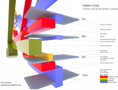
“The next diagram is nothing more than a closer look into one of the ends of the diagram, which is my own routine on a four hour span (from 7AM to 10AM on a regular weekday in June)”

So forget about scale and units here … this is a concept diagram! The Sankey diagram links an individual’s consumption patterns with the bigger picture, thus stressing everybody’s personal share and responsibility in energy consumption (and the possibility to take action). Kudos for this idea!

Apart from that it is of course a fancy 3D rendering, and I love the rotation and close-up of the morning routine. Make sure you post a comment directly at Victor’s post, if you like it as much as I do!

Note: Somewhat related, check out Molly Eagan’s ‘Where is Petroleum in our Daily Lives’ here.
Colorful Energy Sankey Diagram

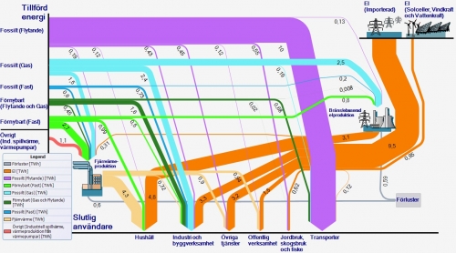
A colorful Sankey diagram for energy flows from Sweden. Found this one on the web page of Länsstyrelsen Skåne (please don’t ask me to read this out loud…) in an article titled ‘Skånska hushåll i fronten för mindre fossilberoende’

Unit of flows is TWh. The orange arrows are imports, the other arrows from the left apparently domestic production, with the majority of energy being from fossil fuels (“Fossilt”). Consuming sectors are at the bottom – in contrast to the typical layout of this kind of energy balance diagrams.

Anyone from Sweden who wishes to comment and explain a little bit?

New Energy City Issaquah

Have you ever heard of the city of Issaquah, WA? To be honest, I hadn’t heard of it until I read this post on the New Energy Cities blog.

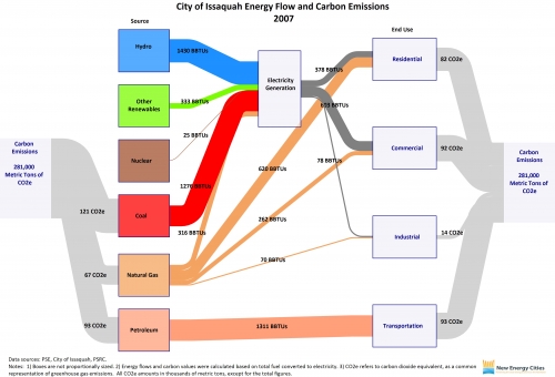
Issaquah is one of ‘New Energy Cities’ in the Northwest that has created an Energy Map and calculates the carbon emissions it is responsible for based on the fuels used. The role model for these Sankey diagrams are the ones published by the EIA.

Elizabeth, the author of the post, writes:

“Total carbon emissions are depicted in the gray flow lines, by both source and end use. The blue flow line represents hydropower energy used for electricity generation; the green represents non-hydropower renewable energy used for electricity generation; the brown represents nuclear energy used for electricity generation; and the red represents coal energy used for electricity generation. The orange flow lines represent natural gas used for electricity generation and direct heating. The pink flow line represents petroleum used for transportation. The dark gray flow lines represent electricity consumption by residential, commercial, and industrial user categories.”

Wow! I’ve seen those energy Sankey diagrams for the world, for nations and for federal states. But this one for Issaquah is definitely the one that covers the smallest geographical and administrative entity.

Energy Flows in France 2011, Rectangles

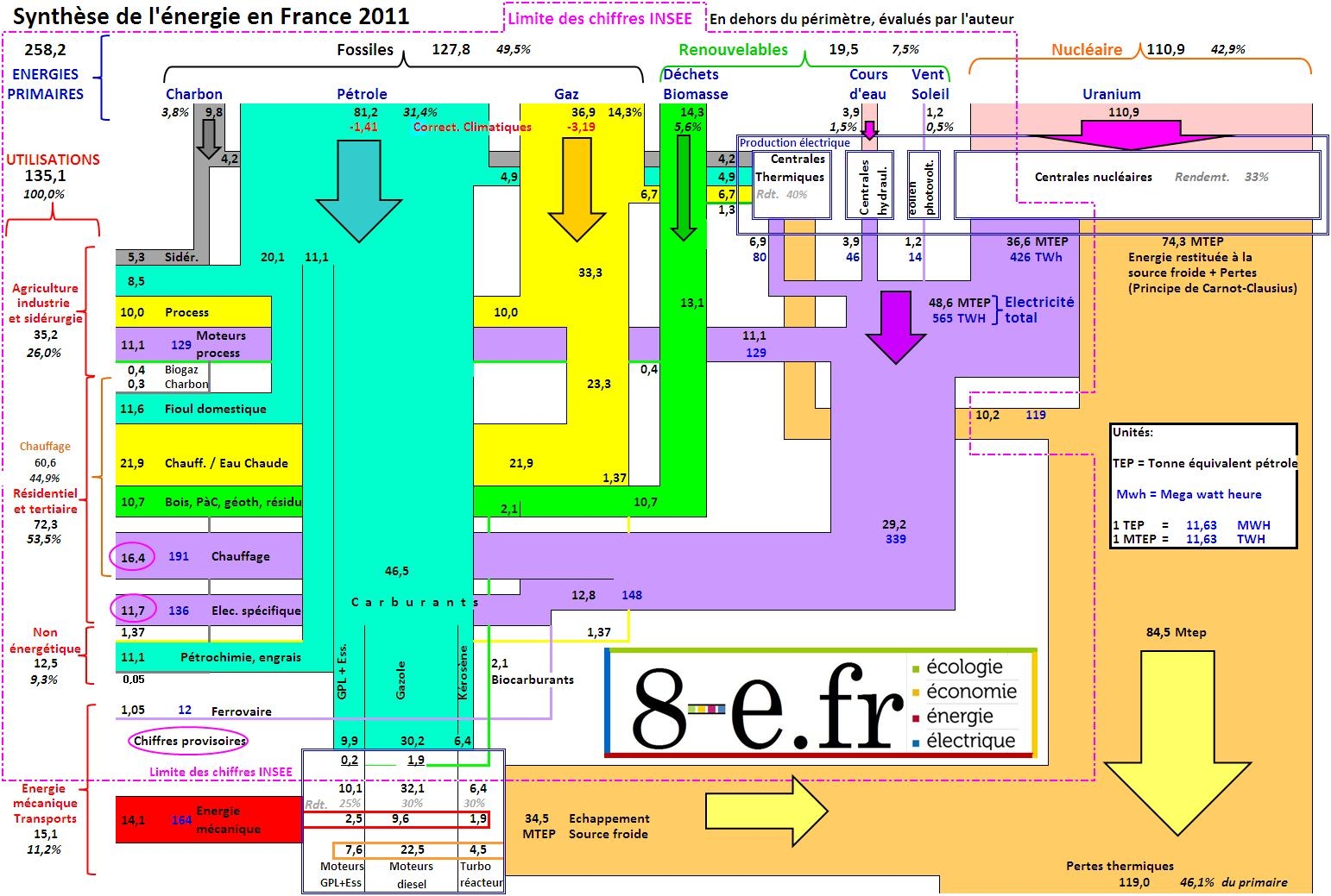
A Sankey diagram made up from rectangles is shown in this post on the blog ‘8-e.fr’ by MM.

The diagram is based on data for 2011 by the French national statistics bureau (INSEE) and the statistics observatory (SoES) of the Ministry for Environment and Sustainability. The author of the post comments that modifications were made in regard to the conversion of primary energy (“Nous corrigeons ce défaut de principe de l’INSEE pour mettre en relief les énergies primaires et secondaires réellement utilisées ou fournies.”) using average efficiency factors.

There are two sets of units: the black figures in MTEP (French for ‘million tons of oil equivalent’ MTOE) and the blue figures in MWh. Even though the flows are drawn with rectangles, one can grasp the general direction from top to bottom/top to left and losses to the bottom right by means of small arrows on the bands themselves. The width of flows seems to be pretty much to scale. The whole diagram a bit overloaded, with a high information density. Nevertheless, it caught my attention…