Tag: energy

Metropolitan Energy Flow Sankey Diagrams

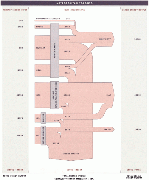
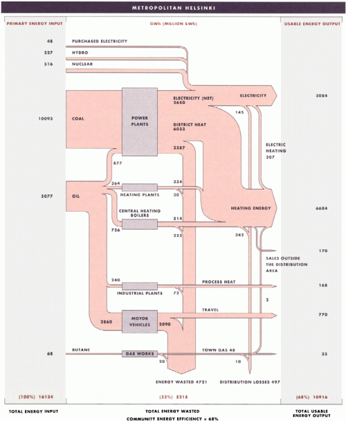
I have posted several Sankey diagrams depicting the energy flows of countries. At least California and West Virginia have published state energy flow Sankey diagrams. I was quite excited to discover the two metropolitan energy flow Sankey diagrams shown below in this publication. They are for Toronto and Helsinki and show energy flows in 1988 in these communities.

The two diagrams show energy consumption and use in Toronto (above) and Helsinki (below). Even though the absolute figures in GWh are given, one shouldn’t directly compare them. A per capita basis would be fairer (Toronto had a population of 2.5 mio in 2006, more than 5 mio. in the metro area, while Helsinki had 580.000 inhabitants in 2008 in the city, 1.3 mio in the greater Helsinki area — Toronto is today 4.5 times larger than Helsinki). Both are “cold-climate municipalities”.

The publication calculates a ‘community energy efficiency’ of 50% for Toronto and 68% for Helsinki. “A comparison of the two municipalities reveals that Helsinki significantly improved its efficiency by using the waste heat that is produced by local coal power plants to warm 90% of the buildings and homes in Helsinki. Further analysis has demonstrated that Helsinki’s energy system was able to achieve its overall level of 68% efficiency because the city’s compact land-use pattern made investments in energy-saving infrastructure, such as district heating and public transit, economically viable.”

Does anybody know other metropolitan energy flow studies? I am aware of research activities in the field of urban material flow accounts or urban metabolism (e.g. Lisbon) but have to check whether they show Sankey diagrams in their publications.
Oxy Combustion vs. Air Combustion

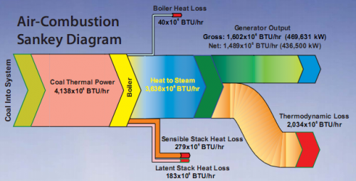
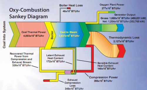
The National Energy Technology Energy Laboratory’s (NETL) website has a lot of interesting stuff, so I dug up these two Sankey diagrams showing energy flows of a typical (air) combustion and of oxy-combustion in power plants.

The Sankey diagrams were presented in May 2008 at the Seventh Annual Conference on CCS in Pittsburgh, PA on a poster titled ‘Strategies for Improving Efficiencies in Oxy-Combustion Retrofits’. See the PDF here.

The first diagram shows how heat losses occur at the boiler and at the stack. Only a part of the energy flow at the power generator can be used, while a large chunk is thermodynamic loss.

In the second diagram, heat from the boiler and compression is recovered and fed back.

A colorful one for the weekend…

Hydrogen Generation Path Sankey Diagram

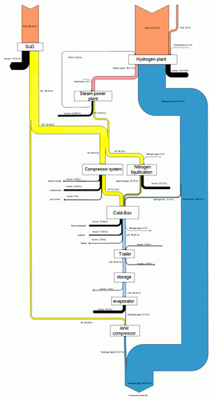
The below Sankey diagram is shown on a webpage of HAW University of Applied Sciences. It shows the generation path of hydrogen from natural gas, and the overall energy yield.

Unfortunately the diagram is too small to grasp the details. The Sankey arrows represent energy content. Losses are shown as black arrows. This seems to have been the result of a study project dealing with a fuel cell driven boat (ZEMSHIPS).

Updated Ireland Energy Sankey Diagrams

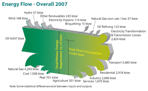
Colm from carbontracking.com in a comment to this blog post on Energy Flows in Ireland pointed me to an updated version of this Sankey diagram for 2007.

Sustainable Energy Ireland has published the report “Energy Ireland – Key Statistics 2008”.

This is the updated overall energy flow Sankey diagram from the report.

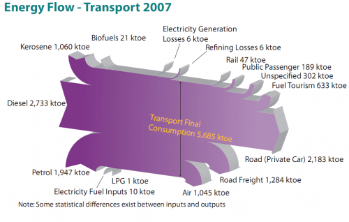
And here is another interesting one from the same report. It features the fuels used for transportation in Ireland with a breakdown by vehicle type.

All flows are in ktoe (1000 tonnes of oil equivalent, 1 ktoe = 41868 GJ). The flows seem to be mostly to scale, although there must be a problem with the flow ‘Refining Losses 6 ktoe’ which seems wider than the ‘Rail 47 ktoe’ flow, for example. Private cars consume most energy of all vehicle types (2184 out of 5685 ktoe or 38.4 %) , followed by trucks (road freight) and airplanes.

I won’t be commenting on the 3D design of the Sankey diagrams, which is definitely … eye-catching. Colm asked which software has been used to create these, but another reader had already pointed out in a comment that it is based on SankeyHelper, but has undergone retouching in Illustrator.

United States Annual Energy Review 2008

U.S. Energy Information Admmoinstration (EIA) now has the 2008 Annual Energy Review (AER) on their website. It contains Sankey diagrams for the nation’s overall energy flows (almost a “classic”) and four additional separate Sankey diagrams for petroleum, natural gas, coal and electricity.

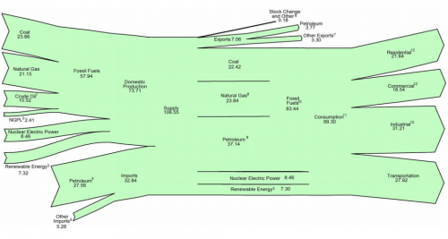
This is the U.S. Energy Flow diagram for 2008:

Check the original PDF file with the accompanying footnotes for further details. Overall energy consumption in 2008 was 99 Quadrillion BTUs (preliminary value, slightly down from the 101 Quadrillion BTUs in 2007.

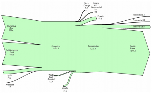
Among the other diagrams in the report, I chose to show the one for coal. 1121 mio. short tons have been consumed in the U.S. in 2008, mainly (1041 mio short tons) for electric power generation. The U.S. is a net coal exporter.

The diagram has a weird sinking downward feeling, caused by the fact that the main left-to-right orientation axis is not maintained. Looking at this it makes me want to shout out: “Hey coal Sankey, cheer up, life isn’t that black…!” 😉

The original full AER report (7.5 MB) can be found here.

New Zealand Energy Flows 2007

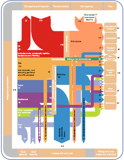
To compensate for the rather awkward Sankey diagram from NZ in my last post, here is a more colorful, and more recent one from Aotearoa. It shows the energy flows of New Zealand in 2007. The Ministry of Economy published a report “Energy in Brief”, which also contains this Sankey diagram:

The diagram shows the main flows in gross PJ (1 petajoule = 1015 J) and is “to approximate scale”. Flows below 2.5 PJ are neglected.

Energy produced domestically from various sources comes from the left, imports of coal and oil enter in the leftmost column from the bottom and the top. The energy flows pass through transformation and conveyance phases, to be finally shown in the different use sectors. Losses in transformation and conveyance are visualized with downward arrows, while losses in the end use are not considered.

There are some design flaws, especially when you look at the arrow curves. Also the fact that flows are only “to approximate scale” is in my opinion not acceptable [an arrow representing a flow of 3 PJ has the same width as one for 6 PJ, and both are only half the width of the 30 PJ flow]. But the overall impression is much better than in the version 10 years before.

Click here for a larger version of the diagram (PDF).

Confusankey Diagram

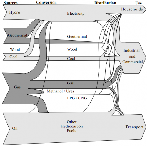
From the deepest and darkest parts of my bookmark list, here is a Sankey diagram for energy flows in New Zealand in 1997. I found it in a PDF document on this website of the Ministry of Economic Development (maori: Manatû Ôhanga).

The text under the diagram reads: “This energy flow diagram summarises New Zealand’s energy use. Primary energy sources are at the left. The flow of these through conversion processes to consumers is pictured, with final end-use classified by consumer type. The width of the bands is approximately to scale.”

Well, almost everything that can go wrong in information visualization goes wrong in this diagram… No quantities or units are given. Flows that are “approximately to scale” narrow down along the way. [The only explanation I have for this, is that this a novel way to account for transmission losses.] Streams meet, but don’t seem to merge. No idea what the spaghetti flows are good for…
In defense of the authors of this diagram I can say that in 1997 there probably weren’t any Sankey diagram software tools around.

I have a nicer one for NZ, which I will present in of my next blog posts. Better energy flow Sankey diagrams from other countries can be seen here, here or here.