Tag: exergy

Exergy Sankey diagram

Found the Sankey diagram below in an article on ‘Exergetic efficiency analysis of pyrometallurgical processes’. It is from a master thesis by Bart Klaasen (PDF file), that contains several Sankey diagrams.

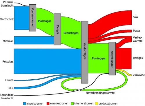
The main diagram is titled ‘Exergetic Sankey diagram for a zinc recycling process’. Input streams are in blue, emission streams are in red. Internal flows are colored green, while yellow represents the actual product.

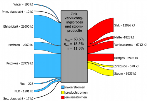
The flows don’t show arrow heads, but a general left-to-right direction can be assumed. No values in the above overall Sankey diagram, but for each process step individual input/output Sankey digrams can be found that feature exergy data in KJ. They look like this one:

In contrast to Sankey diagrams that represent energy flows, the input output flows into a process node don’t have to have the same magnitude. Exergy is synonymously called “available energy”.

“Energy is never destroyed during a process; it changes from one form to another (see First Law of Thermodynamics). In contrast, exergy accounts for the irreversibility of a process due to increase in entropy (see Second Law of Thermodynamics). Exergy is always destroyed when a process involves a temperature change. This destruction is proportional to the entropy increase of the system together with its surroundings.” (Wikipedia)

So it is understandable that the exergy represented by the flow magnitude at the output of the process is less than the one of the flows on the input side.

NB: Bart’s article reminded me of some bookmarks to exergy diagrams I have, will try to post these in the near future too.
All the world in one diagram

This post on the Pinhead’s Progress blog makes my day (if not my whole weekend!). ptuft draws the attention to a slide presented by Wes Hermann from Stanford at the SciFoo 2007 conference. You can see the original photo on flickr and the presentation slides “Earth’s Exergy Resources – Energy Quality, Flow, and Accumulation in the Natural World” by Wes Hermann here.

Slide from a presentation by Wes Herman (uploaded to flickr by zippy)

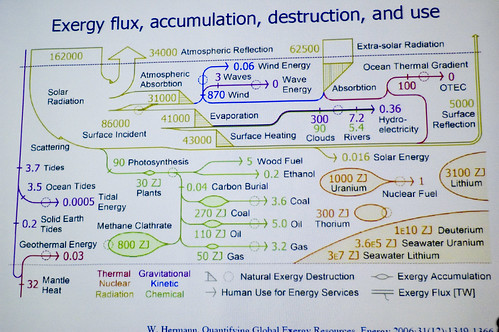
While I am not yet sure if this qualifies fully as a Sankey diagram, I find it really really fascinating! The diagram is titled “Exergy flux, accumulation, destruction, and use” and shows “where all the energy on the earth comes from, where it gets stored, and where it goes”. It distinguishes by colors the following exergy resources: Thermal, Nuclear, Radiation, Gravitational, Kinetic, Chemical.

The diagram type could be called a hybrid Sankey-Grassmann diagrams (see this post). The upper part is where radiation exergy is shown: 162000 TW of solar radiation and another 62500 TW of extra-solar radiation arriving on planet earth, being lost through atmospheric absorption, evaporation and surface heating. The green part (Chemical exergy) is what we focus on when we talk about energy consumption today. Hermann calls it “exergy destruction for energy services” (measured in ZJ). Accumulated exergy is shown with elliptic pouches on the arrow. Nuclear exergy features in the diagram as “bubbles”, most of it not accessible for human use as energy. One can find many other interesting details in this diagram.

I am tempted to challenge my e!Sankey tonight to see if I can draw this. Two different units (in this case TW and ZJ) can be displayed in one diagram. Biggest visualization issue will certainly be to handle the large differences in scale. Let’s see if I find the time, or if I prefer to enjoy radiation exergy of the summer sun at the poolside instead…

Grassmann Diagrams

I have been asked whether ‘Grassmann Diagrams’ are the same as ‘Sankey Diagrams’, or what distinguishes them from Sankey diagrams. Frankly speaking, I only came across Grassmann Diagrams one or two years ago, and I hadn’t heard (or had I overheard?) this term during my studies. So here is a short summary of what I found out about this special type of diagram.

Grassmann diagrams are usually referred to as ‘exergy diagrams’. Exergy, in thermodynamics, are being “defined as a measure of the actual potential of a system to do work” (see Wikipedia entry), or the maximum amount of work that can be extracted from a system. (For those who are looking for a well-written introductory article on exergy, I recommend the first chapters of this one by Wall and Gong, which also shows links to LCA, economics and desalination).

Coming back to Sankey diagrams, they were in the very first place used to show the energy balance, or energy efficiency of a machine or a system. (Today, however, the use of Sankey diagrams has been extended beyond displaying energy flows, and they are also used for any kind of material flows, CO2 emission, value flows, persons, cars, pig halves, and the like).

Thus the difference between Grassmann and Sankey diagrams is mainly that the first depict exergy, the latter energy. Taking this, it is understandable that the width of the flow gets less at each stage, while in Sankey diagrams the width of the arrow at a process (transformation, machine) should be maintained, as energy is only being transformed, but never being consumed (First Law of Thermodynamics).

Let’s forget about the semantics and their primary use for a second, and look primarily to the visualization aspect of both diagram types. Then, in a more general perception of Sankey diagrams as flow diagrams that display arrow widths proportionally to the flow quantities, Grassmann diagrams could be understood as a special subset of Sankey diagrams. Indeed, some authors refer to them Sankey-Grassmann diagrams, or as an adaptation of Sankey diagrams, or as the counterpart to Sankey diagrams.

This article “On the efficiency and sustainability of the process industry” from Green Chemistry is recommended for further reading. It also and contains some nice Grassmann (- or should I say Sankey) diagrams. Enjoy!