Tag: finance

Landscape of Climate Finance

The ‘Landscape of Climate Finance’ is a project by the Climate Policy Initiative. CPI “works to improve the most important energy and land use policies around the world, with a particular focus on finance. (This) helps nations grow while addressing increasingly scarce resources and climate risk.”

At http://www.climatefinancelandscape.org/ the have put up graphically appealing and beautifully crafted slideshow with facts on climate finance. How much is spent? Where does the money go to? Who are the receiving countries. Please browse the slideshow here.

Below are two Sankey diagrams from the 2013 report on climate finance.

The first is a rather coarse overview showing the international funding of climate projects by OECD countries and Non-OECD countries. On the right side the recipients breakdown: within their own borders, OECD countries, Non-OECD countries. Details on the countries are available in the report. Flows are in billion US$.

The other Sankey diagram is more complex. Here we can see the sources of climate finance and intermediate agents, the instruments, the recipients and the uses (adaptation and mitigation).

The incoming flows from the left are mostly “not estimated” (NE) and therefore are not to scale with the outgoing arrows. There are many annotations on assumptions and constraints, so please don’t make conclusions directly from the image. In the online version one can hover over the nodes to receive more information.

Congratulations to CPI for this work. They are tackling a complex issue graphically, and make good use of Sankey diagrams for visualization.
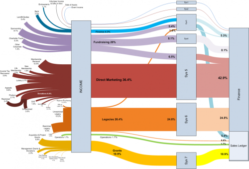
Follow the Money Sankey Diagram

The Visio Guy had another cool Sankey diagram on his blog last week. Credits go to Chris Webb of Woodland Trust, who created this using the line thickness option rather than pre-wired shapes.

The diagram has a left-to-right orientation and shows the different sources of money received by the trust. The types of funds (e.g. grants, legacies, direct marketing) are grouped together by colors. Flows have percentile values, rather than absolute ones. I am not sure what the boxes labeled “Sys” are, but the colors change. All flows merge into the box “Finance” which has a subgroup “Sales Ledger”.

The flow bands between most of the nodes have a nice soft curving. This is why some people do refer to Sankey diagrams as spaghetti diagrams.

If you are using Visio, you can download this diagram and look how it has been done. Nice work! I hope to see more of these Sankey diagrams done in Visio….

Where is the money, honey?

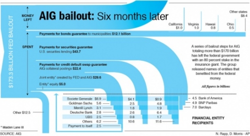
Nathan at FlowingData – Strength in Numbers presented a Sankey diagram by AP’s Nicolas Rapp and Damiko Morris (originally from this post on Nicolas’ blog). It shows where the $173 billion AIG received from government went to.

I especially like the inverse waterfall arrow endings and how they intersect with the grid of beneficiaries.

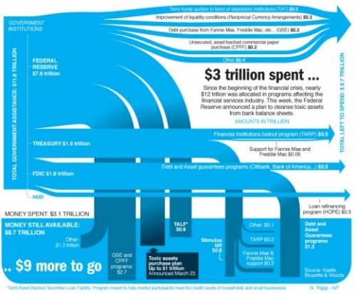
Nicolas, who works in Information Graphics for Associated Press, later presented another Sankey diagramm, displaying how the “nearly $12 trillion that was allocated in programs affecting the financial services industry” were used.

The author says “I spent the day researching and realizing this graphic” (@Nick: how much time was the research, how much the drawing?)

He adds “Fun stuff”, a comment which probably refers to the Sankey graphics part rather than to the content depicted… šŸ™

Sam Brenner’s Sankey Diagram Generator

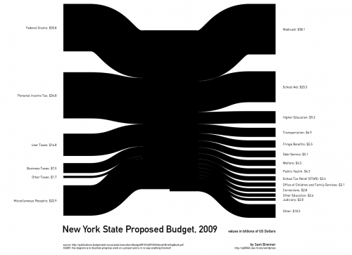
Sam Brenner, interactive design and development student at the Rochester Institute of Technology, has finished version 0.2 of his ‘Sankey Generator’ tool.

Inspired by state federal budgets Sam pursues to display financial figures in a clear and comprehensible way. Sources of state income are on the left, spendings on the right. As Sam says himself, this is still work in progress. “Iā€™m trying to make a dynamic Sankey Diagram generator (…) What I would like to end up with is a program that can take numeric data like a budget and turn it into a diagram…”.

See that small step at the bottom of the middle part? Hey, here you have the “deficit”…

Interesting new tool. Not sure if the Sankey Generator tool will reach a status that would allow Sam to release it publicly, but have added it to my Sankey software list anyway. Hope version 0.3 has some fancier colors, though šŸ˜‰

Sources and Beneficiaries of R&D Funding

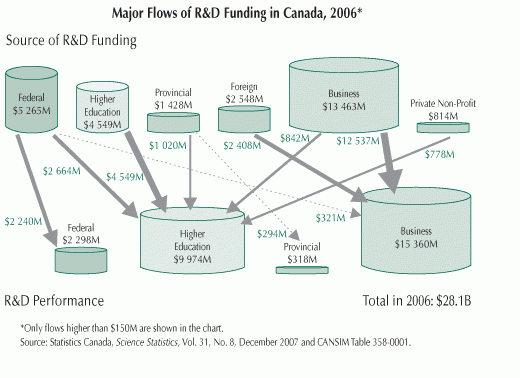
In early November I was pointed to an image on the Innovation Strategy Canada website [the website itself is not accessible any more] by a reader of this blog. Peter asked whether I know of any Sankey diagrams for financial flows, like they are shown in the one below.

The diagram visualizes the sources of R&D funding, and the institutions receiveing this funds. Data is from Statistics Canada for 2006 and shown in Mio (supposedly) Canadian Dollars.

While there are only four different arrow widths to show the financial flows, the interesting thing is that the sums of funds from each source and received by each beneficiary are shown as cylinders (database symbols, tanks, …).

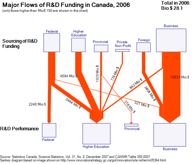
I quickly did several versions of the diagram, but was not too happy with the results. The flow quantities are OK, but as it turns out, it is difficult to see the volume of the cylinder, supposedly to scale with the sums. This information is redundant anyway, since the width of the joined arrows at their base or at their head is exactly the sum that is supposedly to be shown by the cylinder volume.

Here is one version of my Sankey diagram for R&D funding in Canada for 2006 based on the original image. I decided to make the boxes in different sizes (the problem remains the same: can one immediately grasp the area of each box).

Your comments are welcomed. Is there a better way to display the sums?