Tag: France

French Regional Energy Scenario 2050

After many national energy flow balances, some of which I have presented here on the blog, energy flow balances on a regional level are now coming out of France.

Benoît Thévard who writes on the ‘Avenir Sans Petrol’ blog (a French version of Peak Oil) has an interesting post on ‘Un scénario de transition énergétique citoyen pour la Région Centre’ (translated: An civil energy transition scenario for the Central Region). It summarizes a report published March 2015 by VEN Virage Energie Centre-Val de Loire.

The report features two Sankey diagrams. The first on page 33 is for the actual 2009 energy flows in Centre-Val de Loire (check here to find out about this French region)

Flows are in TWh. Production of nuclear energy comes with huge losses (efficiency approx. 35%). The main consumers in the region are residential and services, followed by transport. Energy consumption in industry plays a comparably smaller role in the region. The report explains that the region is vast and not densely populated and houses are older and larger on average compared to other regions (“le territoire est vaste et peu dense et les logements sont anciens et sont plus grands”). Another report mentioned on p. 21 calls the region énergívore (a beautiful word I read for the first time).

The other Sankey diagram on page 37 shows a nuclear-free and almost fossil fuel free scenario for 2050. Overall consumption is drastically reduced (2009 energy consumption approximately 75 TWh, 2050 energy consumption scenario 32,4 TWh). The scenario relies on a diversification of energy sources with an emphasis on wind energy and biogas. The region would hardly export any energy in 2050 anymore.

Just like for the India 2031 scenario I discussed in my last post, the two Sankey diagrams shouldn’t be compared directly, since the scale is different.

The report also has clear and straight-forward explanation on how to read the diagrams (page 32). This “diagramme de Sankey se lit de la gauche vers la droite, en partant des productions régionales d’énergie primaire et des importations, sur la gauche, pour aller jusqu’au consommateur final, sur la droite. L’épaisseur des traits est proportionnelle aux flux physiques exprimés en TWh.”

I think this a remarkable piece of information for the public. And not only because it contains Sankey diagrams. It is beautifully non-academic and inspiring to read. Those of you who understand French should have a look.
Ate your muesli this morning?

I have talked about a cereals Sankey diagram by INRIA Grenoble a couple of weeks ago in this post.

Here are two more Sankey diagrams from the underlying article ‘Etude des flux de céréales à l’echelle locale: Exemples en Rhône-Alpes, en Isère et dans le SCOT de Grenoble’ by J. Courtonne, J. Alapetite, P. Longaretti, D. Dupré.

These are the mass flows for cereals production in France (2007/2008) in Mt (1000 tons)

Here is the same cereals process chain “translated” into a water footprint. Unit is million cubic metres of water consumed.

A very clear structure in both diagrams with three columns: grains production, transformation and final products. Choice of color corresponds to the topic.

eco-data.fr: Cereals Sampe

A research group from INRIA Grenoble engineering school has set up a website for visualization of environmental data. Sankey diagrams are one available visualization option. The below is a sample provided on the website.

The Sankey diagram shows flows along the cereals production chain in France from the 2007/2008 harvesting campaign. Quantities are in 1000 tonnes.

Different grains are shown on the left: wheat (‘blé’), hard wheat (‘blé dur’), maize, barley (‘orge’) and others. Two large end nodes for unprocessed grain exports and use as animal feed (‘consommation animale’). There are further exports as intermediate and processed products. Only a comparatively small fraction is consumed by humans in France as bread, pasta, biscuits.

Could not detect use as energy crops, it is maybe hidden in the ‘industrial use’ flow. Anyway, an interesting application case for Sankey diagrams.

French Négawatt Energy Scenarios

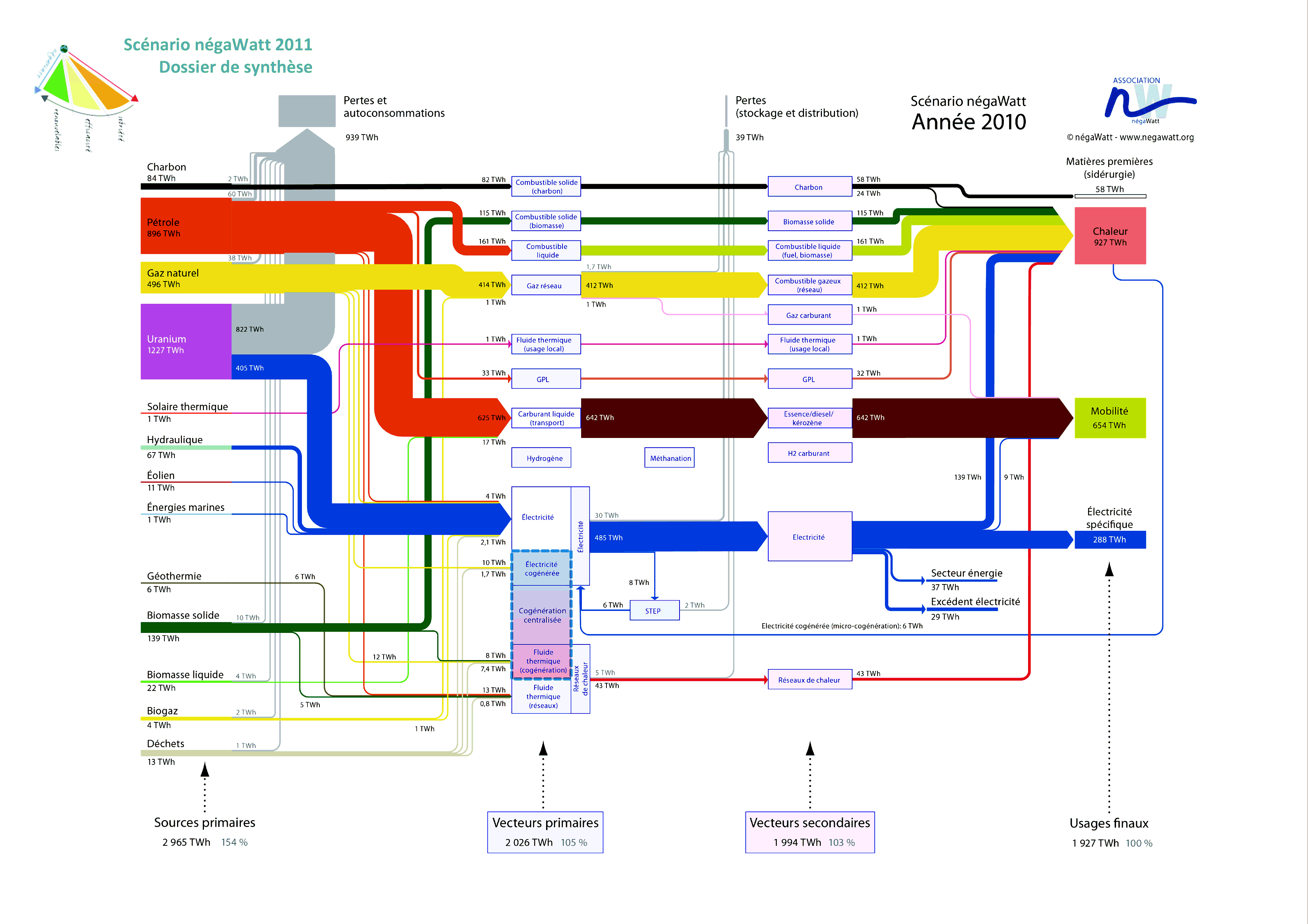
French Négawatt association is advocating a changed attitude towards energy use, expressed in the three words “sobriété – efficacité – renouvelable” (translates as frugalness/modesty, effciency, renewables). On their website they show Sankey diagrams for a 2010 and a 2050 energy scenario. A simplified and a detailed version is available for both years. Below is the detailed 2010 version.


(see a high-res image with magnifying/zoom feature here)

Flows are in TWh. As common in this type of energy flow Sankey diagram they show in a left-to-right orientation the primary energy sources, energy conversion, and final use. Additionally there is a sum for each of the columns that tells us the overall energy efficiency: In 2010, to provide 1908 TWh energy to the users required 3009 TWh of primary energy (1,58:1).

These Sankey diagrams in my opinion are very-well structured, information-rich and don’t lack a certain esthétique

Energy Flows in France 2011, Rectangles

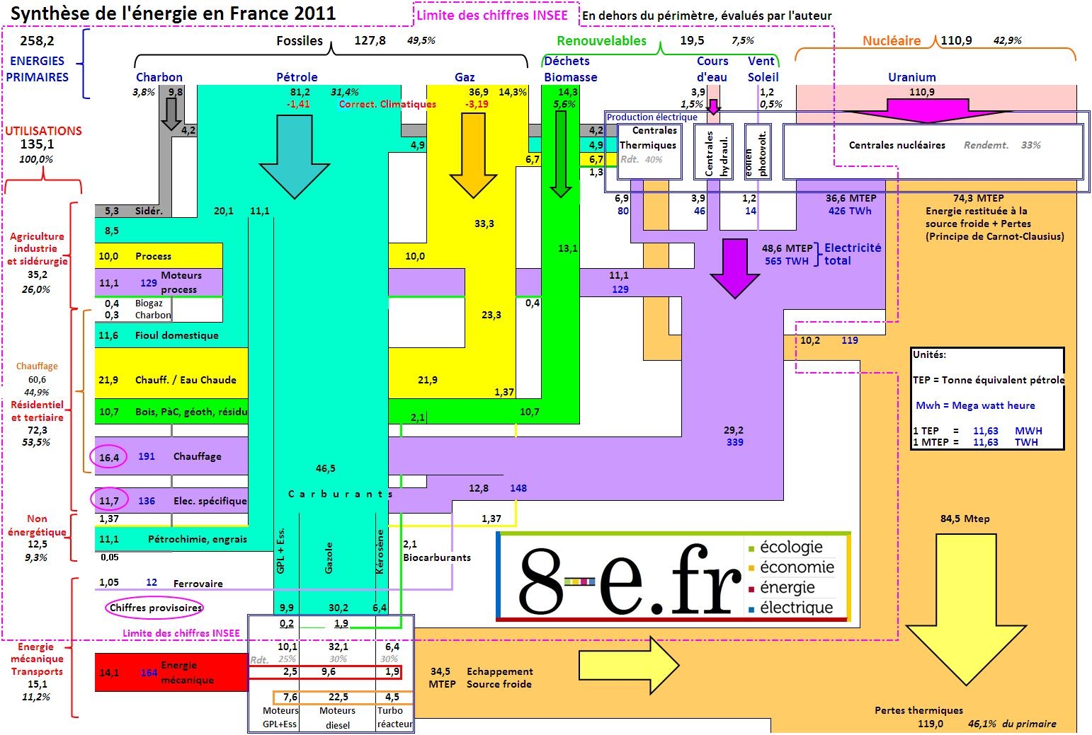
A Sankey diagram made up from rectangles is shown in this post on the blog ‘8-e.fr’ by MM.

The diagram is based on data for 2011 by the French national statistics bureau (INSEE) and the statistics observatory (SoES) of the Ministry for Environment and Sustainability. The author of the post comments that modifications were made in regard to the conversion of primary energy (“Nous corrigeons ce défaut de principe de l’INSEE pour mettre en relief les énergies primaires et secondaires réellement utilisées ou fournies.”) using average efficiency factors.

There are two sets of units: the black figures in MTEP (French for ‘million tons of oil equivalent’ MTOE) and the blue figures in MWh. Even though the flows are drawn with rectangles, one can grasp the general direction from top to bottom/top to left and losses to the bottom right by means of small arrows on the bands themselves. The width of flows seems to be pretty much to scale. The whole diagram a bit overloaded, with a high information density. Nevertheless, it caught my attention…

Misc Sankey Diagrams Uncommented 03

From the Mostly Uncommented Series, here is another one that has been sitting in my collection.

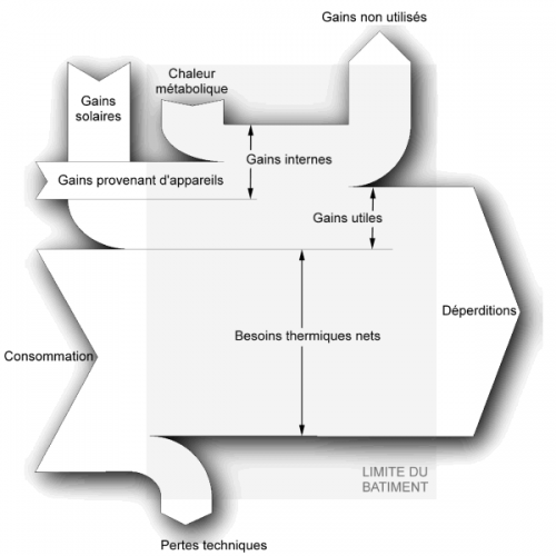
Black/White Sankey diagram for energy gains and losses in a building. Titles in French. Shadow effects. No values given. Unnecessary crossing of Sankey arrows. Not sure where I downloaded this from, will have to check my bookmarks. In the meantime, pls have a nice week-end…

Contres Territorial Metabolism Sankey

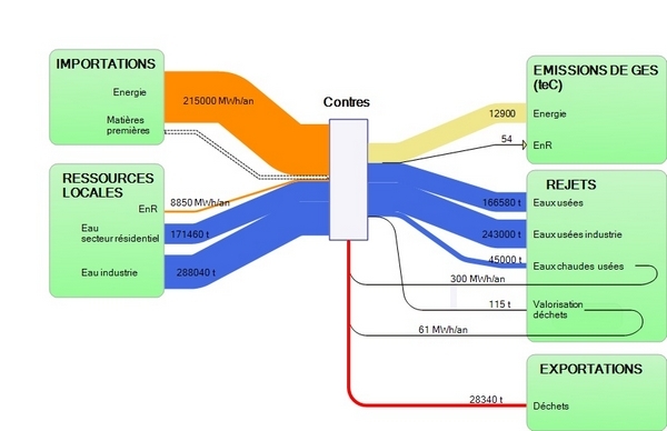
After my last post on the Paris Urban Metabolism I continued to research that topic a little more. I came across another example from France. The below Sankey diagram is from an article on territorial metabolism in the rural village of Contres in France. (“H4 développe une démarche de métabolisme territorial à Contres”).

In this study, the consultant company H4 Valorisation analysed the material and energy flows liked to the villages economic and agricultural activities. Different scenarios were evaluated, focusing primarily on (1) reducing imports and rejects (waste and pollutants), (2) increasing usage of local resources, and (3) looking at reuse of material internally (les rebouclages internes).

The Sankey diagram shows both mass and energy in one diagram, so the inputs and outputs of the central node (representing the village of Contres) are not balanced when summed up. Mass flows are in tons (per year?) in blue and red colors. Energy is in Mwh per year and shown in orange color. Greenhouse gas emissions from energy used is also represented in pale yellow expressed in tonnes of CO2-equivalents.