Tag: Iran

Iran GHG Emissions from Energy Sector

Following up to my two previous posts on Iran’s Energy Flows and Iran’s Energy production and consumption, here is the third Sankey diagram I could find in the report ‘Iran and World Energy Facts and Figures, 2012’ published by Ministry of Energy (MOE) of the Islamic Republic of Iran.

It is on greenhouse gas (GHG) emissions caused by the energy sector in the country


This is interesting, as the setup is reversed in comparison to the typical energy flow diagrams we all know. Here, the consuming sectors are on the left, alongside the energy generation sector itself. The middle section of the diagram sorts the arrows by energy carrier that causes the GHG emissions: natural gas contributes 53% (orange) and petroleum products 45.6% (blue). The third column shows a breakdown into the gases CO2, CH4 and N20.

No absolute values are given in the diagram, the magnitude of the flow amount to 100%. However the detailed values can be found in the accompanying tables in the report: carbon dioxide with 556,866,000 tons, methane 57,000 tons and nitrous oxide 11,600 tons (all values for 2012). Mind that these are absolute values, so in order to understand the impact on climate change one would have to multiply with the respective emission factors for methane and laughing gas and normalize them to kg CO2-equivalents.

Iran Electricity Production, Consumption

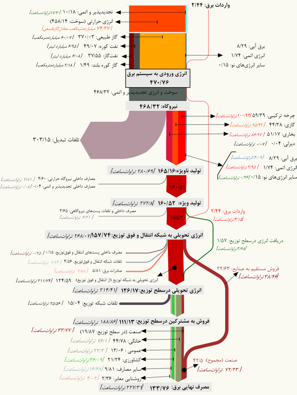
Following up on my previous post on Iran’s Energy Balance, here is another Sankey diagram from p. 54 the latest edition of ‘Iran and World Energy Facts and Figures, 2012’ by the Ministry of Energy (MOE) of the Islamic Republic of Iran.

Unfortunately the overall national energy balance of Iran is not depicted in the 2012 edition of the report any more.

This Sankey diagram focuses on electric energy only. Flows are in GWh per year (in 2012). Fuel sources for electricity generation are broken down in thr first arrow. Losses branch out at the ‘pow plant’ node as a blue arrow. The generated electricity is further broken down in the vertical arrow into consuming sectors. The overall efficiency of the power plants is at approximately 34%. Note how the small arrow head peeking out to the left is not to scale, and understates the 63.6% transformation losses.

Nuclear energy is less than 1% of the overal electricity production. In 2011, the first year of production 327 GWh were produced from nuclear fuel, upping to 1847 GWh in 2012. See p. 50 of the report.

Iran Energy Flow 2009, Sankey Diagram

Stimulated by the media frenzy and the focus Iran gets in recent days (nuclear deal, lifting of sanctions, Iranian oil production and effects on the world market, U.S. navy boats in Iranian waters) I thought it would be wise to look at the country from my narrow Sankey diagram perspective.

Any Sankey diagrams from Iran on the web? Of course!

The Ministry of Energy (MOE) of the Islamic Republic of Iran has been publishing the Energy Balance of the country: here is the Sankey diagram for 2009. This is from p. 67 of the bilingual report ‘Iran and World Energy Facts and Figures, 2009’ available on their web page.

Flows are in Mboe (Millions of barrels of oil equivalent). Out of the total 2587 Mboe primary total energy source, the largest chunk is oil (1585 Mboe), followed by gas (866 Mboe). More than half of the petroleum is exported (blue arrow). Total final consumption is 1144 MBoe. Note that nuclear energy is not shown in this energy balance. Apparently electricity production from nuclear power plants started in 2011 only.

Flows are not always perfectly to scale in the lower range: comparatively thin arrows have been left at a minimum width it seems. At the branch-offs of some wider arrows (oil, petroleum products) the gap has been color-filled, which makes the arrow look wider than it should be. A funny hump of the mauve arrow bridging the refinery node…

I confess I admire the Perso-Arabic script.

I have two more Sankey diagrams from another Iranian report, but these are for another post … soon.