Tag: map

Coal Trade Flows Map

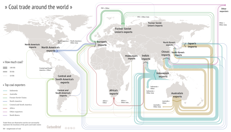
Drawing Sankey diagrams on a world map to show flows between different geographical location is always a challenge. One of the inherent problems is that large (=broad) arrows may run between two points on the map located very close to each other. Another problem is that one wishes to have the arrows more or less along the actual trade routes, which in many cases is close to impossible (take, for example, ships going through the Panama or the Suez canal).

I have shown quite a number of ‘Sankey diagram maps’ here on the blog, but most of them had shortcomings. Now here is an example that does extremely well in tackling the issue of Sankey diagram flows on a world map.


(CC licence – Carbon Brief)

This flow map of coal exports around the world shows the top exporters. It was crafted by Rosamund Pearce for the Carbon Brief article “Mapped: The global coal trade”. She decided to route the Sankey arrows nicely sorted, in parallel, and not along the actual shipping paths. See how much of the coal trade from Indonesia to China is led “virtually” south of Australia and New Zealand? Additionally the arrows are not led precisely to the actual port, but rather connect at a suitable place of each continent. With these simplifications the trade flow map is much clearer, understandable.

Another world coal flow diagram from 2012 can be found here.

South China Sea Oil/LNG Transport

South China Sea has recently garnered increased media attention due to China reclaiming land and building an airfield on Fiery Cross Reef. The territorial dispute regarding Spratly Islands has been simmering since the 1970ies when oil was discovered in the region. South China Sea is also “one of the busiest shipping lanes in the world” with “more than half of the world’s supertanker traffic, by tonnage, pass[ing] through the region’s waters every year” (Wikipedia).

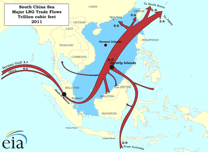
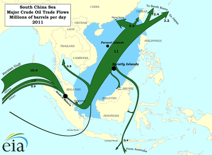
The Department of Energy has two interesting maps on their beta website showing LNG and crude oil transport for 2011.

Transport of liquefied natual gas (LNG) in trillions of cubic feet in the South China Sea:

Transport of petroleum in millions of barrels per day in the South China Sea in 2011:


(both maps from eia.gov website)

These are ‘Sankey-inspired maps’ rather than exact Sankey diagrams. Arrow widths are not maintained where the shipping routes pass through narrow straits. Nevertheless, transport volumes are generally on a correct scale.

Minard’s 1858 Map of World Migration

Martin Grandjean digitized and vectorized Charles Joseph Minard’s World Map of Migration from 1862. His recent post reminds us that no too long ago migrants were also moving from Europe to other places of the world.

via martingrandjean.ch – full vectorized image 2 MB here

The map, based on data for the year 1858, “shows migration flows that contrast with the maps of the twenty-first century. That year, 86.000 Englishmen left their country, as 45.300 Germans, 20.000 French and 11.600 Portuguese.”

Read this interesting post from the Cartographia blog for additional detail on the map.

From a technical point of view, the only criticism I have of Minard’s map is that the direction of the arrows is not indicated. It requires the reader to know about origins or destinations of migration.

You can see the original Minard migration map (“Carte figurative et approximative représentant pour l’année 1858 les émigrants du globe, les pays dóu ils partent et ceux oú ils arrivent”) in this 2009 post and at Wiki Commons or directly at the Library of Congress.

You might want to check out another related June 2015 article by Martin Grandjean, where he points out some shortcomings of migration maps.

World Oil Trade Map: GEA Report

The 2012 GEA Global Energy Assessment report (GEA Global Energy Assessment – Toward a Sustainable Future, Cambridge University Press, Cambridge UK and New York, NY, USA and the International Institute for Applied Systems Analysis, Laxenburg, Austria) features five maps showing energy trade in the world on pages 128/129.

These can almost be considered Sankey diagrams, so I am featuring them here on the blog.

This one is for embodied energy in trade goods.

And this one is a classic oil and oil product trade flows map:

Flows lead from a specific color-coded region to another. The quantities are clustered in arrows with three different widths as shown in the legend (1, 5, 10 Exajoule)

Coffee, tea, cocoa

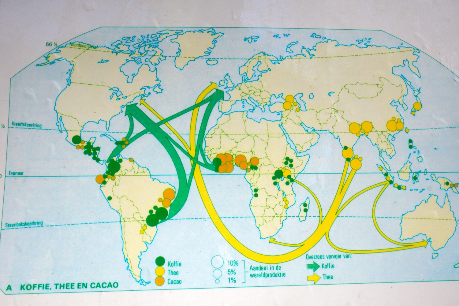
Blog reader Panalion sent me a photo taken in Amsterdam’s Botanical Garden. It is of a map showing coffee and tea flows from producing countries to mainly Europe and North America. Panalion writes “I thought you might like this Sankey map I found attached to a cable between two palm trees. There were chairs set up to accomodate school classes”.

This map is for didactic purposes and features no absolute figures and no year. In addition to the export flows of coffee and tea shown as arrows the map also has circles of three different sizes representing percentage of world production of coffee, tea and cocoa in the originating country.

Infographers might have better ways of showing this information. But in this case I think it is sufficient to get the message across to the target audience, the school kids.

World Coal Flows

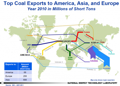
As promised in this post on U.S. 2010 Energy Flows here are some other Sankey diagrams from a July 2012 publication by Eric Shuster, NETL/DOE. These diagrams show world trade flows for coal.

The first one features the top coal exporters and their 2010 exports of coal to the regions America, Europe and Asia. This does not include domestic production, but just export. Indonesia and Australia are clearly the main exporters. Unit is in Mio short tons.

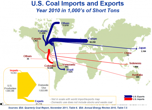
The other coal Sankey diagram is for U.S. coal imports and exports in 2010. Here the unit is in 1,000s of short tons, hence the two must not be directly compared. Also, the inset of the yellow arrow for domestic production in comparison to U.S. import/export is not to scale with the other flows shown on the flow map. In fact, all the blue Sankey arrows appear as a small export flow (81,716) in the yellow Sankey miniature, and all red flows on the world map are summarized as the tiny import flows (19,353).

The U.S. is primarily using its domestic coal and still able to export the surplus.

Stay tuned to see the world’s natural gas flows from the same publication