Tag: migration

Interprovincial Migration Flows Canada

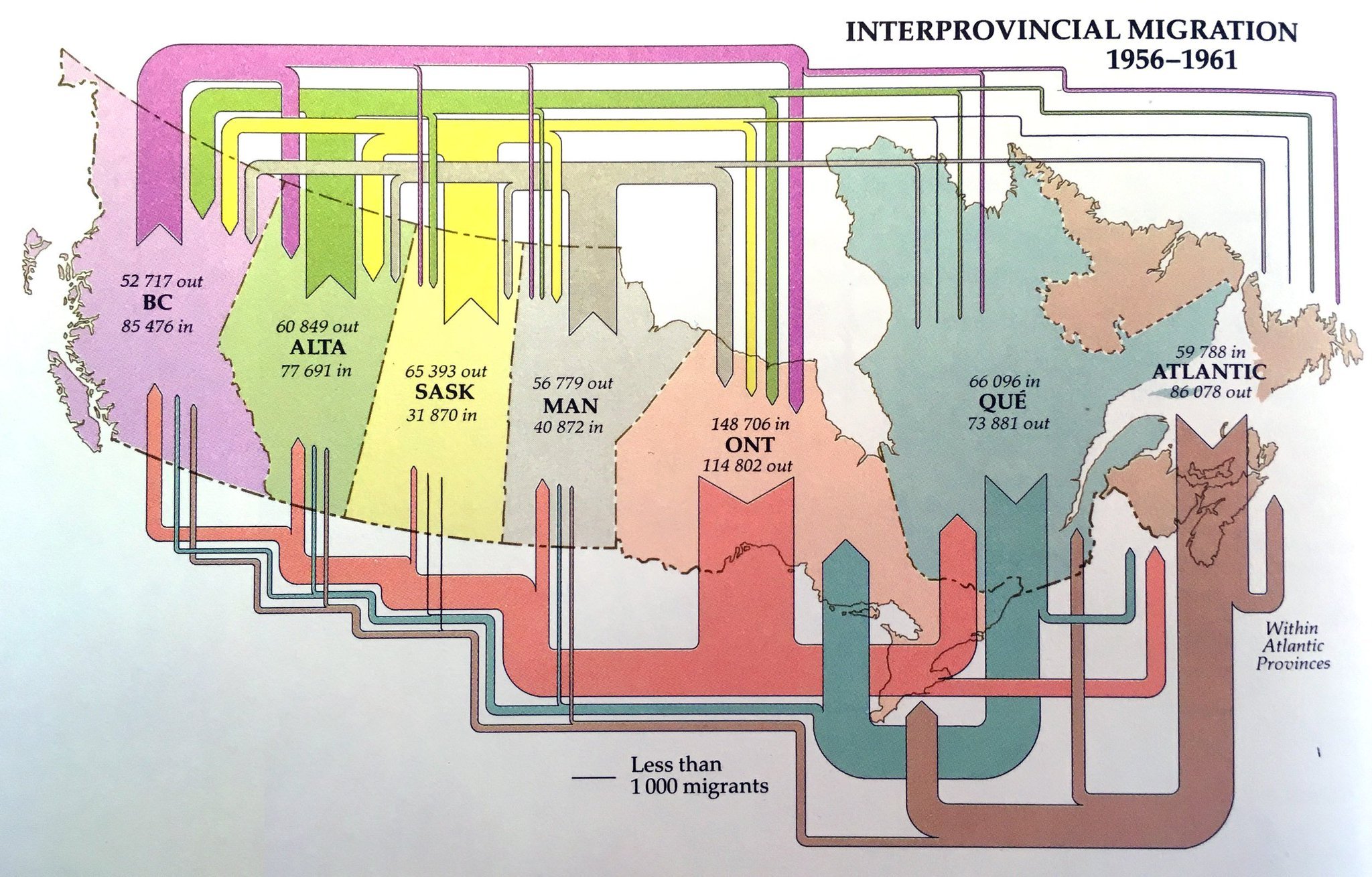
From the museum of Sankey diagrams comes this beautiful visualization of migration flows between Canadian provinces in the years 1956 to 1961. Sorry but I didn’t note the source… still wanted to share it with you.


Unfortunately, flows are not to scale: compare, for example, the exits from the Atlantic provinces in the period (86,078 people) which should have an arrow similar to the inflow of 85,476 to British Columbia. Or look at the exodus from Ontario provice, which seemingly is larger than the influx to the provice (but in fact is smaller).

Minard’s 1858 Map of World Migration

Martin Grandjean digitized and vectorized Charles Joseph Minard’s World Map of Migration from 1862. His recent post reminds us that no too long ago migrants were also moving from Europe to other places of the world.

via martingrandjean.ch – full vectorized image 2 MB here

The map, based on data for the year 1858, “shows migration flows that contrast with the maps of the twenty-first century. That year, 86.000 Englishmen left their country, as 45.300 Germans, 20.000 French and 11.600 Portuguese.”

Read this interesting post from the Cartographia blog for additional detail on the map.

From a technical point of view, the only criticism I have of Minard’s map is that the direction of the arrows is not indicated. It requires the reader to know about origins or destinations of migration.

You can see the original Minard migration map (“Carte figurative et approximative représentant pour l’année 1858 les émigrants du globe, les pays dóu ils partent et ceux oú ils arrivent”) in this 2009 post and at Wiki Commons or directly at the Library of Congress.

You might want to check out another related June 2015 article by Martin Grandjean, where he points out some shortcomings of migration maps.

Cartographia blog shows Minard maps

In 2008, the Cartographia blog started a post series called ‘Monday’s with Minard’. Some people consider Charles Joseph Minard the first to use arrow magnitude in his diagrams to represent quantities. (As a consequence, this means that Sankey diagrams would have to be renamed to Minard diagrams!).

What differentiates Minard maps from Sankey diagrams is that Minard’s fine works always have a geographical relation. The most famous one is his Map of Napoleon’s march to Moscow published in 1869. This “carte figurative des pertes successives en hommes de l’Armée Francaise dans la campagne de Russie 1812-13” shows number of men (as width of arrows), geographic movement of the troops on the map both for invasion as well as for retreat, as well as time and temperature on a separate scale.

Cartographia blog has some other nice examples, two of which are shown here:

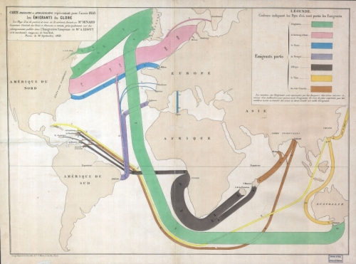
The first shows migration patterns across the globe. Arrows do not have an arrow head but the country of emigration is color coded. The outline of the countries is distorted to accomoadate large flows connected to them. For a detailed description please consider reading the original blog post. This map is similar to the one I showed in this post.

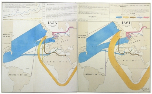
The other is a flow map for wool and cotton for the years 1858 and 1861. “Blue represents cotton and wool from the United States, the orange from British territories in South Asia … One millimeter represents 5,000 tons of cotton or wool.”. As one can see on the 1861 map, cotton imports from Asia have increased dramatically. See the description of the map in the blog post on Cartographia blog.

See all Monday’s with Minard posts here. There has been no activity on the blog since June 2008. I hope to see more of these posts some day.

Showing Migration Flows as Sankey

Most of the Sankey diagrams I come across on the net focus on energy issues, followed by the topics greenhouse gases and material flows of different kinds. Display of cost Sankey diagrams (value streams) is less common, so are people/passenger flows. An interesting approach is presented with Sankey diagrams that show migration flows between countries, or in and out of a region.

The best one I have seen was in this summary report on ‘Europe’s Demographic Future’ published by Berlin Institute for Population and Development. On page 11 you can see the migration flows within Europe (with omissions). The widest Sankey arrows are for migration movements from Bulgaria and Romania, mainly to Spain. There seems to be a lower cut off threshold at approx. 10.000, which leads to smaller flows not being scaled linearly any more. A lot of interesting details in this one… [would have loved to reproduce it, but permission wasn’t granted].

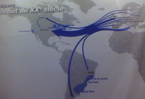
Here are other samples for Sankey diagrams visualizing migration flows (no quantities given, exact time range unknown).

Emigration flows to North and South America in the first half of the 20th century

Refugee flows in Middle East, Africa and Asia in 2006 (clustered quantities)

Both diagrams found on My Paris Your Paris blog

I think Sankey diagrams in this context merit more attention. Will be looking for more of these…