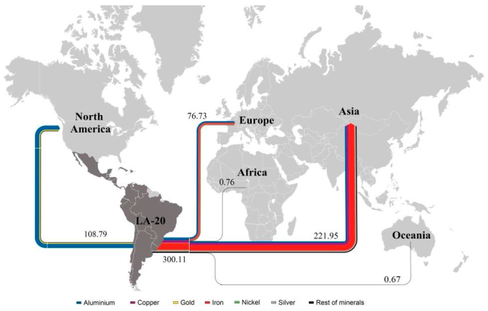
Another example for a Sankey diagram on a map from an article ‘Exergoecology Assessment of Mineral Exports from Latin America: Beyond a Tonnage Perspective’ by Jose-Luis Palacios (Escuela Politécnica Nacional, Quito, Ecuador) et al. published in Sustainability 2018, 10(3), 723 as open access article distributed under Creative Commons Attribution (CC BY) license.
I had not heard of the term ‘exergoecology’ before:
Exergoecology is the application of the exergy analysis in the evaluation of natural fluxes and resources on earth. The consumption of natural resources implies destruction of organized systems and dispersion, which is in fact generation of entropy or exergy destruction. This is why the exergy analysis can describe perfectly the degradation of natural capital.
The thermodynamic value of a natural resource could be defined as the minimum work (exergy) needed to produce it with a specific composition and concentration… (Source: Exergoecology Portal)
The authors of the article argue that the Material Flow Analysis (MFA) approach should be combined with a measure for the thermodynamic quality of minerals, “especially when dealing with non-fuel minerals”. They propose to use the indicator exergy replacement costs (ERC) from exergoecology because it “considers the scarcity degree of the commodities in the crust and the energy required to extract them. When a mineral is scarcer and its extraction and beneficiation processes are more difficult, its ERC value becomes higher”.
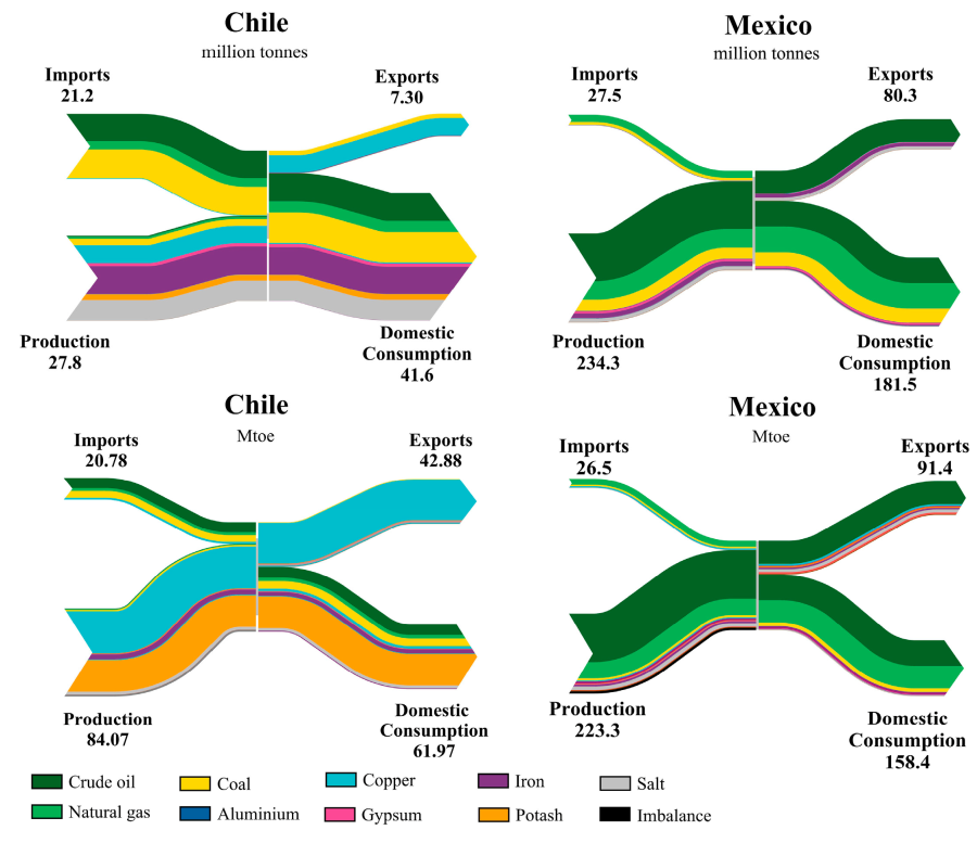
These two sets of Sankey diagrams visualize this approach:
The two Sankey diagrams on the left are for Chile, the two on the right for Mexico.
The figure at the top is a common mass-based figure, showing minerals production, imports, domestic consumption and exports for certain minerals. The unit of measure is million tonnes per year (in 2013).
The one at the bottom shows exergy replacement costs (ERC) measured in million tonnes of oil equivalent (Mtoe). For each mineral an energy indicator in GJ per tonne of element has been applied, representing the work (energy) to extract the mineral.
In the case of Chile we can see for example that iron, copper and salt are the minerals mined in largest quantities (mass-wise). However, iron and salt only make up a small fraction of ERC, while copper and potash dominate the picture. In other words: Potash has a high exergy replacement cost to produce given the work effort required to mine it and in face of its scarcity. Copper comes in second.
For Mexico the figure a the top and below look pretty similar in regard to the proportions of each of the colored flows. One could say that the minerals are similarly difficult or expensive to extract. Coal (yellow band) is comparatively wider in the mass flow diagram than in the exergy replacement costs diagram, so it is “cheaper” in regard to exergy cost to be mined.
Many more interesting details to discover and the article is well worth reading. In my oponion a fascinating blend of two approaches and a great use for Sankey diagrams.

