Tag: money

Infographics Experts on Sankey Diagrams (Part 2)

Following yesterday’s post with the translation of a blog post by Chiqui Esteban from infografistas.com here is the translation of the post “Caudales, erogación… ¿flujo?” of April 5, 2009. Again, I left some words in Spanish in square brackets.

— translation start —

Volume flow, distribution… flux?

A new chapter in the discussion [polémica] about the ‘scientific’ name of the “little arms” graphics [‘gráficos de bracitos’].

Xocas came up with the name ‘volume flow’ diagrams [‘gráficos de caudales’] and my vote was for ‘distribution diagram’. Other suggestions were thrown in: Xoán G. made reference to Minard and his ‘capacity diagram’ [‘gráfico de aforo’]. Herminio J. Fernández voted for cosmography diagrams [‘cosmografías’] as refered to by Stovall [Infographics by James Glenn Stovall, Allyn&Bacon, Massachussetts, 1997]. Many others voted for ‘flow diagrams’ [‘gráficos de flujo’], although Xocas discarded this suggestion because “the term flow diagram normally refers to a very specific type of visualization of process [flows]. It could be used as a generic term, but has interference with another model”.

Now, there is a new player in our conversation. It is Mario Tascón, who also believes that the correct denomination is ‘flow diagrams’. His justification:
“According to Harris (Information Graphics) and Bruce Robertson (How to make Charts and Diagrams) these graphics are called flow diagrams, and are of the type in the same category which are used as decision diagrams in informatics [computer science]. The latter are more in fashion now [Por motivos de modas], but the former have always [sic!] existed (a historic example is the one of Napoleons troops)”.

Suggestions are welcome in the comments.

— translation end —

I hope I got it more or less correct. It is not easy to find the right translation for the sometimes subtle differences between the terms. For those of you who can read Spanish, please check out the original post and the full discussion thread on Xocas’ blog.

The post is decorated with this beautiful Sankey diagram.

It shows the main earnings and spendings of Spain in 2008 and was produced by Jorge Doneiger and Álvaro Valiño for the daily newspaper Publico in 2007. Values are in million Euros. Flows are not always to scale as for as I can see: the ‘impuestos especiales’ in dark black and the ‘deuda pública’ (at the bottom on the right side) are examples.

The top part shows the sources of funding, the bottom part the beneficiary sectors. The fact that the stacked width in the middle is wider than that of the funds distributed suggests that the Spanish state is actually piling up its money, but probably this has to do either with the list of recipients not being complete, or with earnings received in 2008 but not distributed in the same year.

The hand with the coin supports Chiqui Esteban’s vote for naming it a ‘distribution diagram’. Toss a coin in the coffee dispenser and wait for your coffee to be poured… errh, did we have ‘dispenser diagram’ already? 😉

I save the ‘best of comments’ and my reasoning why I still call them Sankey diagrams for another time…

Note (Aug 19): A case of DYRF, do your research first! I just detected that Chiqui himself has an English version of his article here. So, now you got the choice between two versions!

Infographics Experts on Sankey Diagrams (Part 1)

Chiqui Esteban who runs the Spanish blog infografistas.com had two posts back in March/April about a discussion he had with his colleague Xocas on how to name Sankey diagrams. Or, to be more precise: how a certain type of diagram that is more and more used in infographics should be named correctly.

They are absolutely funny, so I am trying to give you a translation of these two blog posts. This is part 1 for a post from March 17 titled “Gráficos de erogación”. I left some words in Spanish and my comments in square brackets.

— translation start —

Distribution Graphics

A couple of months ago, Xocas and I discussed via GTalk what the name, or what should be the name of the diagrams with the little arms [‘gráficos de bracitos’]. As it turned out, the winner name was volume flow graphics [‘gráfico de caudales’].

Today, we decided to withdraw our proposal and we are going to call them ‘distribution graphics’ instead [‘gráficos de erogación’].

This is because of the coffee. The coffee machine of my new employer www.lainformacion.com (click the link, we are already up running), shows the message ‘distributing’ [‘erogando’] while you wait for your cup to be filled. Looking in the RAE [note: Real Academia Española], the verb ‘erogar’ is defined as:

(Del lat. erogāre).

1. tr. Distribuir, repartir bienes o caudales. [distribute, share the goods or funds]
2. tr. Méx. y Ven. Gastar el dinero. [México and Venezuela: spend money]

This definition is spot on. So we shouldn’t continue to call them ‘little arms’ [‘de bracitos’], ‘tubing’ [‘de tubería’], ‘squid’ [‘de pulpo’], ‘tree-roots’ [‘raíces’] or whatever diagrams any more. But don’t say that we didn’t work hard in finding the correct nomenclature. As we have to do. So Tufte will… [‘A Tuftear’].

— translation end —

The accompanying Sankey diagram apparently is from the New York Times and shows how 21.4 billion $ in federal aid for NYC after 9/11 were distributed (hey! there you are, a ‘distribution diagram’ 😉 ). Funny enough, the caption says: “The figure above is an attempt to bring sources of funds together and show how they add up (sic!) to $ 21.3 billion”.

So what is distribution for one, is “adding up” from another perspective.

Part 2, the translation of “Caudales, erogación… ¿flujo?” and a summary of the comments to follow.

Note (Aug 19): A case of DYRF, do your research first! I just detected that Chiqui himself has an English version of his article here. So, now you got the choice between two versions!
Where is the money, honey?

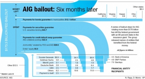
Nathan at FlowingData – Strength in Numbers presented a Sankey diagram by AP’s Nicolas Rapp and Damiko Morris (originally from this post on Nicolas’ blog). It shows where the $173 billion AIG received from government went to.

I especially like the inverse waterfall arrow endings and how they intersect with the grid of beneficiaries.

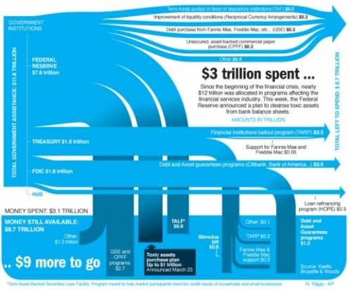
Nicolas, who works in Information Graphics for Associated Press, later presented another Sankey diagramm, displaying how the “nearly $12 trillion that was allocated in programs affecting the financial services industry” were used.

The author says “I spent the day researching and realizing this graphic” (@Nick: how much time was the research, how much the drawing?)

He adds “Fun stuff”, a comment which probably refers to the Sankey graphics part rather than to the content depicted… 🙁

Cost Sankey Diagrams show Added Value

While browsing through some of my older bookmarks I discovered this page of what seems to be an information portal of one of a German federal ministry. The Sankey diagram for cost flows they show reminded me of a feature in the Umberto material flow management software, which I always wanted to inspect in more detail.

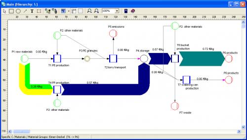
Using their 30-day trial version I worked with one of the simple demo examples they provide. Basically this software is a modeling tool for process systems and analysis of material flows within any kind of process system (production plant, supply chain, region, …). Sankey diagrams in Umberto are not the default view for material flows, but one can switch from the normal “Material Flow Network” view to the Sankey view.

Even though the Sankey diagram feature of the software would need some retouching, I was surprised and extremely pleased to see a “Cost Sankey” feature.

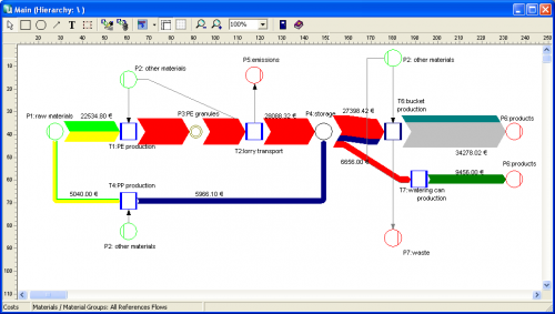
You can enter material direct cost for all materials (in the ‘bucket factory’ example of the demo all materials already have a “market price” property), as well as fixed and variable process costs. The variable process costs are spread over the process throughput using ‘machine hours’ or ‘work hours’ as cost drivers (i.e. to link cost creation to the material throughput). Thus, at every process (shown with blue squares in the flow diagram) the costs -or should I say: the value – increases. Going from left to right along the general flow direction in the Sankey diagram you can see clearly that the growing magnitude of the Sankey cost flows… a kind of ‘Value Added Sankey diagram’.


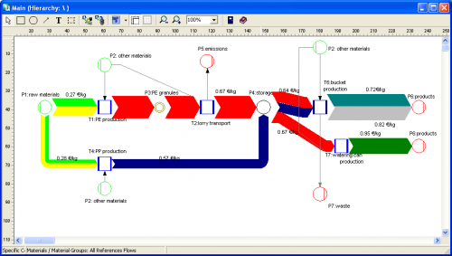
The above screenshots show the overall cost for the three products produced in the bucket factory (Fig.1), the cost per unit for each of the three products of the bucket factory (Fig.2).

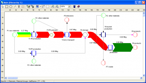
The following two cost flow Sankey diagrams are for the individual costing units ‘plastic bucket’ and ‘watering can’ (Fig.3 and 4). Please note that on theses diagrams a part of the machines is not being used, so they don’t add any process costs to the costing unit (or don’t contribute to the value added). Unfortunately you can only display either mass or energy flows in one Sankey diagram, so the energy costs (from the circle labeled ‘other materials’) are not shown as a Sankey flow, even though they add to the price for each product.