Tag: software

FRED Energy Flow Diagrams

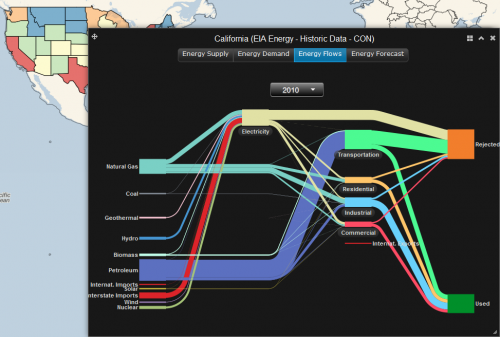
A number of renown partners such as DOE, NREL, Pacific Northwest National Laboratory and more) have created FRED (FRee Energy Data). This interactive website allows visualizing energy data for all U.S. federal states. Here is a screengrab for California 2010:

Go to the website directly to experiment yourself. Here is how to proceed: To start, make sure the layers are turned on (button at the top left), then click on the federal state of your choice. In the pop-up window there are four visualization options: Energy Supply, Energy Demand, Energy Flows, and Energy Forecast. Choose ‘Energy Flows’ to produce the typical production/consumption Sankey diagrams. Hover over the bands to see more detail.

FRED is really intuitive and fun to use. And it is open-access. You have more options when you register. According to the About section, among the future planned developments of FRED are “expanding FRED’s US coverage to global, adding energy expenditures and C02 emissions data, and allow[ing] users to extract FRED data and graphics”. Good!

Sankey Diagrams with Color Gradients

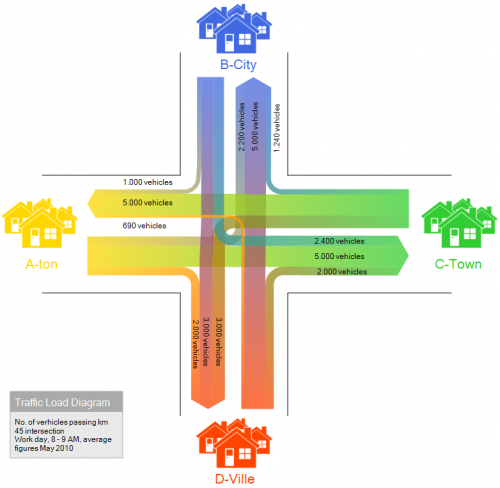
Color gradients seem to be the new like for Sankey diagrams. I already featured an example in yesterday’s post. The new e!Sankey 3.1 version has a color gradient feature now as well.

This diagram is taken from the samples included in the trial version. Traffic flows at a fictitious highway intersection is shown with the number of cars going from A to B, A to C, and so on.

It is not new at all (see this post) but has been pimped and now sports the color effect and some icons. Nice!

Sankey Diagram Maker by HJ Berchmans

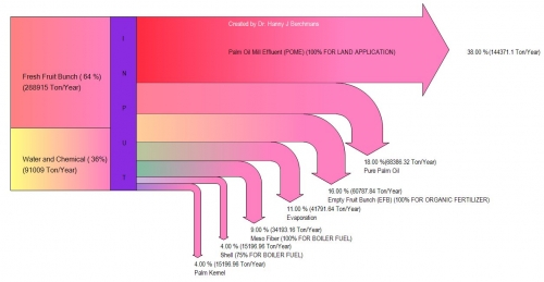
The release of a new tool for Sankey diagrams has passed almost unnoticed. Dr. Hanny J. Berchmans has developed Sankey Diagram Maker and provides it as freeware on Google Docs.

This very basic tool can be used to produce simple Sankey diagrams that have a left-to-right layout and breakouts to the bottom as the above. Data values are fed as text file (CSV format). Colors can be set individually and nice color gradient effects are possible.

I have added Sankey Diagram Maker to the software list.

Distribution Diagram from Excel Data

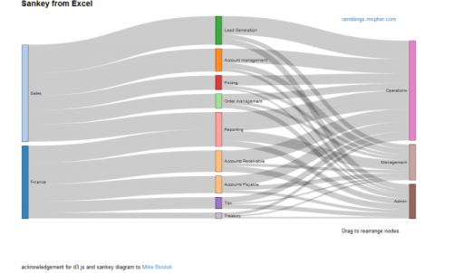
Bruce from http://ramblings.mcpher.com writes about “how to free your Excel data from your desktop and take advantage of web capabilities such as Docs, Maps, Earth, Gadgets, Visualizations and a whole bunch of other services”. His last contribution is on Sankey Diagrams from Excel, for which he uses d3.js and some work previously done by Mike Bostock.

While I don’t fully agree with Bruce’s definition of Sankey diagrams (“What are Sankey Diagrams? They are designed to show the movement in a network over time.”), this sure is good stuff and great work. You can download the VBA code from his page directly.

Distribution Diagrams (aka ‘Spaghetti Diagrams’) can be created directly from Excel. The interactive version (follow link above image on this page) allows to rearrange the nodes within the same column, and individual bands are highlighted on mouse over.

Why don’t these fully qualify as Sankey diagrams, in my opinion? Why would I rather call them distribution diagrams? It is exactly the fact that these are not directed flows, but rather quantities that are distributed over categories (or dimensions). There is no time relation in them, neither are there flows “from” (e.g. Finance) “to” (e.g. Reporting) or the other way round. These are bands hooked between nodes rather than arrows leading from one node to another. Each category could be represented by a pie chart as well … which would be more boring, of course. No unit given for the value of the flow (I guess it could be US$), but this is not even necessary, as the sum of the bands add up to 100% (like in a pie chart). For those of you interested, I recommend to read on the Parsets page.

Have added Excel to Sankey (based on d3.js) to the software list.

The math behind those curves…

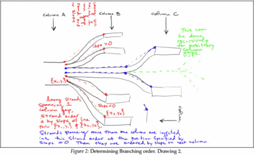
A great post on Sankey diagrams at the visualign blog led me to Sam Calisch’s PDF at github. It contains some insight on the maths behind the drawing of Sankey diagram curves, especially the type known as spaghetti diagram or distribution Sankey diagram (see discussion here).

There are some great scribbles in this paper that I wanted to share.

And I especially like this one, with the little man using the Sankey arrow as a slide…

The article is well-worth reading, so if you are into programming a Sankey software (the Mathematica workbook for Sankey might be a starting point), please download and study it.

Sankey Diagrams in Python

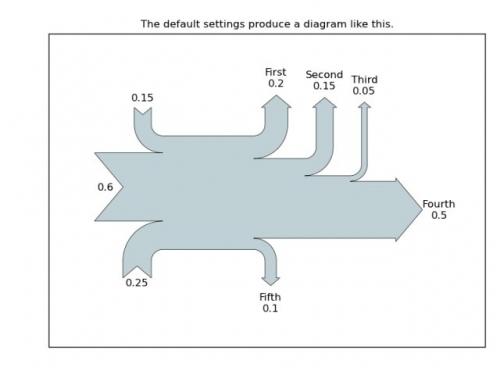
I am impressed by the Sankey diagrams produced with ‘sankeypython’, a new open source project. I first came across this in a discussion forum, where Yannick Copin from France presented his work using matprotlib. The project is now at Sourceforge. This sourceforge link not working any more, check Matplotlib project instead (thanks to commenter Johannes for pointing out the broken link), and several Sankey Diagrams in Python samples can be seen there.


The most important functionality is available, such as labels for flows and units. Diagrams have a basic left-to-right orientation, with vertical arrows branching out on both sides. Color changes seem to be realized by combining several systems. There are apparently no node objects where the flows directly hook to (as is common in other tools), but by interlacing differently colored Sankey arrows a process step becomes kind of implicit.

This has only been up on Sourceforge since June 2011, so it will be interesting to follow further development on ‘Sankey Diagrams in Python’. I have added the project to the list of Sankey diagram software.

Fineo and ParSets

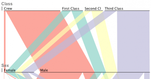
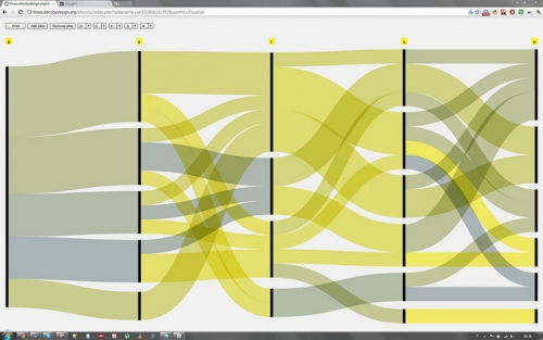
Two Sankey-style diagramming tools which I have shamefully neglected until today are ParSets and Fineo. Both visualization tools have been released to the public in 2009 (first publication on ParSets in a research paper in 2006, predecessor project of Fineo, the Design Research Map project first mentioned in 2008). The main idea behind both tools is to visualize statistical data by grouping it into categories and showing bands/streams/parallelograms between the categories to represent the relationships between the categories.

ParSets and Fineo have similarities and differences. But before we go into details, let’s have a look at both tools first. Here is a screenshot from ParSets:

And here is one from Fineo:

ParSets was developed by Robert Kosara (Department of Computer Science, College of Computing and Informatics, University of North Carolina at Charlotte) and Caroline Ziemkiewicz (Brown University). The tool is open source and runs on Mac and Windows platforms. Read more about ParSets on the project page on Robert’s EagerEyes blog. The project had some funding from the U.S. Department of Homeland Security, and the tool is designed to work on census data or other statistical data.

Fineo was developed by the DensityDesign group, a Research Lab in the design department (INDACO) of the Politecnico di Milano in Italy. This is an online tool and can be used by uploading csv data files. Try the online version here, or visit the project page on the Density Design blog. This is a self-sponsored project, targeting at designers and infographers.

There are some differences in the layout and design. ParSets shows the link between categories as parallelograms, while Fineo has curved bands. The main orientation of the diagram is top-to-bottom in ParSets, and left-to-right in Fineo. Hence the nodes (representing categories) are thin horizontal lines in ParSets, and vertical black bars in Fineo. Not sure, but this is probably an option setting.

The main difference though seems to be that ParSets keeps track of subdivisions over neighbouring categories. Fineo looks more at pairs of categories (category – relation – category) and is according to the authors more inspired by this feature of Sankey diagrams (read here). On a side note I would like to add to this that both ParSets and Fineo lack one important of characteristic of Sankey diagrams, which differentiates them from Sankey diagrams: flow direction, or, in other words, a ‘from-to’ relationship. “Both of the visualizations are weighted bipartite graphs”, but not directed graphs.

Still, both tools are very good pieces of work, and I am looking forward to seeing updates in the future.
Very Simple Online Sankey Diagrams

Found this very simple online Sankey diagram drawing application developed by Jan Stępień. It is a very very basic interface where you can define nodes (“Processes”) and streams (“Reagents”) between source and sink nodes. The whole thing is in black and white and you will get outputs like these:

I played around a bit with the tool, but didn’t quite manage to do my own Sankey diagram. See for yourself. The code is open source, so if anyone wants to contribute… I updated my software list.