Tag: Switzerland

Swiss Wood Flows

I received another diagram from Gabor Doka, who already pointed out the Swiss biomass flows Sankey diagrams to me. Gabor seems to have a close eye on publications in the environmental field in Switzerland, and he apparently is an avid follower of this blog. I appreciate.

He writes:

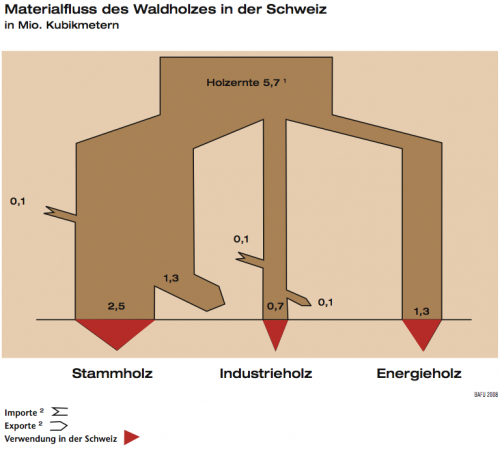
Now a very similar topic (just wood flows in Switzerland) but probably a by-the-book example of how not to do Sankey diagrams. This is from the FOEN magazine “Umwelt” issue 4/2008 (full PDF 8 MB here)

Shown are wood flows in Switzerland in million cubic metre. Again only in German though.

Errors that I saw include:
a) flows are slimming, when pointing in a non-vertical direction (“angle-dependent violation of mass conservation”). See e.g. “Stammholz Export” and “Energieholz” which both should be 1.3, but the latter is larger.
b) Addition of imports does not lead to wider flows. The author could not be bothered to deal with small flows, although 0.1 represents a 14 % increase over 0.7, i.e. perceptible.
c) The arrows representing “0.1” are over 2 times too wide, i.e. they visually represent 0.23. Also the arrow representing 0.7 is somewhat larger.

He continues:

What I do like is visual aid of identifying inland consumption (red arrows). Also inputs and outputs add up, which is always a nice thing 😉 However, this seems like a stitched together diagram drawn manually (and probably re-drawn for publication). This is supported by the angled design and observation that in the original paper publication, the main input representing 5.7 Mio m2 is exactly 5.7 cm wide…

Not much more to add from my side. Thanks, Gabor, for this contribution.
Swiss Biomass Sankey Diagrams

Gabor Doka pointed me to a publication by the Swiss EPA (Federal Office for the Environment, FOEN). The publication titled “Biogene Güterflüsse der Schweiz 2006” (‘Flows of biogenic goods in Switzerland in 2006’) features many different Sankey diagrams. “Biogenic goods are defined as goods of biological origin, excluding those of fossil origin”. Data is based on Swiss statistical figures and valid for 2006. Available in German only (Download PDF 7,5 MB).

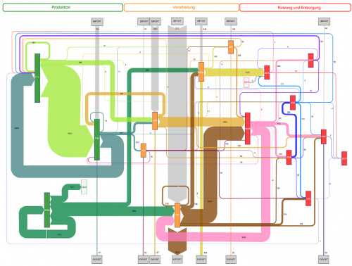
The overall structure of biomass flows is given in a generic layout and as Sankey diagrams with proportional arrow magnitudes for mass flows (unit is in 1000 tons, based on dry matter) as well as for energy content (in GWh, based on lower heat value of dry matter). These overview diagrams are structured in three columns ‘Production’, ‘Conversion’, and ‘Use/Disposal’. Imports are from top, exports to the bottom. This very clear structure for both mass and energy flows makes the complex diagrams easier to comprehend. These overview Sankey diagrams are available for download as a separate PDF file (still 3,2 MB)

The main diagram is then broken down into individual Sankey diagrams for the different sectors involved, such as plant production (PLB), animal farming (THA), and forestry (WAW) in the production column (orange colored processes), or food industry (LMI) and wood/paper industry (HPI) in the conversion sector (green colored process). Finally, in the use/disposal sector (red colored processes) we find goods consumption (WAK) along with energy generation and waste treatments.

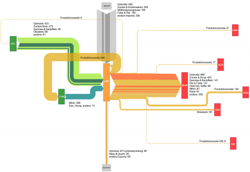
This is the sectoral Sankey diagram for the food industry in Switzerland. We can see that a large part of the biomass for food production is imported, and that most production wastes are fed back into animal farming again. The red boxes are different waste treatments receiving input from the food industry.

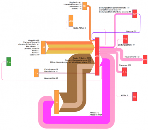
The above is the goods consumption section. Main biogenic goods inputs are from food industry and wood/paper industry. The meat input is rather small comparatively. A big chunk of the mass output (namely waste wood and waste paper) feeds back into the wood/paper industry. 472.000 tons ended up in waste incineration that year, some 329.000 tons in waste water.

The Sankey diagrams in the study are interesting to browse and reveal a lot more interesting facts. The stuctured approach with the breakdown into smaller diagrams is very useful. The authors Baier and Baum from ZHAW at Wädenswil have done a great job in compiling this.

“The results of this study will serve as useful decision aids for strategic planning and assessments concerning the potential, use and management of biogenic resources (…) makes it possible to detect quantitative changes that occurred during a given period of time and to reach conclusions concerning the efficiency of measures taken.

Actually this way of visualizing statistical data with directional (from-to) information attached to it could serve as a role model for other national mass and energy accounts, I think.

Uh – this has become my largest post ever 😮 . But I think this was well worth it and the publication merits it. Your comments appreciated.

More National Energy Flow Diagrams

A followup to my last post: This thread on ‘The Oil Drum: Europe’ features similar national energy flow diagrams for UK (2007), The Netherlands (2006) and Switzerland (2007).

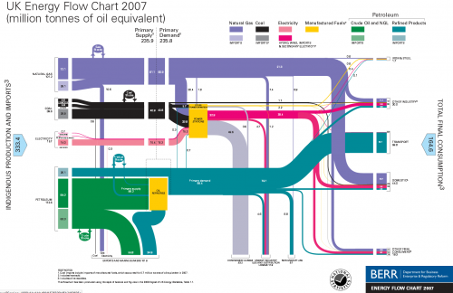
For the UK these Sankey diagrams are published by BERR (Department for Business, Enterprise and Regulation). Historic charts back to 1974 can be found on their website.


UK Energy Flows 2007, by BERR, via The Oil Drum: Europe

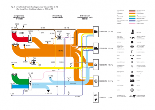
A commentor to Chris Vernon’s original post added the Swiss version of this Sankey energy flow diagram originally published by Swiss Bundesamt für Energie (BFE):

These Sankey diagrams have some nice details, which a worth a mentioning: The UK diagram shows stock increases and decreases with circles. The size of the circle has no significance, but the magnitude of the in and out flows seem to be to scale, thus allowing to see if the stock has increased or decreased in that year. Losses at transformation steps are shown with “hanging arrows” (the flows branching off to the bottom line of the diagram). The Swiss version also shows exports this way, but visualizes losses with a pin with a big round head.

Even though your run the risk of being overwhelmed by a gloomy feeling when your read through the comments to Chris Vernon’ post, I would like to draw your attention to a comment by “realist” on Sept 5. He writes: “Deceptive graph! Why show losses for electric power generation and not transportation? The heat losses from the internal combustion engine in most transport is 70-80%”. This is true, but I have always understood that losses explicitly shown in these energy flow Sankey diagrams are the losses occuring in the energy generation, conversion and grid, while losses in the energy consumption (such as use for transport) are not shown. This let alone that they are worthwile to discuss.