Tag: U.S.

President’s Budget Revenue/Spendings

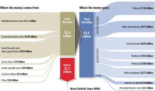
In a post on the winners of the SND 31 competition over at the Infographics News Blog I found the below diagram on the President’s Budget. Originally published by the Washington Post it has won an Award of Excellence in the 31st edition of the Society of News Design contest in the Infographics / Breaking News section.

It is not really a Sankey diagram, since the arrows are not explicitly directed. But it has weighted arrows/bands, in this case representing $$$. This infographic was maybe inspired by this one from Spain that was – after lengthy discussion – named a “distribution diagram”.

I cropped the lower part of the infographic that had details on the deficit as bar chart. See original, full infographic file here.

Two more infographics in this post have characteristics of Sankey diagrams, and I might post them here on the Sankey Diagrams blog, if I run out of ideas one day…
Making Of an Infographic

A notice on scoop.it/visualdata led me to this fascinating video on visualnews. It shows the making of an infographic in two minutes or 3657 frames and is by Jess Bachmann for mint.com.

The central element of the infographic is a Sankey diagram on the trade flows between the United States and China (and to/from other countries).

it is interesting to see how Jess did every weighted arrow as a brush line with rounded head (the heads are neatly hidden behind the country maps, or capped at the other end). Each horizontal, vertical and curved segment is done individually.

In the YouTube comments of the long version of this video the author replied to one commenter: “After determining a metric, i.e 1 pixel width = $1M, I then stroked a line with the corresponding size brush. A $34M item would have a 34px width line. At one point you can even see a calculator popping up (0:55 into the video).

The long (7 minute) version has a lot more details on how the infographic comes to life. You can even see that Jess keeps saving his work from time to time…

Wow, what a hell lot of work – but the result sure looks gorgeous.

I calculated that Jess took more than 10h to complete this: 3657 frames, ten seconds between each frame = 36570 sec, 3600 seconds to an hour, makes 10.16 hours! I am just glad I have my Sankey diagramming software, so at least I don’t have to bother about brush sizes.

Explore U.S. Energy Flows on Bloomberg

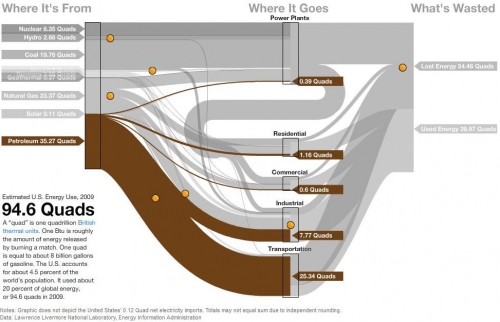
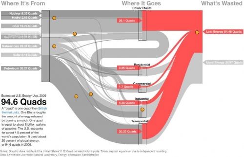
David Yanofsky from the Bloomberg Newsroom advised me of a Sankey Diagram he did on U.S. Energy Flows. The diagram is based on the well-known Lawrence Livermore National Laboratory (LLNL) diagrams and shows the 94.6 quads (1 quad = 1 quadrillion BTUs) estimated energy use in the United States in 2009.

The Sankey diagram has a nice mouse over effect, that let’s the user explore the stream as they are highlighted in different colors. The nodes show the contribution from different carriers. Additional information is available when positioning the mouse over the orange bullets. This makes the diagram fun to explore…

In this image the lost energy is highlighted in red.

In the above screenshot the energy flows based on petroleum are shown in brown color, all other flows in light grey.

These are only two static screenshots, please go over to the Bloomberg site to see more.

Colorado River Water Accounting Sankey

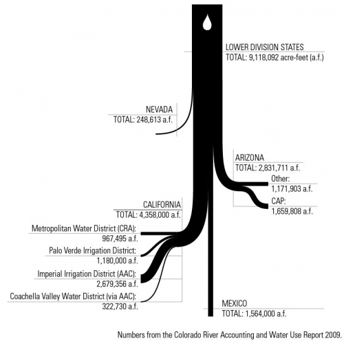
From Fei-Ling Tseng’s design blog comes this Sankey diagram. Her post is on some visualizations and infographics done for a project on water economies/ecologies of the Colorado River water system.

The diagram shows the distribution of water from the Colorado river to different lower basin states (Nevada, Arizona, California), “export” to Mexico and a breakdown to irrigation areas within California. The quantities are in acre feet (a.f.). Underlying data is from the Colorado River Accounting and Water Use Report 2009.

Simple, beautiful, conveying the message … and a single white water-drop as catchy design element.

Extended LLNL Sankey diagram

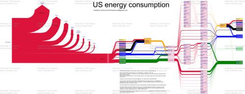
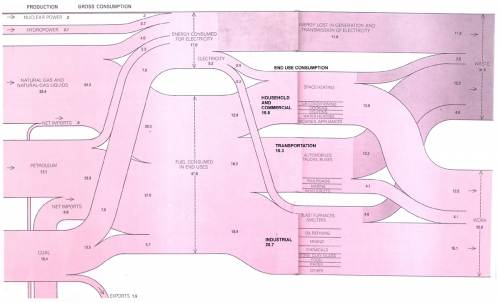
Blog reader Johan Land submitted the Sankey diagram below. “As I am interested in the energy field I especially was fascinated by the LLNL graph over US energy consumption. I spent the weekend on further enhancing the LLNL graph using a trial version of e!Sankey (and data that I have gathered the last few years). I’m attaching the PNG-file for this graph. Feel free to share it if you like the graph!”


(click image to enlarge)

The typical LLNL graph has been extended by the red section on the left that shows a world energy breakdown. Only the U.S. energy consumption is traced further.
The second extension is the pink section. Here, Johan has broken down the energy use sectors ‘Residential’, ‘Commercial’, ‘Industrial’ and ‘Transportation’ in one or two further steps.

All flows are in TWh, data is from 2005 to 2009. The author used several additional data sources and recompiled the data, so that “figures may differ from Lawrence Livermore Laboratory estimations”. See notes for further information.

Good Sankey diagram, and definitely a great job Johan did here. The only suggestion I have, is to add percentage figures to the regional energy breakdown (red section on the left). Unfortunately, the watermark spoils the overall impression, but this is owed to the fact that he used a free trial version.

Johan also mentioned that he is working on forecasts up to 2050, and an animated GIF “running it over time since 1950 up until 2008”. Hope to be able to show you these here on the blog someday.

Transport Sankey Diagram

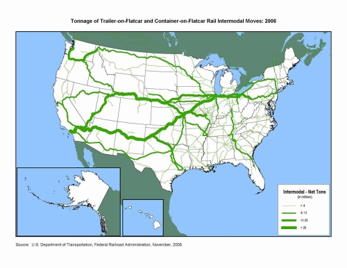
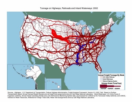
A reader of the blog pointed me to some Sankey diagrams available on the U.S. Department of Transport (DOT) Federal Highway Administration (FHWA) website. Sankey arrows are shown as a U.S. map overlay.


The first transport Sankey diagram shows the net tons of goods being transported on flatcars (either as trailer-on-flatcar, or container-on-flatcar) on the U.S. railway systems. The transport volume quantities are clustered into four groups shown with four different arrow widths. It is nice to see how in the eastern part you still have many railroad tracks, but with significantly less transport on them, while to the west coast you basically have 3 main lines, two of which carry more than 25 mio tons of freight per year.

The second one represents freight transport on railroad (bright red), inland waterways (blue) and national highways (dark red). Values also in million tons per year. I am not sure whether flows are to scale, or if transport quantities are also clustered into groups as in the first diagram. I can distinguish at least five different arrow magnitudes, even though only three sizes are given in the legend. A great transport Sankey diagram, as it shows that the East has most of the cargo, and has a much denser transport infrastructure. The reason why railroad transport on this second Sankey diagram differs so much from what is shown the first one, is probably due to the transport of bulk materials not shown in the intermodal transport quantity map.

Flows are not directional in both diagrams, so I assume that quantities for both directions have simply been added.

Can anybody confirm that the massive stream out of Wyoming by rail is coal?

PET flows in the US

Polyethylene terephthalate is something everyone of us uses almost every day. Better known by its acronym PET it is used for plastic film and soft drink bottles.

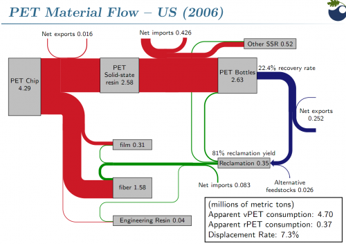
The following Sankey diagram is from a presentation on PET beverage bottle recycling by Brandon Kuczenski and Roland Geyer of Donald Bren School of Environmental Science and Management at the University of California, Santa Barbara. It was held on the First Symposium on Industrial Ecology for Young Professionals (SIEYP) in Tempe, AZ on May 17, 2009.

The Sankey diagram shows PET flows in million metric tons in the U.S. in 2006. 4.29 mio tons of pet flakes are being produced, of which 2.63 mio tons are transformed into PET bottles (other products are PET film and PET fiber). Only 22.4% of these bottles could be recovered after use. This “loss” is being represented by the blue flow which has only a fourth to a fifth of the width of the red entry flow. Recovered PET bottles are exported or reclaimed, closing the loop at least for a fraction of the PET flows.

Interesting Sankey diagram. Congratulations to Kuczenski/Geyer for visualizing this so clearly. Your comments appreciated