End-of-year cleanup of my bookmarks and saved diagrams. There are more goodies, and enough in stock for a couple of posts next year…
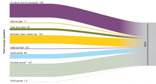
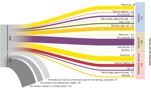
Below are three image sections of a Sankey diagram showing Swedish energy flows in 2007. These were published on p. 54/55 in the report ‘Energy in Sweden 2008’ by Swedish Energy Agency (Energimyndigheten). Numbers are in TWh, source for the diagram was Statistics Sweden data.
The first diagram (which is the left part of the diagram) shows the total 624 TWh energy supplied and the energy sources. The second one is the breakdown of energy produced by sectors, and also shows the losses in energy conversion. The third on is a different breakdown of the 404 TWh by energy carrier.
Nothing more to add. They are simple, clean, beautiful.


