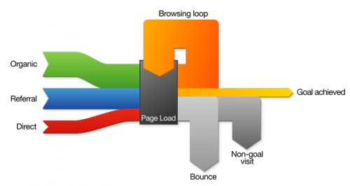
UK-based Stuart Brown at Modern Life in his latest post (“The Varying Virtues of Site Performance Metrics”) uses a Sankey diagram to visualize web site performance. This is a rather novel idea of using Sankey diagrams, but hey, why not?
This nicely done Sankey diagram – in this case without any absolute or relative numbers – shows where web site visitors come from (input flows from the left side), and if their visit can be considered successful (that is, meeting the “goal” of the site operator) or not as output flows to the right side. Returning visitors are shown with a “browsing loop” in the Sankey diagram.
I really like this Sankey diagram and I would love to see web site metrics being visualized in this way. It really is a good visualization and can show how a website performs, although Brown acknowledges that “there simply isn’t any single great method of gauging a site’s performance”.
Coming back to the Sankey diagram itself, it does however have a small flaw. Look at the grey arrows for “Bounce” and “Non-goal visit”. The latter does not connect to the “Page Load” node, but rather seems to dive under the “Bounce” flow and appears where this one branches of vertically.
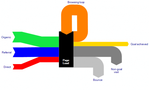
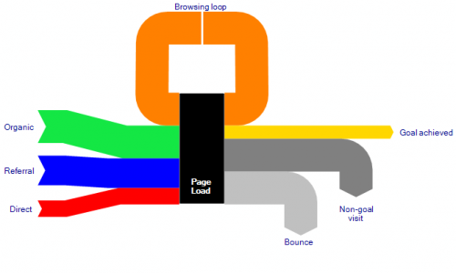
I have created two alternative Sankey diagrams where these two flows set off from the “Page Load” box parallel (stacked), rather than in an overlay manner. The overall quantity represented by the flows on the output side should be equal to the number of visitors on the input side. The first diagram keeps the original idea of the browsing loop coming in from the top, the second one hooks it on the left side of the box.
Alternative version:
As for the colors of the two diagrams above, sorry Stuart, didn’t hit the right values right away…


1 Comment
A related graph could show, for each page hit (not session) how many are a “final” page load, vs. an intermediary page load; you could spread them out, replacing your “page load” with “page load 1”, “page load 2”, etc. and at each stage, showing how many users succeeded, continued, or dropped out, to gauge how long a visitor is willing to poke around before giving up, how quickly they’re finding what they came for (or you wanted them to find); you could also track this (using the “traffic” view, where color bands continue through nodes, not stopping and merging) to show differences between returning/organic/referral/direct visitors, and what their tolerances are — are returning visitors more likely to click through several pages, for example?
Comments are closed.