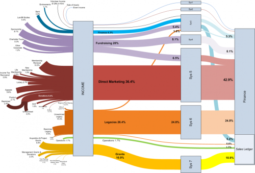
The Visio Guy had another cool Sankey diagram on his blog last week. Credits go to Chris Webb of Woodland Trust, who created this using the line thickness option rather than pre-wired shapes.
The diagram has a left-to-right orientation and shows the different sources of money received by the trust. The types of funds (e.g. grants, legacies, direct marketing) are grouped together by colors. Flows have percentile values, rather than absolute ones. I am not sure what the boxes labeled “Sys” are, but the colors change. All flows merge into the box “Finance” which has a subgroup “Sales Ledger”.
The flow bands between most of the nodes have a nice soft curving. This is why some people do refer to Sankey diagrams as spaghetti diagrams.
If you are using Visio, you can download this diagram and look how it has been done. Nice work! I hope to see more of these Sankey diagrams done in Visio….

4 Comments
Wow, this was excactly what I was looking for. Didn’t know about sankey diagrams before.
Chris, many thanks for the time and effort put into this diagram!
Marco
Comments are closed.