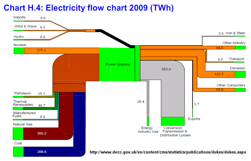
Featured on Jo Abbess’ blog on ‘Energy Change for Climate Control’ recently was this Sankey diagram. It appears in his recent post on ‘The Waste of Power’. It was originally published in Annex H of the 2009 Digest of United Kingdom Energy Statistics (DUKES) published by Department of Energy and Climate Change (DECC).
The report has numerous other Sankey diagrams like this one, similarly structured. They show energy use of coal, petroleum, natural gas, and renewables.
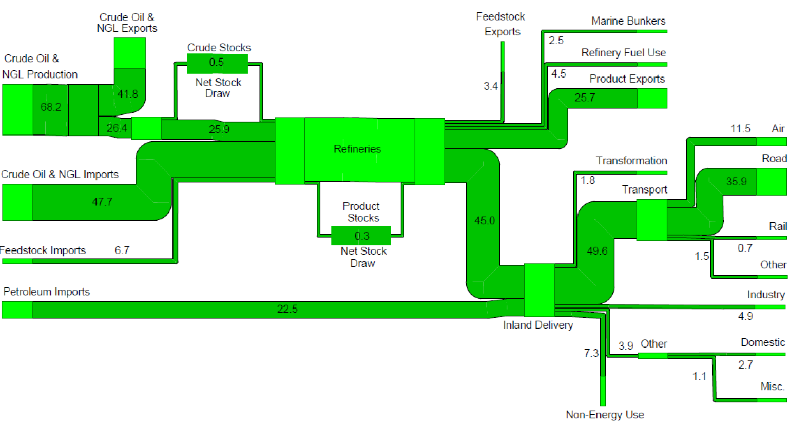
Below is the one on petroleum flows in 2009 in millio tons. A lower threshold has been introduced, so that small quantities don’t fall below a minimum width (see, for example, the flow of 0.7 mio tons to “Rail”, compared to the one of 4.9 mio tons to “Industry”, which would in principal be 7 times wider if it was to scale.
Nice and colorful!

