Tag: Latin America

LatAm BEN – Honduras

Some time has passed since the last post in my mini-series featuring energy balances of Latin American countries. Panama was last in July 2019. So today, here is the Balance Energético Nacional (BEN) for Honduras.

This Sankey diagram can be found on page 43 in the report ‘Balance energético: un panorama del actual sistema energético hondureño’ (2018) published by Secretaría de Energía, Gobierno de la República de Honduras.

The figure shows energy origin (left column), energy type (middle column) and consuming sectors (right column). Individual streams are not labelled with quantities, but all the numbers are in the report on the previous pages. Overall final consumption of energy in 2017 in Honduras was 33.376 kbep (kilo barrels of oil equivalents). We understand almost half of the energy was imported.

Some observations that possibly only strike a nitpicking observer like me: Streams sometimes don’t maintain their width when sloping upward or downward (an indication that d3.js sankey has been used to draw this). The flow depicting electricity export goes back to the left (green node ‘Exportación’). Nodes for tiny flow quantities are amplified, so please don’t take the middle column as a stacked bar. Otherwise a fine diagram. I like the icons used for describing the energy types and different uses.
LatAm BEN – Panama

Skipping the remaining countries in South America (Venezuela, Guyana, Suriname, French Guiana) for the time being, my series of Sankey diagrams depicting the National Energy Balance of Latin American countries continues with Panama.

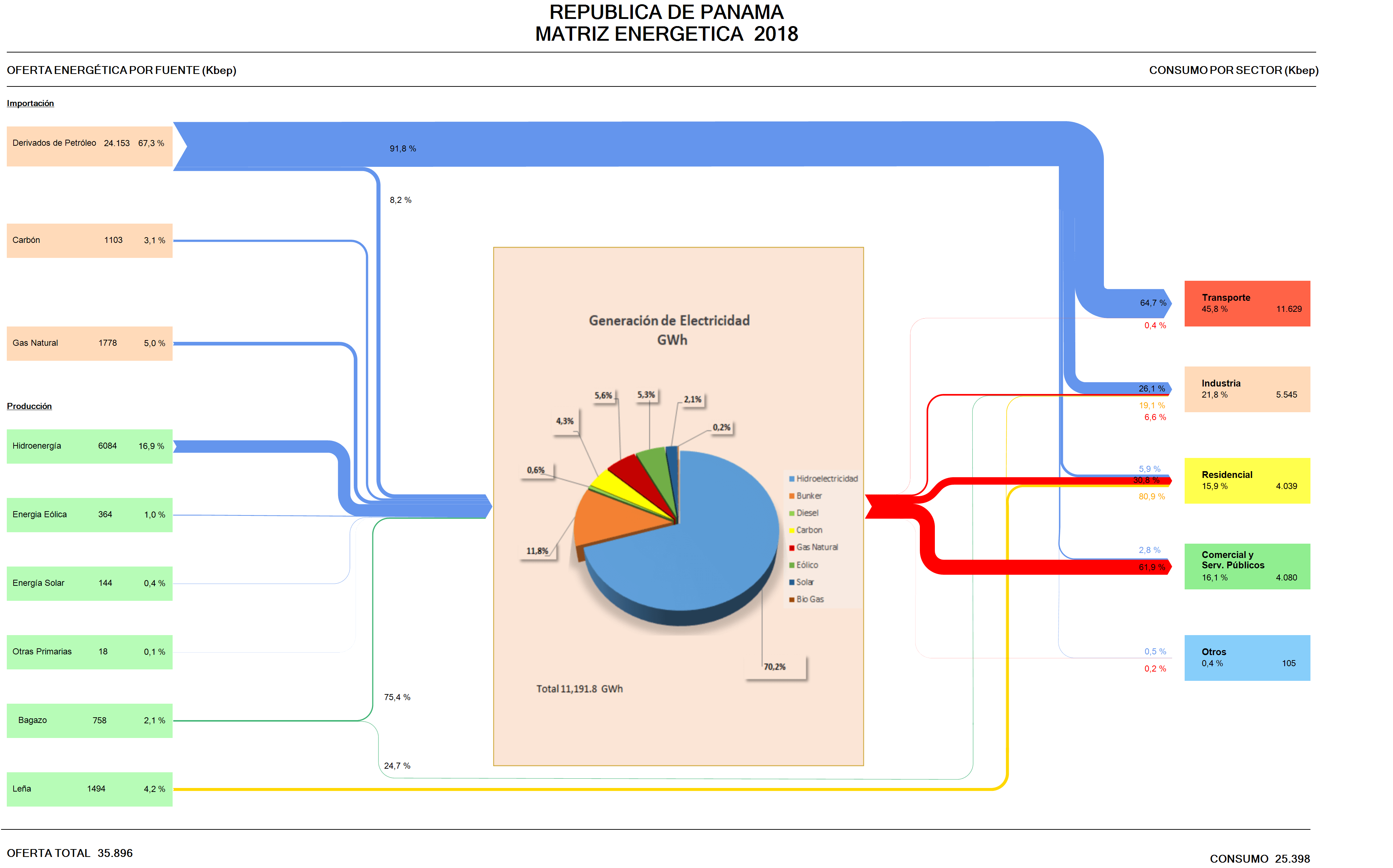
Data for the Balance Energético Nacional (BEN) is available on the website of the Ministry of Energy (Secretaría Nacional de Energia), but I could only find this visual representation of the Matriz Energético done in Excel.

Arrow lines are all the same width and glued together from horizontal and vertical line segments. To be featured here on the blog, it has to be some kind of Sankey diagram, with the magnitudes of the arrows or bands representing the flow quantity.

I checked the sieLAC page maintained by OLADE, but there I could only find energy flow diagrams up to the year 2010.

So I decided to “translate” this Excel figure (which has all the numbers) into a Sankey diagram. As it turned out, the work wasn’t straightforward, since this figure uses two, actually three different units. Primary energy on the left and consumption per sector is in kbep (kilo barrels of oil equivalents). The pie chart in the middle that represents the electric energy generation is just an insert with data in GWh. The arrows in the Excel figure are labeled in percent. I started out using the kbep scale, but then was unable to convert the quantities for the streams, since actually energy losses are omitted in the figure.

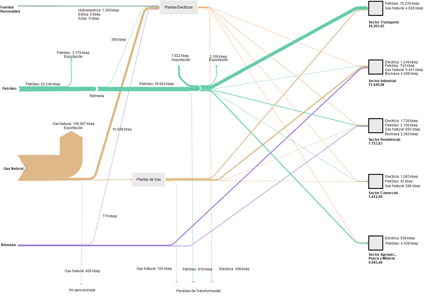
Here is my remake:


I chose to work with the percentage scale for the downstream splits per fuel, setting the magnitude of the energy generated at the same size as the input. We can see that the energy landscape is dominated by imported petroleum derivates consumed for transport. Actually this is almost three times as much energy as is being used for energy generation. Domestic energy production is mainly from renewables with only some coal and natural gas.

Colors and general layout of the remake stick pretty much to the original figure.

LatAm BEN – Colombia

Colombia is next in my mini-series on National Energy Balances (Balance Energético Nacional, BEN) of countries in South and Central America.

Searching for an energy flow chart for Colombia brought up a lot of data and publications by UPME (Unidad de Planeación Minero Energético), an agency of the Ministerio de Minas y Energía (MinMinas). However, finding an actual energy flow chart turned out to be more difficult. I finally found one for 2012 in a presentation ‘Potencial energético colombiano para la generación de energía y su óptimo aprovechamiento’ by UPME on a U.S. National Institute of Standards (NIST) website.

With Colombia being an energy exporter, they seem to have been facing the same problems as Bolivia and Ecuador when drawing the Sankey diagram: The comparatively much larger energy export quantity kind of dwarfed the other flows of the Sankey diagram. Hence, in the same presentation, they excluded the export stream and focused on the domestic energy flows.

Flows are in terajoules (TJ) for the year 2012 in both diagrams. The scale of the two diagrams is not the same, so they must not be compared to each other. What has been reduced to tiny streams and hairlines by the massive export flow in the first diagram, received more weight in the domestic energy flow diagram.

A good solution to a general issue when handling flows with huge differences in the same Sankey diagram.

LatAm BEN – Ecuador

Here’s the continuation of my mini-series on Sankey diagrams showing energy balances of Latin American countries. After my recent post on the Balance Energetico Nacional (BEN) of Bolivia the neighbouring Peru would be next. However, I have presented a Sankey diagram on energy flows in Peru on this blog before. So today, here is the BEN for Ecuador. It is published every year by the Ministerio Coordinador de Sectores Estratégicos.


Data is for 2016. The unit of flows is ‘kbep’ (kilo barrels of oil equivalents / miles de barriles equivalentes de petróleo). The appearance is very similar to the BEN Bolivia I showed here.

Again the flows are not to scale, which is a pity. Smaller flow quantities (in the range of 0 to 1000 kbep) are shown as arrows with a minimum width, which is fair, because otherwise we wouldn’t see much more than a hairline for ‘Solar’ or ‘Eólica’. However, if you look at the light grey flow of 17,533 kbep derivates exports branching out after the refineries node, it has the same width as the arrow representing 3,024 kbep of own use (consumo própio) – although it should be 5 times wider. The orange arrow depicting 4,433 kbep of natural gas on the other hand is wider than the one 17,533 kbep derivates exports…

I really like the graphical aspects of the Sankey diagram, and I admire the effort made here to come up with an annual Balance Energetico Nacional. In my opinion, not showing the flows to scale thwarts the whole effort, and makes using this diagram type superfluous. I know that doing such a Sankey diagram to scale is sometimes challenging, in particular when there is a very large dominating flow (like here the 139,046 kbep petroleum exports), but nevertheless, the message you are otherwise conveying with the figure is simply misleading.

Just as for Bolivia I will again have to draw this one myself …

LatAm BEN – Bolivia

In my mini-series on National Energy Balances (Balance Energético Nacional, BEN) of countries in South and Central America, I have reached the Plurinational State of Bolivia.

I couldn’t find any Sankey diagrams on the website of the Ministerio de Hidrocarburos, which apparently is responsible for drawing up the energy balances for Bolivia. However, I was sure they must exist, as a press release for the launch event of the report exists. Finally I found a publication of the ministry for 2000-2009 in the BIVICA library and it has some black/white energy flow diagrams.

There have been newer editions of the report until at least 2015, and here is the BEN Bolivia for 2014 (from the OLADE library), You might remember that OLADE, the inter-governmental Organización Latinoamericana de Energía plays an important role in motivating countries to draw up their BEN and runs a website where BENs are available for many Latin American countries).


The unit of flows is ‘kbep’ (kilo barrels of oil equivalents / miles de barriles equivalentes de petróleo). Now, this Sankey diagram is definitely not to scale: the width of the flow representing 133,902 kbep of gas would have to be almost 6 times wider than the one standing for 23,065 kbep of petroleum. The biomass flow would have to be much thinner in comparison, hence it is over emphasized in the diagram for the reader who is unaware. My feeling is that the person who did this wasn’t acting with bad intentions, but had no technical means or support to do this properly and just glued it together from round rectangles, arrows and other shapes.

Definitely a candidate for a remake, if I find the time… Edit: I found some time to remake this BEN for Bolivia with flows being to scale. Quite a difference to the above! It becomes obvious, that the country is primarily a natural gas exporter. I didn’t notice this dominance of energy export at first. Now with the flows being to scale, the details and differences of the other flows are hard to tell. One would have to remove the natural gas export to show more of the domestic energy flows.

An analysis of the BEN Bolivia and some background on the data is available (in Spanish) in this paper.

LatAm BEN – Brazil

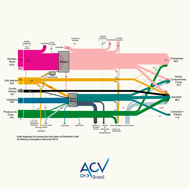
Working my way up the southern cone, here is the Balanço Energético Nacional 2014 for Brazil. Found this on the webpage of Curitiba based consulting firm ACV Brasil.

The national energy balances for Brazil are published annually by the Ministério de Minas e Energia (MME), and newer reports are available (PDF for 2018, large!). However, the energy flows diagrams in these official reports are less refined, so I opted to go with the remake by ACV.


The unit of flow is not shown, but my guess is that it is Mtep. like in the original publication.

LatAm BEN – Paraguay

So, after Argentina and Uruguay, here is the Balance Energético Nacional (BEN) for Paraguay.

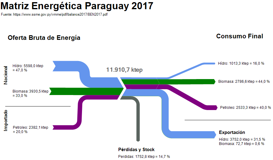
I couldn’t find any Sankey diagram for the national energy flows on any government website. However, a document on the Balance Energético Nacional (BEN) is published annually by the Viceministério de Minas y Energía. It contains this schematic drawing:

I turned this into a Sankey diagram using the ktep values and the percentage shares indicated.


The structure of this BEN is a little different from the ones previously seen, since it doesn’t indicate the sectors of final consumption. Obviously, most imported crude derivates are used for transport. Regarding biomass, the report indicates that wood is used in households for cooking and sugar cane to produce ethanol to be mixed into fuels for the transport sector. Electricity is produced entirely from hydropower and Paraguay exports over half of the electricity generated to its neighbours Argentina and Brasil.

LatAm BEN – Uruguay

Working my way up the southern cone, next in the mini-series on national energy balances for countries in Latin America is the one for Argentina‘s neighbor: Uruguay.

The Ministerio de Industria, Energía y Minería (MIEM) is publishing the Balance Energetico Nacional (BEN) for Uruguay and there is a dedicated website with all the underlying data.


The flow diagram (diagrama de flujo) for the 2015 energy balance was produced by engineering and energy consultancy SEG Ingenieria from Montevideo and appeared in their technical file on energy indicators (Nov 2016, in Spanish only).

Flows are in ktoe (Spanish: ktep, kilo tonelada equivalente de petróleo). The country-wide final consumption in 2015 was 4399 ktoe.

The round icons visualize sources, energy conversion and consuming sectors. They look nice and playful, however, they might also dissimulate the flow quantities: For example, if you look at ‘Transporte’ and ‘Industria’ in the right-hand side, they do have the same diameter, but transport has a 28% share of the final consumption while industry has 42%.