Author: phineas

Signing off…

Many of you have probably noticed that my posting had become somewhat scarce… not to say: had ceased. Well, the last months have brought some changes in my personal and professional life, so I have neglected posting Sankey diagrams.

Since starting this blog in February 2007 (almost 15 years ago), I did over 660 posts, or – in other words – showed you more than 660 Sankey diagrams. I did a last post yesterday, just for the sake of it, and with that will be signing off.

The good news is that I found someone who will take over from me: From December on, Riall will be posting here. And I hope that he finds some good Sankey diagrams to share with you.

China Pearl River Delta Water System

A follower of this blog sent me an e-mail with a Sankey diagram. I think it deserves to be presented here.

He writes [original e-mail, wording slightly modified by me]:

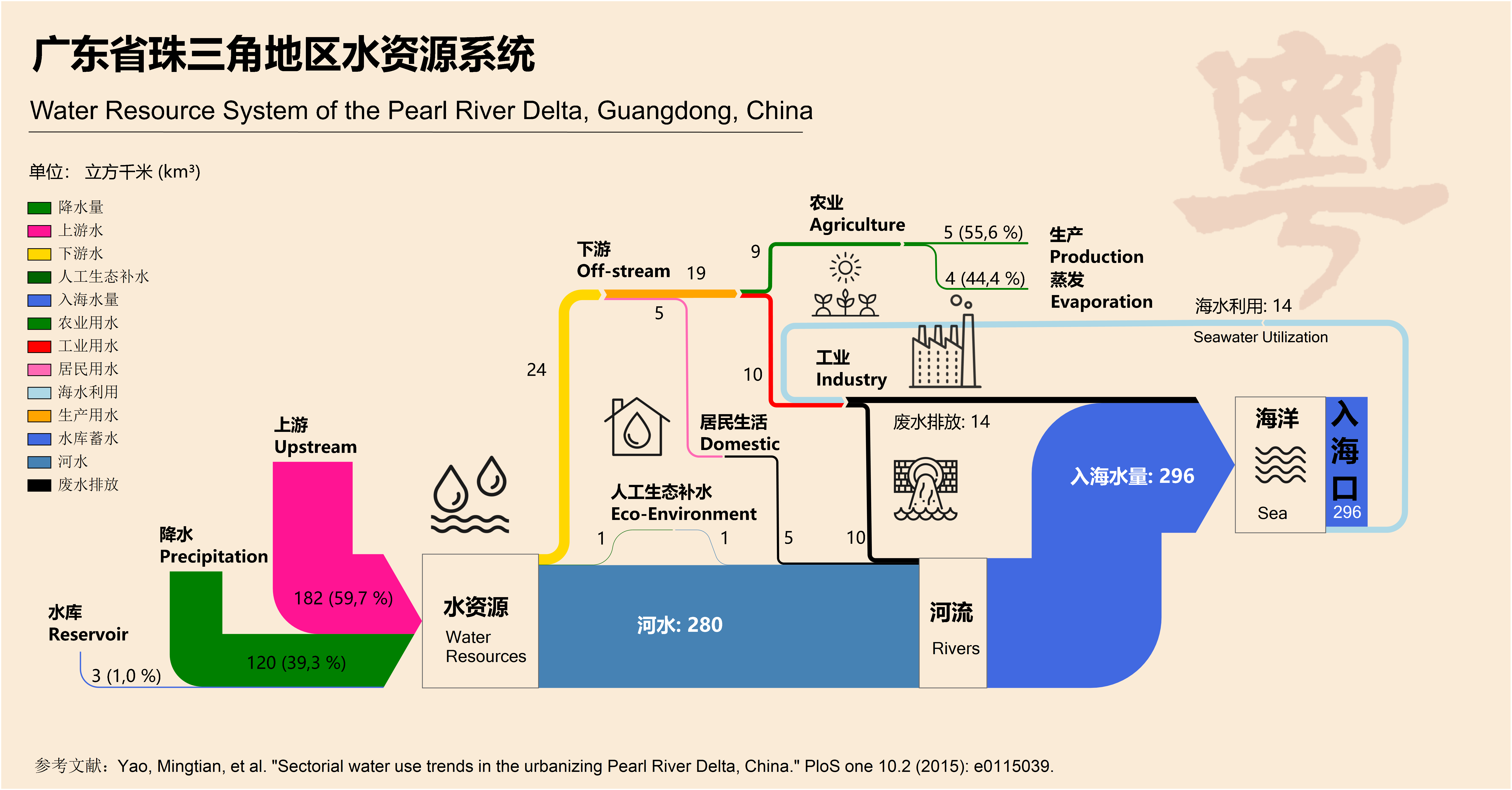
… I was inspired to do this by the Water Use in Qingdao post on your blog. When I discovered an article that had a schematic figure of the Pearl river water use system in my home province Guandong (广东省) I took on the task to create a nice Sankey diagram. I hope you like it. You are free to use it on your blog.

This is the original figure from an open access article Yao M, Werners SE, Hutjes RWA, Kabat P, Huang H (2015) Sectorial Water Use Trends in the Urbanizing Pearl River Delta, China. PLoS ONE 10(2):e0115039.doi:10.1371/journal.pone.0115039.

And here is the Sankey diagram that he created.

Flows are im cubic kilometres (km³) per year. Most of the water (280 km³), both from the upstream river and precipitation in the area, runs directly into the sea. A comparatively small part (24 km³) is taken for industry, agriculture and domestic use. Some water (14 km³) is also extracted from the sea for industry (cooling?).

Nicely done, somewhat colorful … I like! Thanks for sending this to me to share it with the public. A worthy farewell Sankey diagram…

Household Packaging Waste Recycling

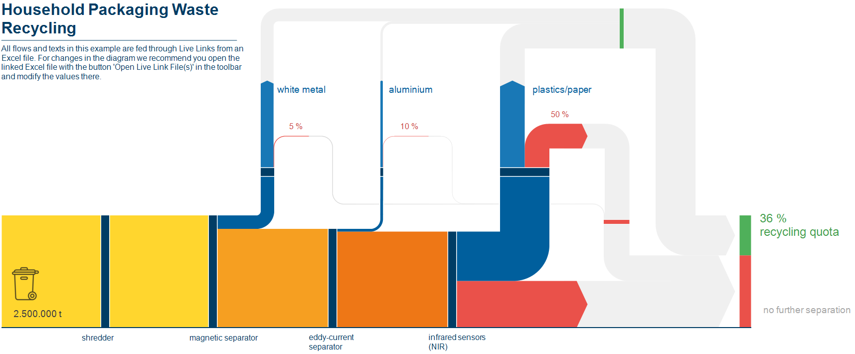
This Sankey diagram on recycling of household packaging waste is one of the sample files shipped with the new e!Sankey software release.


The overall household waste collected passes several processing/recovery steps where white metal, aluminium, plastics and paper are separated from the stream. These recovered materials add up to 36% recycled material.

Values seem to be fictitious, and flows are fed from an Excel spreadsheet, where you can modify the recovery quota for each material. The Sankey diagram reacts to values changing and updates the arrows accordingly. Nice !

Sankey Diagrams in Excel

Mark over at the Excel Off The Grid blog has a great new post on how to ‘Create a Sankey diagrams in Excel’.

Mark shows how to build a simple 2 category relationship diagram by using stacked area charts and reversed stacked bar charts. By layering the individual charts with mostly transparent colors (except the actual arrow), he manages to get a very neat diagram. It even allows changing the spacing between the start and end nodes, as well as the segment length of the horizontal first and and last arrow segment.

That is ‘big ass’-Excel usage!! Check out this video to see how the source data is prepared (some SUMIFs involved here) and the Sankey diagram is made. It is well worth watching all 18 minutes, in my opinion.

And if you want to try it out, you can download the template and start building from there. Read Mark’s post here.

Material Flows and Value Streams in Mining

A news item reporting on a 2019 workshop on sustainability assessment by Liesbeth Horckmans (VITO) also makes mention of findings in the European research project METGROW+. What caught my eye were two Sankey diagrams from the field of mining and metals production.


(Source METGROW+ Project via Crocodile project news page)

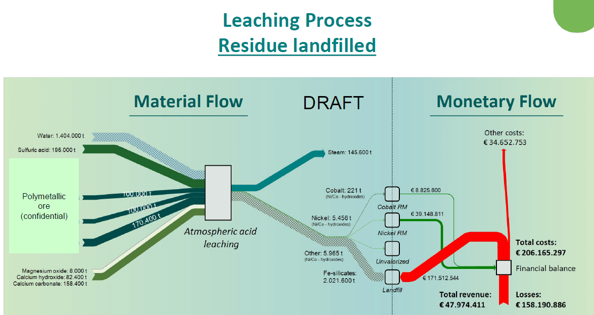
The Sankey diagram is interesting in two ways. First, these are actually two Sankey diagrams, touching each other at the nodes along the dotted ‘cut here’ line. The left part shows material flows in mining and metals production. From the tailings that typically end up on a landfill, nickel and cobalt are recovered. The right part visualizes the value streams linked to metal recovery and and costs associated with the landfill. These “monetary flows” are shown in red (if it is an expense) and in green (if it is a revenue). They run in opposite directions and are connected at the “Financial Balance”.

A second Sankey diagram (not shown here) compares this to a situation, where the Fe silicates typically sent to landfill can actually be “valorised” and fed back into the material cycle. In this case the financial balance can actually show a profit.

The second interesting aspect of this Sankey diagram is the way they handle flows that are out of scale (an issue I am particularly wary about, as some of you might have noticed).
In the mining and metal production process the water quantity being used is threefold the materials quantity, so the water flow would normally be three times the width of all the other flows in the Sankey diagram, if they were to scale. Here, the authors opted instead to mark the flow with a pattern and also use a pastel color to signal that this flow is not to scale.
The same on the output side, where we see the tailings stream (2 million tonnes) that is much much larger than the green recovered metals flows. If you were to draw these flows to scale, the arrow to ‘Landfill’ would be many times wider, and most likely spoil the whole diagram. Instead they opted to draw it in light grey with a moiree pattern. …

Circular Economy Roadmap Australia

CSIRO, Australia’s national science research agency, recently released a report “Circular economy roadmap for plastics, glass, paper and tyres. Pathways for unlocking future growth opportunities for Australia”. It looks at “a circular economy, with an objective of reducing total waste generated in Australia by 10 per cent per person by 2030”.

For each of the consumer products mentioned in the title it presents the current situation, and a 2030 circularity scenario as a Sankey diagram. Here is the one for plastics in Australia 2018 and 2030.

Flows are in million tonnes. In 2018 only 4% of plastics were recycled. This is projected to increase to 50% in a circular economy scenario, even with a slight overall increase in annual plastic use from 3.41 Mt to 3.76 Mt.

Read more here and download the summary report.

Overseas visitors to Italian Regions

I confess I am not a fan of this Sankey diagram, but since the topic is kind of interesting I thought I’ll share it with you anyway… Ah, those times when you could just decide to pack your stuff and head off someplace…

This distribution diagram show visitors from non-European countries to different Italian regions in 2012. It is from a 2014 report ‘DATATUR trend e statistiche sull’economia del turismo’ (trends and statistics on the tourism economy) by the Italian Federation of Hotels and Tourism (Federalberghi).


The report has a number of these figures, distinguishing areas/countries of origin and destination regions. This diagram splits non-European visitors by country of origin and links them to the Italian destination regions. Data is from the National Italian Statistics Office (Istat).

All the crossing streams in the middle really create visual mess. Spaghetti diagram (as some people have labelled this type of distribution diagram) seems to be an appropriate term here.

What we can see is that in 2012 the largest group of non-European visitors to Italy were from the United States (34%), followed by tourists from Japan and China. And Americans like to travel to the Lazio region (Rome), to Tuscany (Florence, Pisa, Siena, …) and the Veneto region (Venice).

There is a newer report to be found on the Federalbergi website with diagrams based on 2017 data, if you want to check out any major shifts in tourists choice of destination…
U.S. Energy History 1800-2019

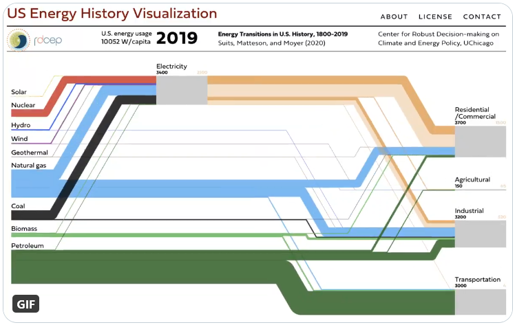
You can watch the changes in United States energy generation and use in a very cool animated Sankey diagram.

This was developed by University of Chicago’s Center for Robust Decision-making on Climate and Energy Policy (RDCEP) and is based on Suits, Matteson, and Moyer (2020) “Energy Transitions in U.S. History: 1800–2019”.


Click here to access RDCEP website and view 220 years of U.S. energy history.

You can play the whole period or use the timeline slider to jump to a specific year. At the top, next to the year, see the per capita use of energy rises from 3.660 W/cap to over 10.000 W/cap today.