Tag: Canada

Interprovincial Migration Flows Canada

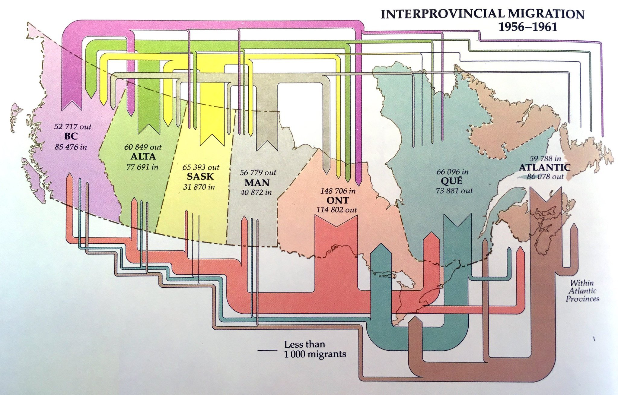
From the museum of Sankey diagrams comes this beautiful visualization of migration flows between Canadian provinces in the years 1956 to 1961. Sorry but I didn’t note the source… still wanted to share it with you.


Unfortunately, flows are not to scale: compare, for example, the exits from the Atlantic provinces in the period (86,078 people) which should have an arrow similar to the inflow of 85,476 to British Columbia. Or look at the exodus from Ontario provice, which seemingly is larger than the influx to the provice (but in fact is smaller).

Tracing Wood Fibre in Canadian Forestry

As part of the Canadian SPRUCE-UP research project one activity is dedicated to Genomic, Ethical, Environmental, Economic, Legal or Social (GE³LS) aspects of this applied genomics project. As part of their work the scientists have developed the Canadian Forest Service – Fiber Cascade Model (CFS-FCM) simulation model.


(see high res image here)

This Sankey diagram shows one specific scenario for a downstream flow of wood fibre from Canadian forests to products. Flows are in metric tonnes (probably for one reference year), with the exception of the ‘Bioenergy’ flow, shown in terajoules (TJ).

Québec Energy Flows and CO2 Emissions

The CESAR (Canada Energy Systems Analysis Research) blog at www.cesarnet.ca had been idle for a while, but reopened 2015 with a post on Québec’s energy flows and related carbon dioxide emissions.

The post ‘The State of Energy in Quebec – 2015’ features two Sankey diagrams originally from a report in French language ‘État de l’énergie au Québec’ by HEC Montral (PDF here). Benjamin Israel is the author (should I say artist?) of these Sankey diagrams.

The first Sankey diagram is on Québec’s energy flows in 2012. Flows are in petajoule (PJ). 1 petajoule is described for everybody to understand as “(278 GWh) corresponding to the energy consumption of approximately 10.000 households in Québéc.”

Four columns give a structure to the diagram: energy sources, transformation, use, efficiency of the system. The upper part depicts energy produced in Quebec (“Énergie Produite en Québec”). Energy sources are purely renewable: hydro, wind and biomass. The bottom part shows fuel imports into the province: petroleum, natural gas, uranium, coal. Grey arrows collect the losses. Interesting to see how losses from energy generation and refineries in column 2 dive beneath crossing bands to rejoin the other losses in column 4.

The second Sankey diagram (from p. 27 in the HEC document) is a summary of greenhouse gas (GHG) emissions (in French: ‘émissions de gaz à effet de serre’ short: GES) in Québec in 2012.

Given the information from the above energy diagram, where Québec domestic energy production is 100% from renewable sources, it is not surprsing to see that the carbon emissions are mainly from imported energy. Combustion of fossil fuels makes up for 57 of the total 78 Mt CO2-equivalent emissions. The remaining 21 Mt of CO2-equivalent emissions are from industrial processes, agriculture and waste.

Québec’s per capita GHG emissions ranges lowest with 9,7 tonnes of CO2-eqs compared to other Canadian provinces (see scale in lower left).

Beautifully crafted Sankey diagram. I hope to see more on the CESAR blog in the future.
Canada Energy Flows by Province

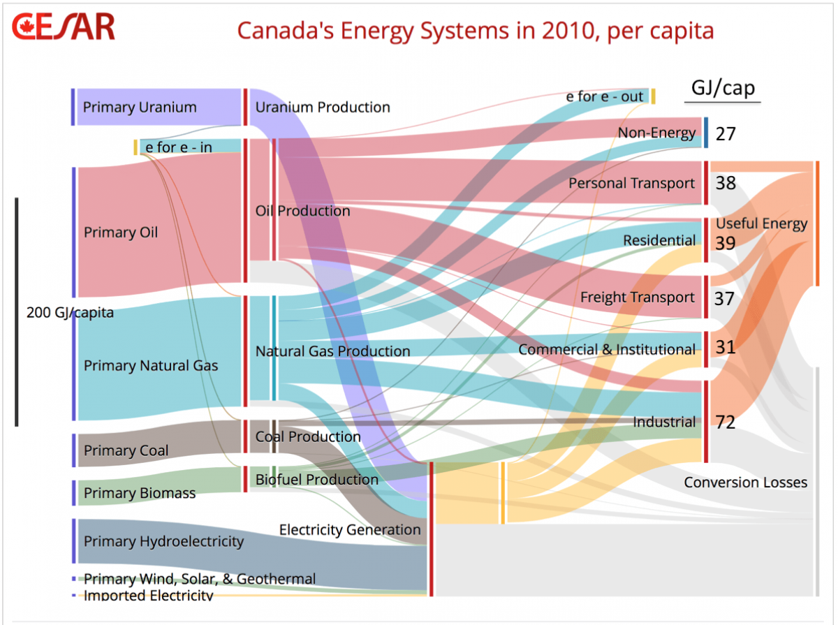
Another Sankey diagram of Canada’s energy flows is featured in a blog post titled ‘Dividing the Big Picture: Visualizing Provincial Diversity’. The post appeared May 5, 2014 on the Canadian Energy Systems Analysis Research (CESAR) blog by David B. Layzell, Professor at the University of Calgary. It is a follow up to a previous CESAR blog post that showed “the big picture” for Canada (featured in a recent post here on the blog).

“The Sankey diagram below shows only the domestic portion of Canada’s energy systems. (…) It also shows how much of that demand is met by oil/petroleum (red), natural gas (blue), electricity (yellow), biomass-derived products (green) or other energy resources.”

Flows are in GJ per capita. This relative unit is different to the other national energy flow diagrams I have presented here on the blog. But it is interesting for differentiating energy consumption in the different provinces.

The article explains:

“There are significant inter-provincial differences associated with each end-use category. For example, British Columbia (BC) residents had the lowest residential energy use in the nation, at 63% of the per capita energy use in Alberta (52 GJ/capita), the national leader in this category. The balmy BC climate compared to what Albertans face each winter accounts for most of this difference. However, our model also draws on government data showing that many BC buildings tend to be better insulated than those from much colder Alberta.”

Check out all Sankey diagrams tagged ‘Canada’ here.

Canada Energy Flows 2010

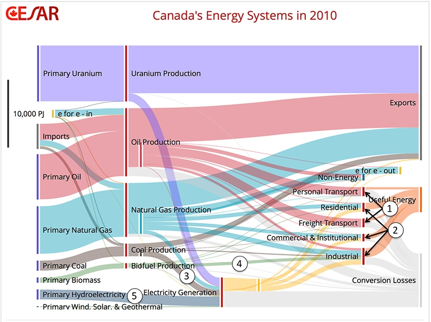
Featured on the Canadian Energy Systems Analysis Research (CESAR) blog is the below Sankey diagram on Canada’s Energy Flows in 2010. The article reports about a new model called ‘CanESS’ (Canadian Energy Systems Simulator) developed by Technologies Inc. and the University of Calgary.

Pulling together data from different sources the tool can visualize energy flows as Sankey diagrams.

The big picture of Canadian energy in 2010 is as follows:

“Canadian primary energy production in 2010 was nearly 25,600 PJ, and after including 3,700 PJ of imports, total primary energy availability was 29,500 PJ. As the Sankey diagram shows, 58% was exported, with the remaining 42% or 12,500 PJ being used domestically, 910 PJ for non-energy applications and 11,652 PJ for the provision of energy end use services to Canadians.”

Read the full article by Ralph Torrie on “the big picture” here.

There is an interactive version that allows you to choose the year (1978-2010), to break down the data onto each Canadian province, or change the unit. Try it out!

Canada Energy Flows

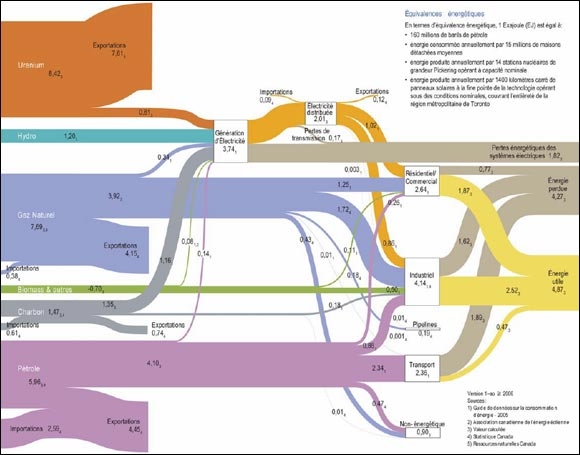
From a briefing document ‘Global and Canadian Context for Energy Demand Analysis – Energy Briefing Note’ (original source: ‘Powerful Connections: Priorities and Directions in Energy Science and Technology in Canada, Natural Resources Canada, 2006’) available on the National Energy Board website comes this Sankey diagram for Canadian Energy Flows in 2008:

Barely legible, but flow quantities are in Exajoule (EJ). The large bands that end about a quarter of the way are ‘exports’. Only the flows that go through to the power generation and consuming sectors represent domestic energy consumption.

Alberta Report full of Sankey Diagrams

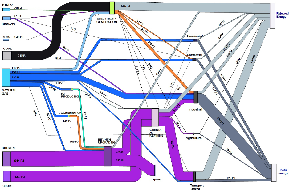
A recent report prepared by Kumar, Subramanyam and Kabir of the Department of Mechanical Engineering at the University of Alberta in Edmonton describes “Development of Energy, Emission and Water Flow Sankey Diagrams for the Province of Alberta Through Modeling”. Canada has been underrepresented with Sankey diargams on this blog, I feel. But the numerous Sankey diagrams on water and energy really compensates for this lag: I counted 12 more or less beautiful Sankey diagrams. Here is an example:

This is for the energy consumption in Alberta. Flows are in PJ (not sure which year they refer to). There are also several Sankey diagrams in this report for the water catchment areas of rivers (pp. 27-34).

Download the full report here (caution 6.5 MB PDF)

Metropolitan Energy Flow Sankey Diagrams

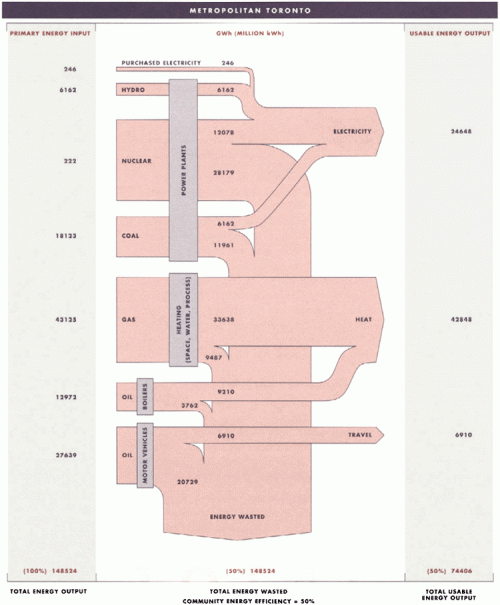
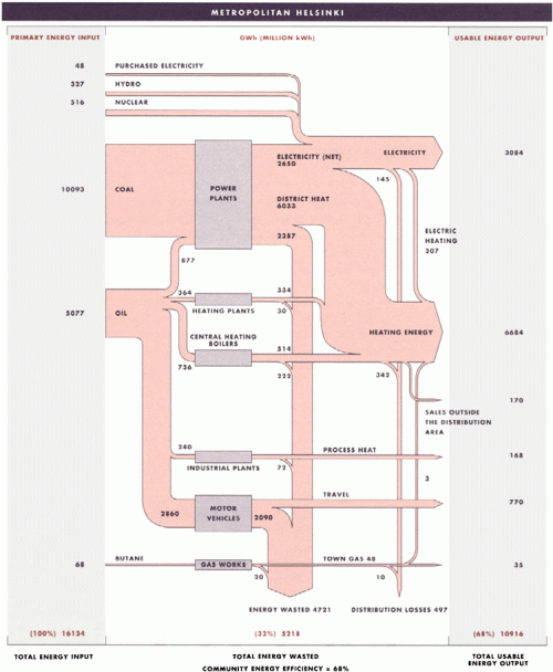
I have posted several Sankey diagrams depicting the energy flows of countries. At least California and West Virginia have published state energy flow Sankey diagrams. I was quite excited to discover the two metropolitan energy flow Sankey diagrams shown below in this publication. They are for Toronto and Helsinki and show energy flows in 1988 in these communities.

The two diagrams show energy consumption and use in Toronto (above) and Helsinki (below). Even though the absolute figures in GWh are given, one shouldn’t directly compare them. A per capita basis would be fairer (Toronto had a population of 2.5 mio in 2006, more than 5 mio. in the metro area, while Helsinki had 580.000 inhabitants in 2008 in the city, 1.3 mio in the greater Helsinki area — Toronto is today 4.5 times larger than Helsinki). Both are “cold-climate municipalities”.

The publication calculates a ‘community energy efficiency’ of 50% for Toronto and 68% for Helsinki. “A comparison of the two municipalities reveals that Helsinki significantly improved its efficiency by using the waste heat that is produced by local coal power plants to warm 90% of the buildings and homes in Helsinki. Further analysis has demonstrated that Helsinki’s energy system was able to achieve its overall level of 68% efficiency because the city’s compact land-use pattern made investments in energy-saving infrastructure, such as district heating and public transit, economically viable.”

Does anybody know other metropolitan energy flow studies? I am aware of research activities in the field of urban material flow accounts or urban metabolism (e.g. Lisbon) but have to check whether they show Sankey diagrams in their publications.