Tag: GHG

China Carbon Emissions from Energy

Energy generation in China is dominated by the use of hard coal. This Sankey diagram is from an article titled ‘A Method for Analyzing Energy-Related Carbon Emissions and the Structural Changes: A Case Study of China from 2005 to 2015’ by Honghua Yang, Linwei Ma and Zheng Li (Tsinghua University) in: Energies 2020, 13, 2076; doi:10.3390/en13082076. It shows carbon flow and emissions (I take that as CO2 only, although it might include CH4 if biogas was used)


Published under the terms and conditions of the Creative Commons Attribution(CC BY 4.0) license

Depicted are energy-related carbon flows in China in 2015. Unit of flow is 10 Mt C, which in the last column also translates into Mt CO2.

The sectors Transport (“Vehicle”), Industry (“Factory”) and Buildings are further broken down into the individual services the energy provides, like illumination, thermal comfort, hygiene.

There is another energy flow diagram for China in 2015 in this article, and it shows that there are also other energy sources (hydro, wind, nuclear, solar), but these don’t show up in the carbon flow diagram.
Material Flow Analysis for Almaty

Almaty is the largest city in Kazakhstan. It is also the first city in Central Asia that did a circular economy opportunities analysis. Numerous ideas were proposed during a project with local stakeholders.
The project is described on the Shifting Paradigms blog, and the full report ‘Metabolic analysis and circular economy strategies for Almaty, Kazakhstan’ describing the project can be downloaded there.

Visuals turned out to be crucial in this project for communicating information and to be able to oversee the amount of data. “Mapping out the metabolic system of a city, helps understand how a city uses material resources to deliver valuable services to its inhabitants, like nutrition, shelter and mobility, and identify opportunities for improvement.”

This is the Sankey diagram depicting the material flows for Almaty, Kazakhstan covering minerals, metals, biomass, fossil fuels, energy and water used in Almaty’s industry. It is shown on pages 36/37 of the report. Flows are in kT (per one year ?) with imports/exports across the city’s boundaries.

Blended into this material flow analysis (MFA) diagram are greenhouse gas emissions (GHGs). “The red flows at the lower section of the graph show the embedded gas emissions in imported goods and materials.” These could be considered hidden quantities associated with the production of products or the import of fuels, “piggybacking” on the actual physical material flows that enter and leave the industrial sector in the city.

Note that it seems as if flows are not always to scale or parts are hidden behind other flows (see, for example, the yellow stream representing 968 kT of fuel being turned into 2,975 kT GHGs, a flow that is not three times as wide). Also the recycling flow width seems to overblown, probably to point out that recycled materials can loop back through the system multiple times, and to focus the circular economy perspective.

There are two other Sankey diagrams in the report, so make sure you have a look at it.

World GHG Emissions 2016

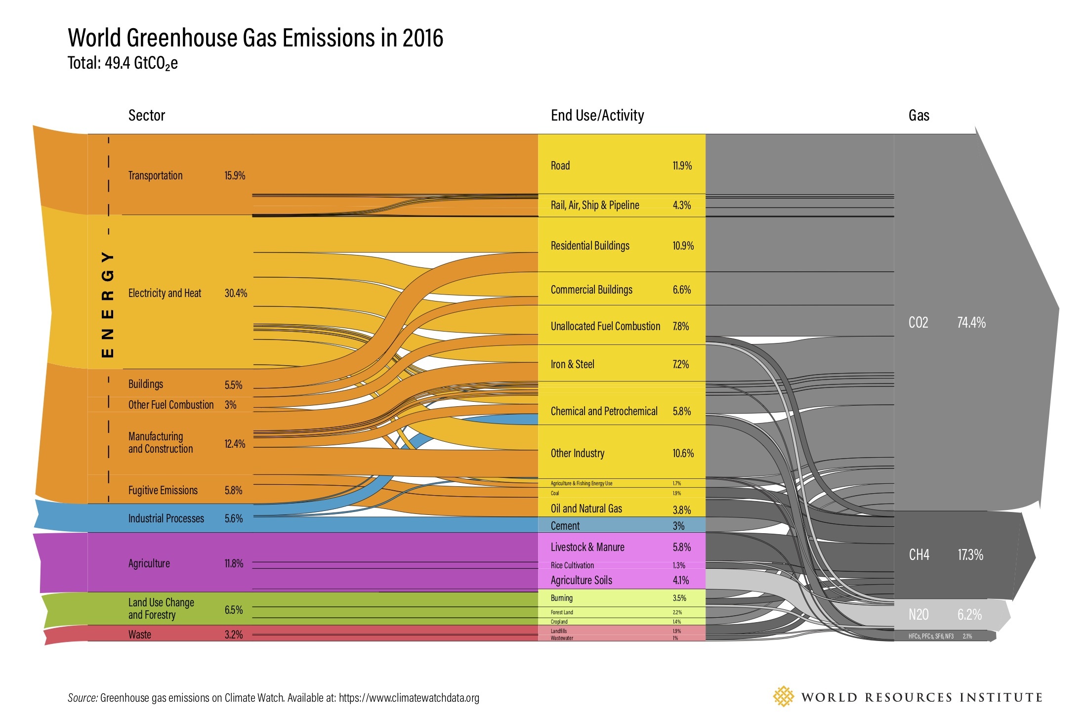
Here is an updated version of the world greenhouse gases emissions diagram for 2016. This was published 2019 by World Resources Institute (WRI) on their website.


Flows are in giga tonnes CO2 equivalents (GtCO2e). Overall emissions contributing to climate change were 49.4 GtCO2e. The first column is a breakdown per sector, the second one lists the activity causing the release. The third column shows the actual gas (GHG)

You can compare the quantities to the previous editions with data for 2000 and 2012, but mind that these figures are structured differently.

In addition to this “static” Sankey diagram there is also an interactive version that lets you explore the individual streams by hovering the mouse over the diagram.

If you like WRI’s work you might want to consider supporting them.

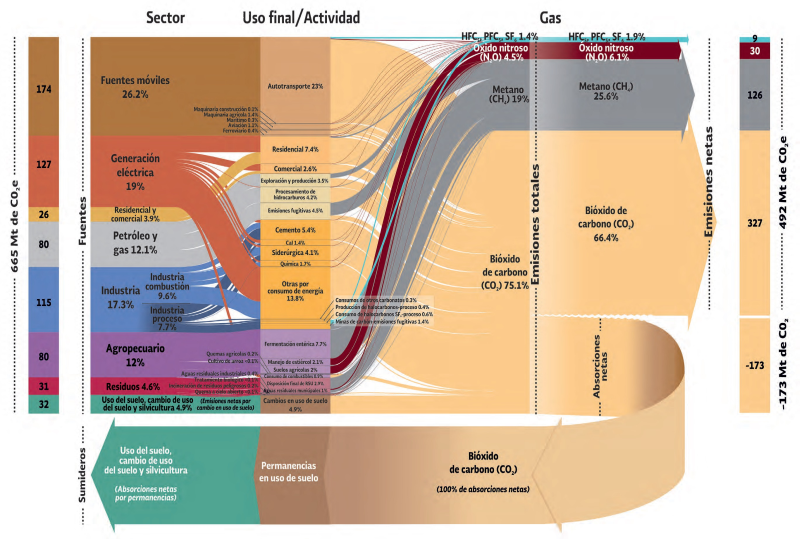
Greenhouse Gas Emissions Mexico 2015

Here is a great Sankey diagram visualizing the greenhouse gas emissions of Mexico in 2015. This graphic comes from the ‘Sexta Comunicación Nacional y Segundo Informe Bienal de Actualización ante la Convención Marco de las Naciones Unidas sobre el Cambio Climático’ published by Secretaría de Medio Ambiente y Recursos Naturales (SEMARNAT) and Instituto Nacional de Ecología y Cambio Climático (INECC).

The Mexican national inventory of emissions of gases and composites withe greenhouse effect (Inventario Nacional de Emisiones de Gases y Compuestos de Efecto Invernadero) is compiled by INECC on a regular basis as part of its reporting as a signatory to the United Nations Framework Convention on Climate Change (UNFCCC). The report is here, you can find the graphic on pages 110/111.

On the left side we see the different sectors of the country and their contribution to the emission of the 665 Mt (megatonnes) of GHG gases in 2015. The unit of measure is Mt CO2 equivalents. For each of the sectors this is further broken down to the activities causing the emissions. Further to the right these emissions are split to the individual underlying gases,. We see a large share (75%) caused by carbon dioxide (bióxido de carbono), methane and nitrous oxides. 492 Mt CO2eq were released to the atmosphere, while 173 Mt CO2eq were sequestered (absorbed by plants and soil).

Dairy Supply Chain GHG Emissions

Rediscovered this Sankey diagram in a 2011 project report ‘Scottish Dairy Supply Chain Greenhouse Gas Emissions’ (Sheane, R., Lewis, K., Hall, P., Holmes-Ling, P., Kerr, A., Stewart, K., Webb, D.: Identifying opportunities to reduce the carbon footprint associated with the Scottish dairy supply chain – Main report. Edinburgh: Scottish Government, 2011).

Flows are in megatonnes of CO2-equivalents (Mt CO2e) greenhouse gas emissions (GHG) in 2007 related to the production of milk and dairy products in Scotland.

A total of 1.657 MtCO2e GHG emissions were caused along the dairy supply chain emissions, which was equivalent to 3% of Scotland’s direct GHG emissions. With a yield of 1.3 billion litres of milk on dairy farms in Scotland in 2007 this corresponds to 1.1 kgCO2e/kg of milk or 1.2 kgCO2e/litre of milk.
If you look at the origins of the emissions in the diagram you will see ‘enteric fermentation’ (aka ‘cow fart’) and liquid manure (‘cow poop’) as the main causes.

Read the full report here.

Embodied Emissions of Products in the EU

Embodied emissions (similar to embodied energy) is an interesting perspective on the environmental impact of products we use. It takes into account the full life-cycle of the product and aggregates the emissions produced from raw material extraction, from the actual manufacturing, from the transports along the supply chain, and from the disposal of the product after use.

In many cases ’emissions’ is reduced to greenhouse gas emissions (GHGs) and the impact on climate change caused along the product’s life cycle. In this case we could colloquially also call it the ‘carbon rucksack’ of the product.

Kate Scott from the Sustainability Research Institute, School of Earth and Environment, University of Leeds (UK) in her article ‘Extending European energy efficiency standards to include material use: an analysis’ suggests the European Union should – in addition to its energy efficiency policies – add consideration of material efficiency of products to their climate change strategy. GHGs are considered a lead indicator for material efficiency, as “material-intensive manufactured products … offer significant scope for emissions reductions along product supply chains.

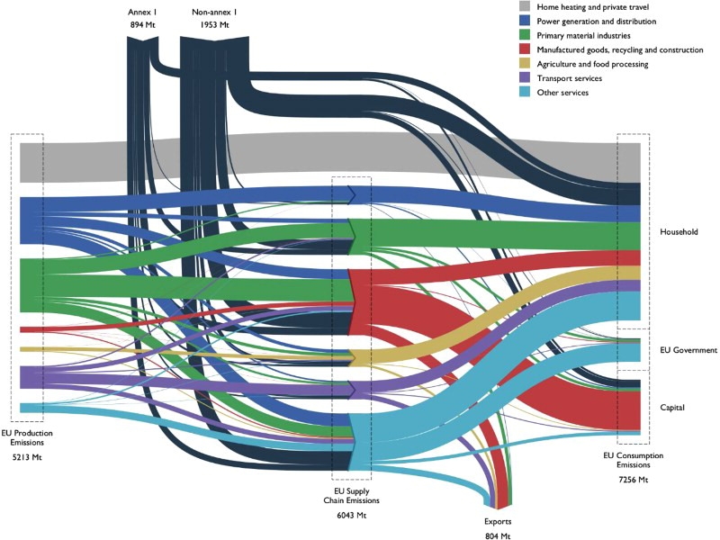
This Sankey diagram of supply chain emissions associated with global product flows of the EU is presented.


Source: Kate Scott, Katy Roelich, Anne Owen & John Barrett (2018) Extending European energy efficiency standards to include material use: an analysis, Climate Policy, 18:5, 627-641, DOI: 10.1080/14693062.2017.1333949 distributed under Creative Commons Attribution License.

The diagram doesn’t show much detail as to the individual stream and relies heavily on color coding. Only group sums are shown. Data is for the year 2007. Flows are in Mt (megatonnes) CO2-equivalents embodied as emissions in the products.

“Production emissions in the EU in 2007 were 5,213 MtCO2e, with the width of each flow on the left-hand side of Figure 1 representing production emissions by sector, the conventional accounting approach. In the same year, the EU’s consumption-based emissions, the right-hand side of Figure 1, were 39% higher, at 7,256 Mt due to the EU’s trade balance. Emissions embodied in EU imports were 2,847 Mt and emissions embodied in their exports were 804 Mt, meaning that the EU is a net importer of 2,043 MtCO2e (imports–exports).”

The black streams from the top represent embodied GHG emissions from raw materials, finished products or product components imported into the EU.

Read the full article here.

World GHG Emissions 2012

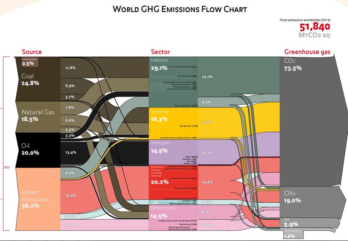
This “dense” or “block-style” Sankey diagram might look familiar to some. Indeed it is based on the greenhouse gas (GHG) emissions Sankey diagram for 2000 published by the World Resources Institute WRI (see this post). Consulting firm Ecofys (now Navigant) has updated the data and refined it, but kept the overall appearance of the figure.


via @ChrisChambers64

Total emissions of climate gases were 51,840 Mt Co2-eq. Carbon dioxide and methane contributed more than 90%. The industry sector is the largest emittor, followed by agriculture and land use.

Very clear and compact Sankey diagram, conveying the most important information about GHG emission sources.

Greenhouse Gas Emissions Brazil 2012

SEEG Sistema de Estimativas de Emissões de Gases de Efeito Estufa (Greenhouse Gas Emissions and Removals Estimates System) is an initiative of the Observatório do Clima (Climate Observatory) in Brazil.

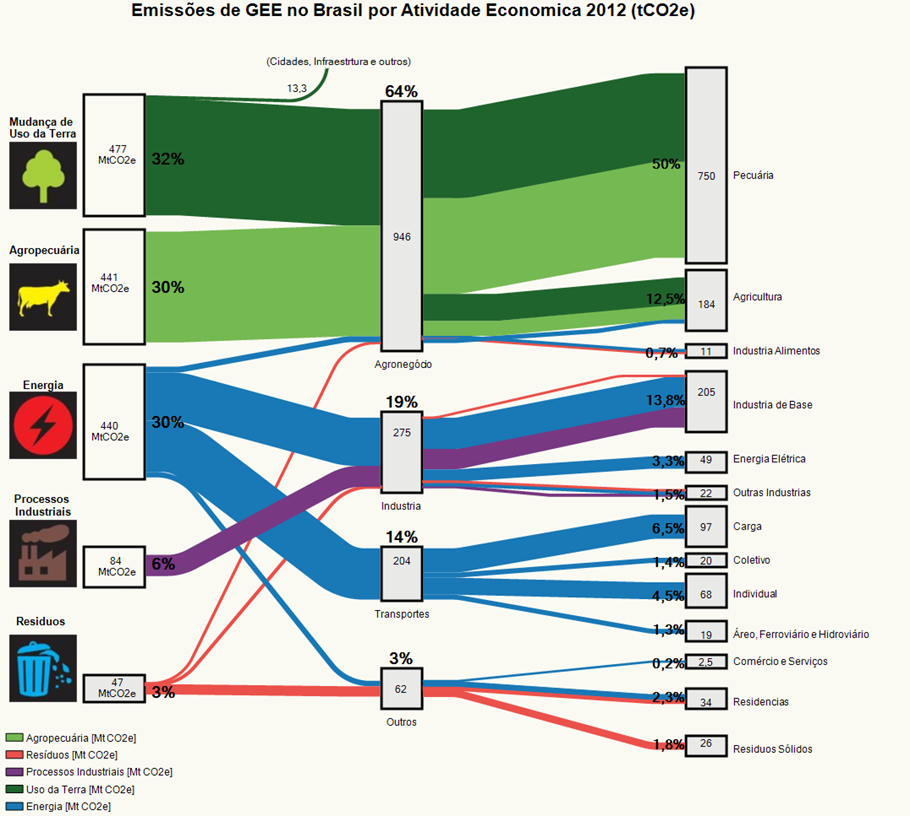
This Sankey diagram on the SEEG web page (in Portuguese) shows greenhouse gas (GHG) emissions in Brazil in 2012.

On the left are the emitters by sector: land transformation, livestock farming, energy generation, industrial processes and waste sector. Emissions are grouped in the middle column by activity: agriculture, industry, transport and other. The third column is a detailed breakdown of the activity sectors.

The agricultural sector contributed 64% of Brazil’s GHG emissions in 2012, with most likely methane (CH4) from livestock breeding and CO2 release from deforestation as the major sources.

Emissions are shown in Mt CO2-e[quivalents], even though the caption says differently. Overall greenhouse gas emissions were 1490 Mt CO2e (or 1.49 bn tonnes CO2e). Detailed data is available on the website, so this can be seen as the consolidated overview of GHG emissions.

More recent GHG data for 2017 from Brazil has been published at an event in November 2018 in São Paulo, but I couldn’t find a Sankey diagram (yet).