Tag: UK

Brexit Negotiations Outcomes – Outdated!

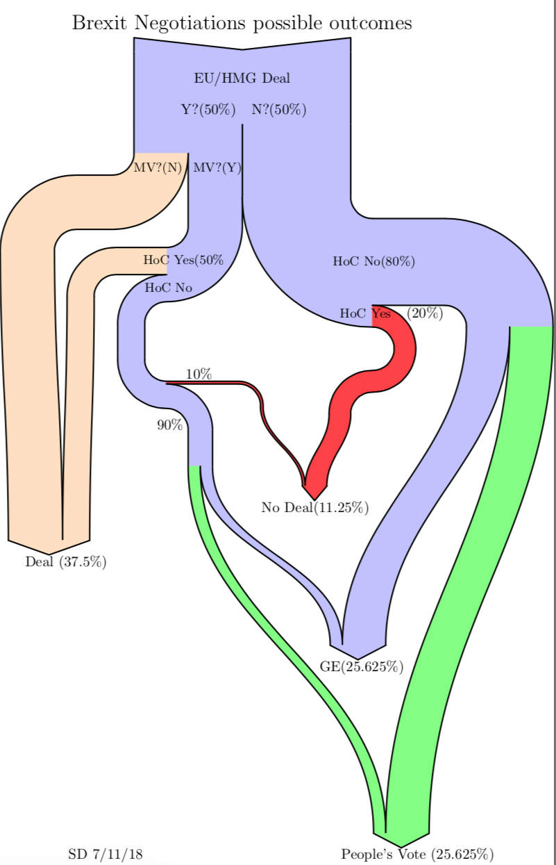
As Boris Johnson makes a dash to Luxembourg today for negotiations with Juncker on Brexit, this Sankey diagram from a blog post ‘Brexit Negotiation Outcomes using a Sankey Diagram’ by Sean Danaher at Progressive Pulse – less than a year old (Nov 9, 2018) – is soooo outdated. In fact the situation was (and still is) so fluid that any attempt to describe it can be outdated within a week or even a day…


This is a decision-tree diagram, just that the estimated probabilities for a decision are shown as weighted paths. Decision paths can merge again when they lead to the same result.

Note: I try to keep this blog non-political. The only other politics related Sankey diagrams are here (Scottish referendum) and here (Trump).

Dairy Supply Chain GHG Emissions

Rediscovered this Sankey diagram in a 2011 project report ‘Scottish Dairy Supply Chain Greenhouse Gas Emissions’ (Sheane, R., Lewis, K., Hall, P., Holmes-Ling, P., Kerr, A., Stewart, K., Webb, D.: Identifying opportunities to reduce the carbon footprint associated with the Scottish dairy supply chain – Main report. Edinburgh: Scottish Government, 2011).

Flows are in megatonnes of CO2-equivalents (Mt CO2e) greenhouse gas emissions (GHG) in 2007 related to the production of milk and dairy products in Scotland.

A total of 1.657 MtCO2e GHG emissions were caused along the dairy supply chain emissions, which was equivalent to 3% of Scotland’s direct GHG emissions. With a yield of 1.3 billion litres of milk on dairy farms in Scotland in 2007 this corresponds to 1.1 kgCO2e/kg of milk or 1.2 kgCO2e/litre of milk.
If you look at the origins of the emissions in the diagram you will see ‘enteric fermentation’ (aka ‘cow fart’) and liquid manure (‘cow poop’) as the main causes.

Read the full report here.

UK Resource Flow 2014

This Sankey diagrams for the resource flows in the UK in 2014 can be found in the Digest of Waste and Resource Statistics – 2018 Edition. The report is published annually by UK’s Department for Environment, Food & Rural Affairs (DEFRA). This is for all mass flows nationwide, but excluding fossil fuels and energy carriers. Unit of flows is megatonnes (mt) per year.

That figure didn’t quite convince me. Apart from the the pixelated arrow segment borders where arrows don’t run vertically (see red arrow), I found that some flow quantities were missing. Further, I didn’t like that the blue recycling back flow was exaggerated (read: not to scale) and the 91 mt arrow as wide as the green 143 mt biomass flow (at least in some segments). To be fair, the footnote for the diagram warns “that the ‘pipes’ are not all to scale”, but my impression was that this effect was mainly used to emphasize the thinner arrows.

I did a quick redo of this resource flow diagram only to find out that it was impossible to determine some of the missing flow quantities. I could find some of them in the report, but was unsuccessful for others. So I had to estimate them (which is indicated with an asterisk in my version).


Warning: Some values based on estimates, please do not use the data from this figure.

As you can see the recycling stream is less wide in my remake. Didn’t fully hit the right color codes, but tried to stick to the original layout as much as possible.

Energy Flows in ZeroCarbonBritain

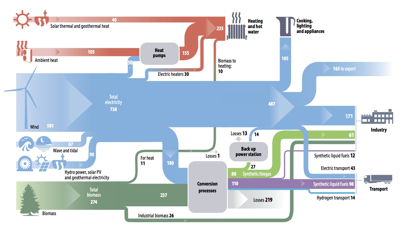
What would daily life in a ‘zero carbon’ Great Britain look like? Since 2007 the Zero Carbon Britain (ZCB) project of the Centre for Alternative Technology (CAT) has worked to “offer the hard data and confidence required for visualising a future where we have risen to the demands of climate science; to remove fear and misunderstandings and open new positive, solution-focused conversations.”

They have presented a Sankey diagram for the energy landscape in the UK, the way it could look like if Britain’s energy production was actually carbon free and 100% renewable energy.


via Open Energy Monitor blog, original image here (under CC BY-NC 2.0 license)

Flows are in TWh/year. The largest energy sources are wind and biomass. Some of the electricity is used to produce synthetic gas, synthetic liquid fuels and hydrogen (used mainly in the transportation sector). In that scenario there is even an electricity surplus that can be exported.

While I can not judge how realistic such a vision of the UK energy landscape is, I can at least say it is very different from the current situation (see here or here), and even from this UK 2050 energy scenario.

Global Plastics, Ellen MacArthur Foundation

This week the global plastics flows topic made the news and social media with the publication of the EU Plastics Strategy and Chancellor Philip Hammond presenting the United Kingdom’s plan for tackling plastic waste.

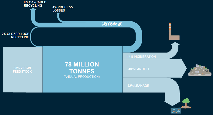
Ellen MacArthur Foundation has long been active in research and awareness building in this field. It aims at supporting a transition to a circular economy. The foundation tweeting under @circulareconomy contributed this Sankey diagram. It is from a 2016 report they produced together with the World Economic Forum and McKinsey.

The Sankey diagram shows indeed, that “today, plastic packaging material flows are largely linear”. This beautifully crafted diagram had already caught my attention back in 2016 when I first saw it.

However, I had this subtle feeling that something was wrong here. Not regarding the content or the data … but rather that something wasn’t OK in the Sankey diagram, Just my gut feeling. Now, seeing the Sankey diagram again in the above tweet this week, I finally sat to quickly do a remake of this Sankey diagram. Here it is:

I stuck to the original layout and design as closely as possible, using the same color codes and even the white all caps font. While transfering the numbers (all percentage values, so no issue there), it immediately became clear to me what caused my irritation. Can you identify it yourself by comparing the two pics?

Won’t give it away now and wait for your comments. Will post the answers to this small ‘spot-the-difference contest’ here next week.

[Edit 24 Jan] Blog reader ‘First!’ was the first to comment and point out that the 2% recycling flow does not seem to be to scale (i.e too wide / overemphasized) in the Sankey diagram published by Ellen MacArthur Foundation, and possibly the same issue with the two arrows representing 14% each.
Mapping Scottish IndyRef Votes

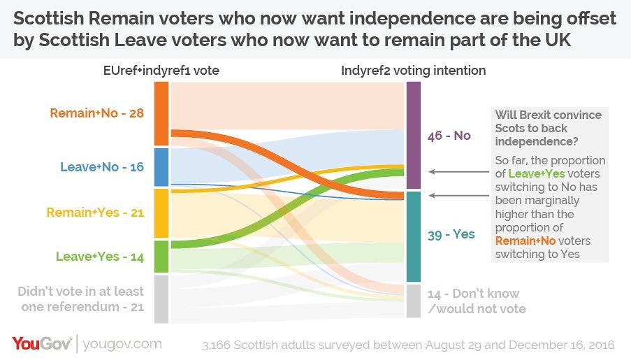
Good use for a distribution diagram shown in the January 2017 Guardian op-ed ‘Why hasn’t Scotland changed its mind on independence?’. It shows Scottish voter behaviour in the first pre-Brexit vote independence referendum (‘IndyRef1’) and intended vote in the second independence referendum (‘IndyRef2’), based on a poll among some 3,200 Scots in Nov/Dec 2016.


(via Coffee Spoons blog, originally from The Guardian, using YouGov data)

The left columns has two categories (Brexit Leave/Remain and first independence vote ‘Aye’/’Nae’), the second only one category. Both columns have the undecided voters fraction in light grey.

The changeovers from one camp to the other are shown emphasized in strong colors. One can see that the ones who voted “No” in the first referendum and that would now vote “Yes” for Scottish independence are compensated by voters who said “Yes” in the first vote, and who would now probably go for a “No”.

There seem to be less undecided voters (down from 21% to 14%), but the overall outcome would at present be the same: 46% No, 39% Yes (Indyref1: 44% No, 35% Yes). Of course a lot has happened since the poll in Nov/Dec 2016 and there is still a long way to go up to IndyRef2.

UK Electricity Generation Efficiency 2012

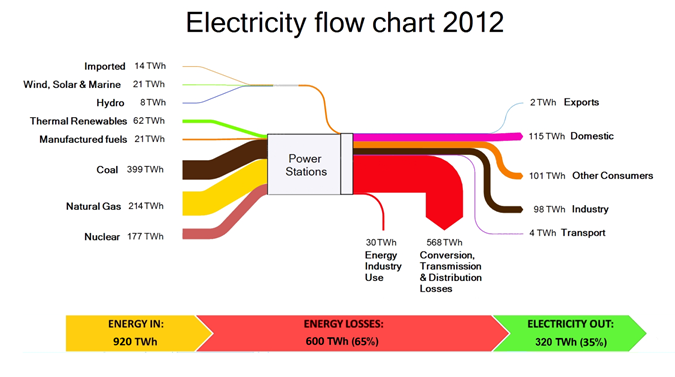
UK-based consulting firm Green Peninsula has the following Sankey diagram on their website showing electricity generation in the United Kingdom in 2012.


“In 2012 around 920 TWh of primary energy … went into electricity generation in the UK. Due to conversion [in]efficiencies during electricity generation and losses during its transmission, 65% of this energy was lost – primarily as heat. With around 320 TWh reaching the end user, this equates to an overall supply efficiency of around 35%.”